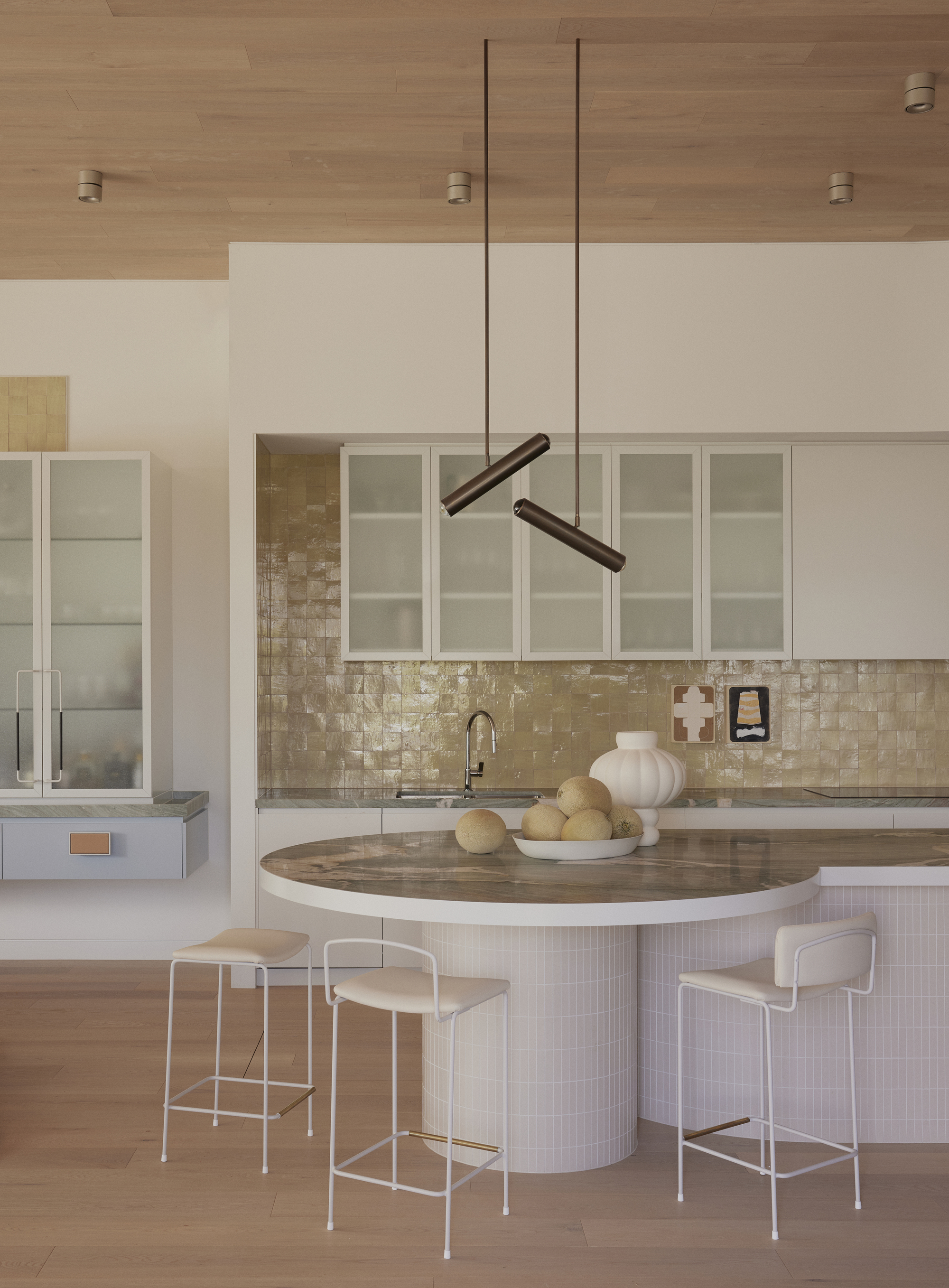
A lot happens in the kitchen. Meals are prepared, homework is endured, and everyone knows that the best conversations at a party happen in the kitchen (usually pretty late at night). It’s a high-traffic zone where lives are lived, and colorful kitchen ideas only help encourage that.
That's why it makes sense that your kitchen palette needn’t be limited to sterile white, grey, beige, or greige. Renovating a modern kitchen is the perfect opportunity to introduce more hues to your house. Thankfully, inspiration is everywhere. Not since the vivid Formica kitchens of the 1960s have we seen such a rainbow of choices of joinery color, materials, tiles, and furniture.
Ready to revive your cook zone with color? Here are some of the kaleidoscopic kitchen color ideas that have inspired us lately.
1. Kick off with a key saturated color
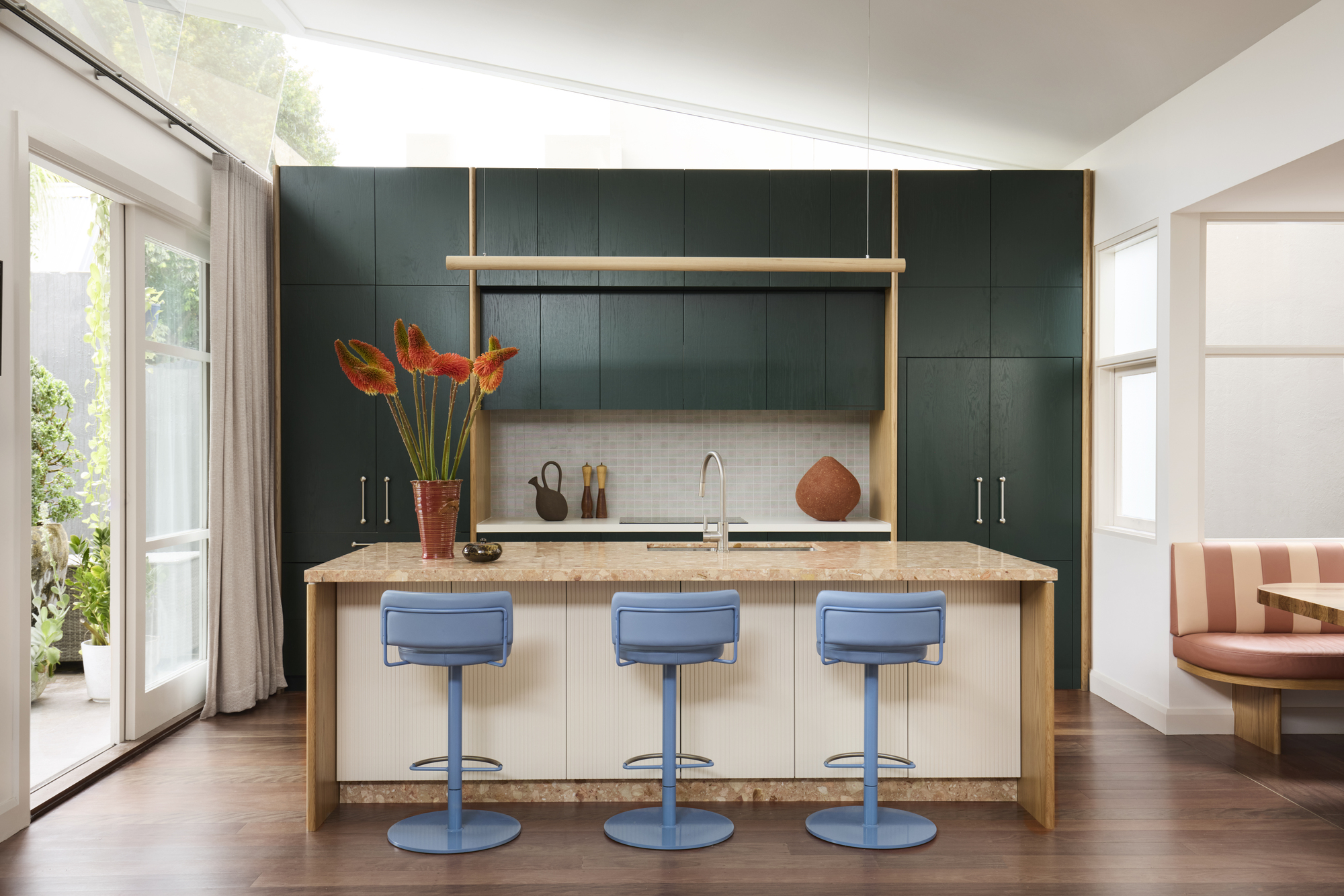
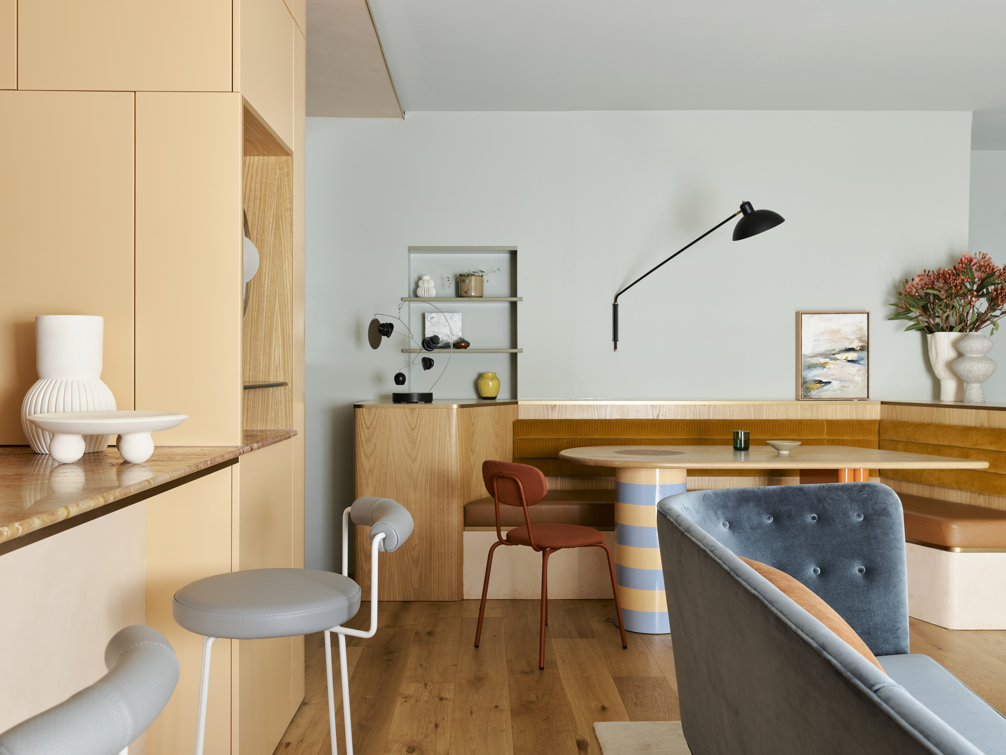
The owners of this personality-filled home in Sydney’s inner west work in creative industries, so when curating the kitchen scheme, interior designer Josie Simpson, of Altus Design Studio, started with bold green joinery.
“The clients’ love of color was immediately clear when I first visited their home; it was vibrant and expressive,” Josie recalls.
A rich, clean green was the ticket. “Rather than letting green dominate the entire palette, I created a layered, joyful interplay of tones,” Josie says. “The blue bar stools link visually to the soft blue of the dining banquette pendant, while warm, earthy corals in the terrazzo benchtop and banquette upholstery help ground the space and bring a sense of warmth.”
Don’t forget the supporting players, she adds. “Details like lighting, hardware, and soft furnishings are opportunities to layer in, or tie together, colors. This makes the palette feel cohesive and complete.”
Josie loves creating surprising moments, too, such as the coral-colored pantry interior — revealed only when the pocket doors are opened.
Individual pieces don't have to be technicolor, but choosing something like a bar stool in a contrasting color to your kitchen can help make the space feel more vibrant.
2. Make it autumnal, and paint the ceiling
This colorful kitchen idea by Morris Studio absolutely brings the outside in; even the ceiling is awash with Farrow & Ball Lulworth Blue, like the sky.
“The house is close to Hampstead Heath in this very old, residential area of North London,” explains director Tom Morris. “The heath is a large and ancient expanse of woodland and meadows… we started the project when all the leaves were turning red, and the grasses were looking faded. This palette was really influential as we kicked things off.”
Tom and his team wanted to embody that autumnal vibe, while transforming the space into a modern kitchen. “It is a very warm, calm space that's not too serious for a family to live in, but not frenetic. The clients have a lovely garden full of tall thistles and purple salvia, too, and this color palette was designed as a frame for that.”
3. Paint your timber kitchen joinery
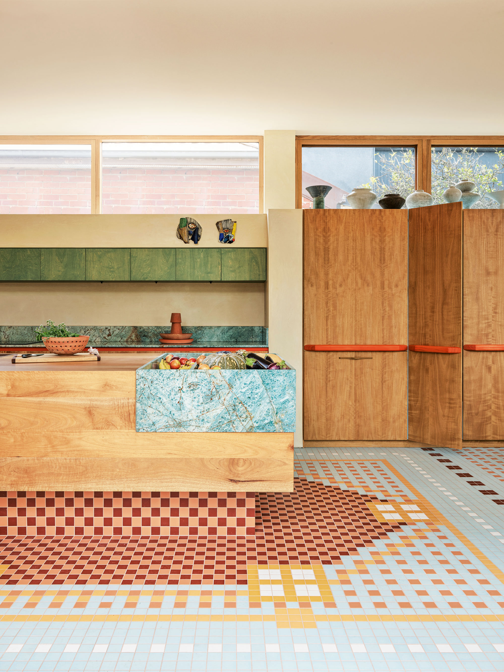
It might sound like run-of-the-mill DIY, but hand-painting joinery timber is a classic manoeuvre that’s used by the most esteemed interior designers. In this Melbourne kitchen by YSG, an apple-green was lightly applied to overheard birch cupboards.
“We often use this timber for painted joinery surfaces, as its natural woodgrain is picked up beautifully by the color — so long as it’s a relatively light shade,” explains YSG director, Yasmine Ghoniem. The team used the same approach for the tangerine timber cupboard pulls.
Color is further infused via the Ocean & Merchant porcelain floor tiles, and the turquoise granite fruit and veggie receptacle that’s built into the countertop. “One of our clients wasn't a fan of fruit and veg bowls cluttering kitchen surfaces, so this added a surge of color and pattern, but no mess,” says Yasmine.
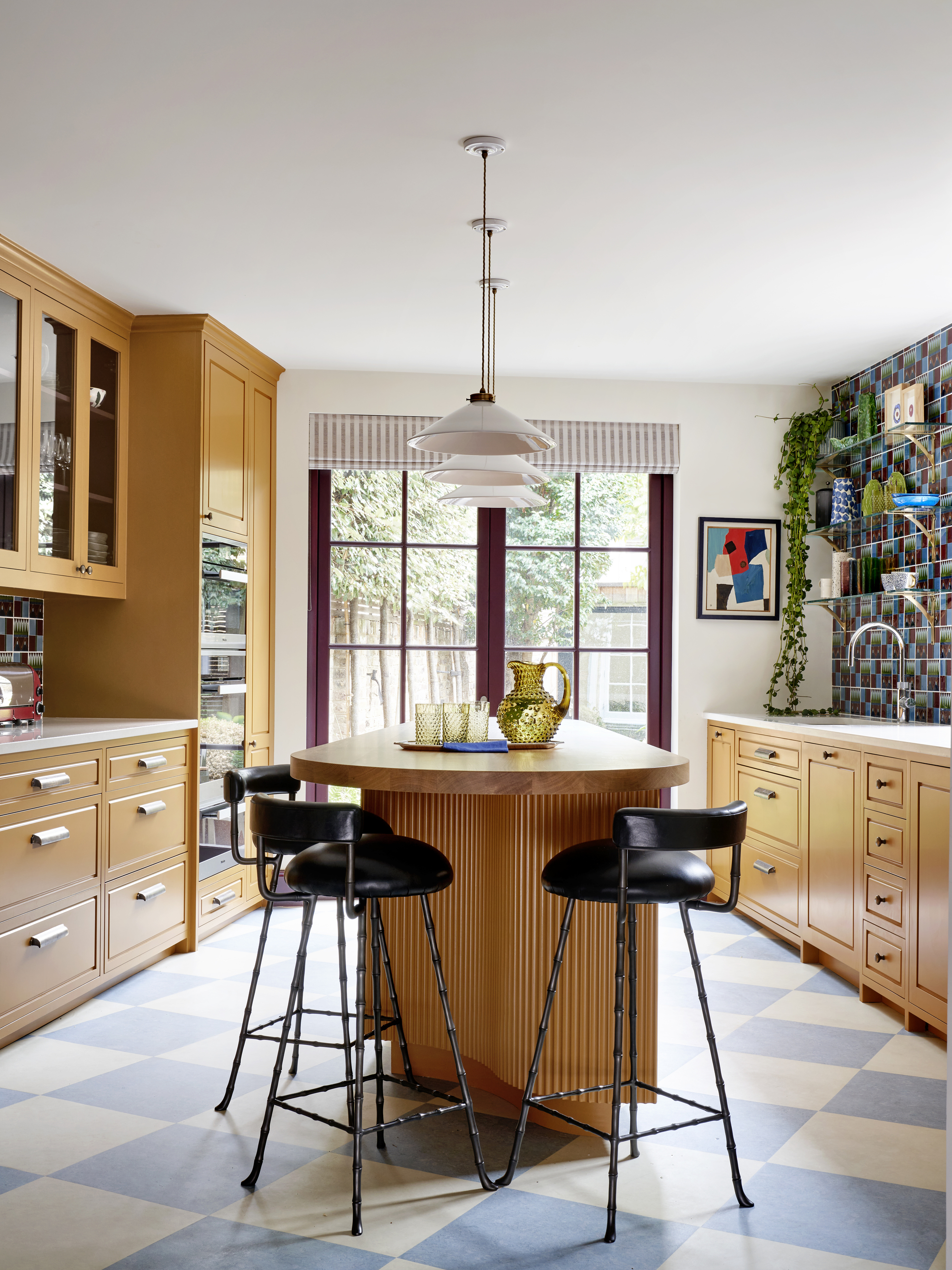
4. Go large or go home when picking colors
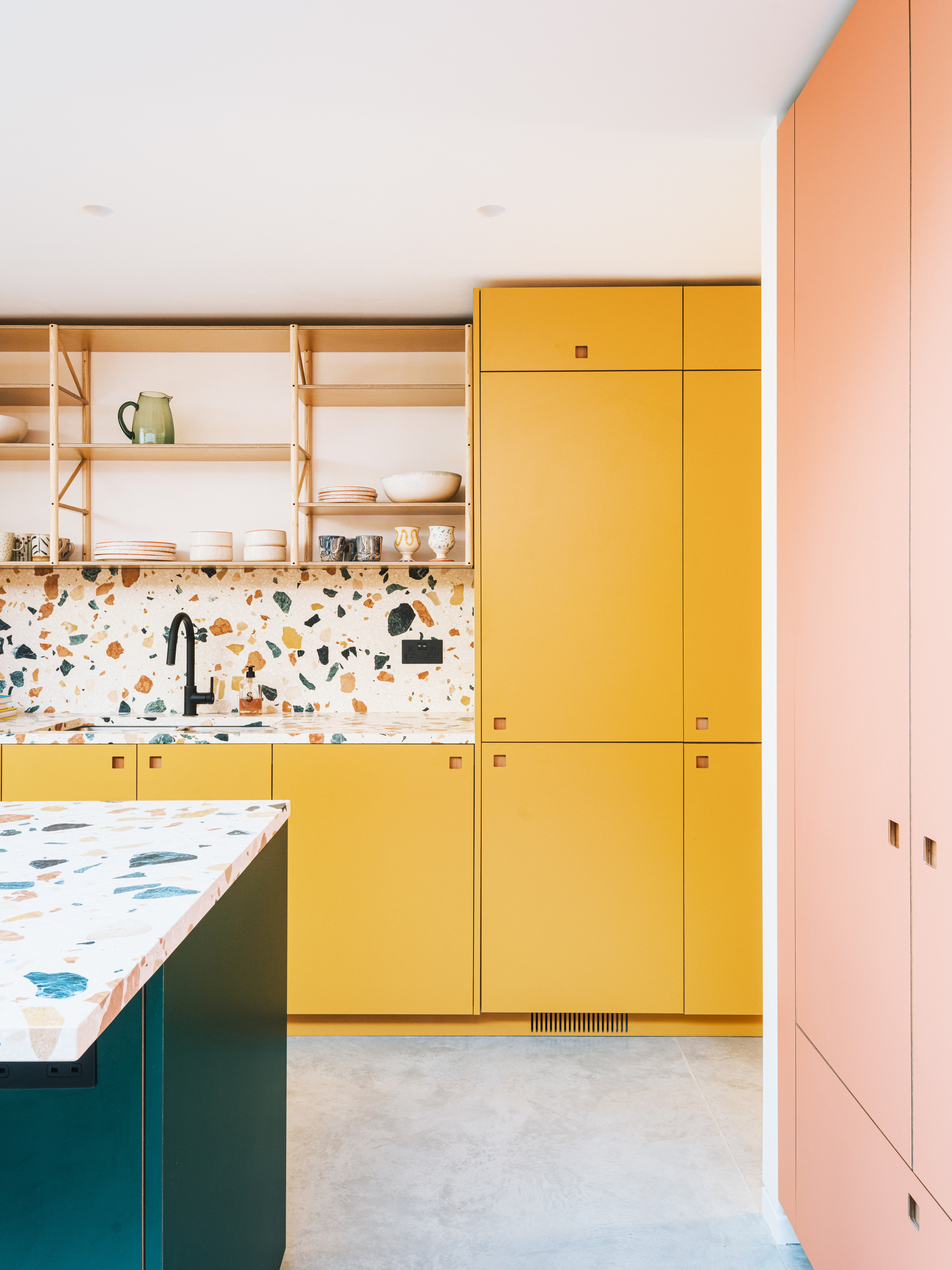
“If you're going big with color, then don't hold back,” says Alex Raher, director and co-founder of Delve Architects, when asked about colorful kitchen ideas. “We often have conversations with clients who wish they’d been bolder with color choice on previous projects, so we try to push the palette and test fun combinations.”
Case in point: this South London terrace kitchen, which Alex transformed with bright hues, in collaboration with Pluck Kitchens. The yellow column and joinery balances beautifully with rich emerald green and coral-pink, and it’s tied together in a neat bow by the Dzek Marmoreal marble terrazzo countertop and backsplash.
Terrazzo offers so many different color play opportunities, as seen in this sweet coaster set from John Lewis.
5. Think outside the box
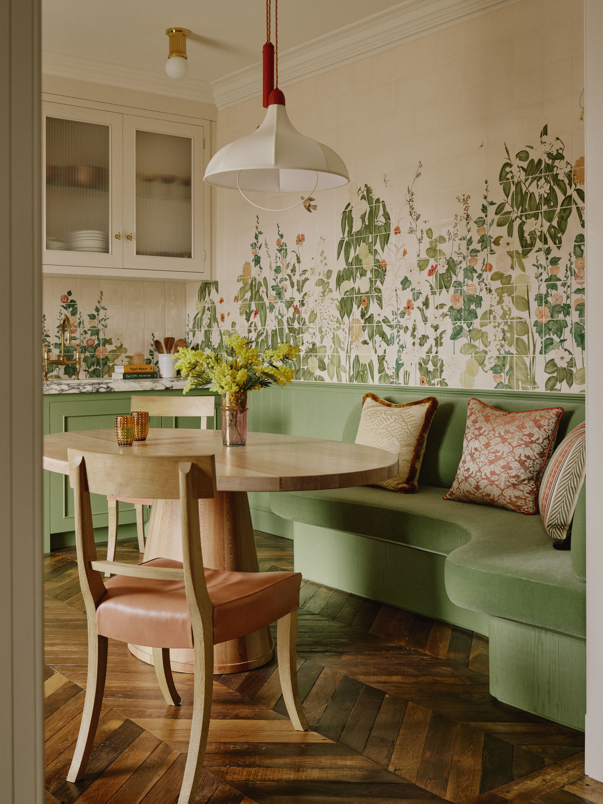
Or, color outside the lines. When it came to adding color and materiality to this Belgravia kitchen and dining space, Studio Ashby founder Sophie Ashby sourced hand-painted Balineum wall tiles featuring botanical art by Anna Glover.
Referencing the tiles’ colors are the cabinets, painted in Argile Guatemala, a custom green mohair banquette, a pair of Howe Grecian chairs with peachy-pink upholstery, and Breccia Capraia purple and green marble countertops. The red rod of the Beata Heuman light is a quiet nod to the red flowers of the meadow depicted.
6. Stick to an odd number of colors
For a more balanced and visually appealing composition when it comes to colorful kitchen ideas, opt for three or five colors, says interior designer Greg Natale. “This allows for a dominant color, complemented by secondary color and accent hues, ensuring the space feels cohesive rather than chaotic,” he explains.
In this reimagining of a guest cottage, Greg took cues from the layered English country house aesthetic and its chintz textiles, intricate prints, and soft heritage tones. The dominant color is a soft sage green, while the secondary is warm cream, which forms a backdrop for the floral print of the scene-stealing Ralph Lauren wallpaper.
The deep purple veins of the Calacatta viola backsplash and countertop add more vibrancy to this fantastical twist on a cottage kitchen.
Wallpaper kitchen ideas can often be a one-stop-shop when it comes to making a space feel more colorful.
7. Max your impact with subdued color
Not all colorful kitchen ideas need to involve drenching your space with saturated hues; the right combination of more muted tones can have the same effect.
For this subtle but still colorful kitchen idea, Studio Doherty’s Mardi Doherty employed soft yellow Moroccan Zellige gloss tiles and a richly veined Cristanza quartzite countertop to evoke a calming yet multifaceted kitchen.
A muddy pink door marks a clear and fun delineation from the home’s original Federation footprint and the contemporary extension. Just a step to the left, in the living space, floating drawers have been painted in a baby blue with large apricot-colored pull handles.
Combined with the French oak ceiling panels and floor, the whole kitchen/living/dining space deftly reflects the sunny beachside environment and garden outside.
8. Choose opposing color-wheel colors
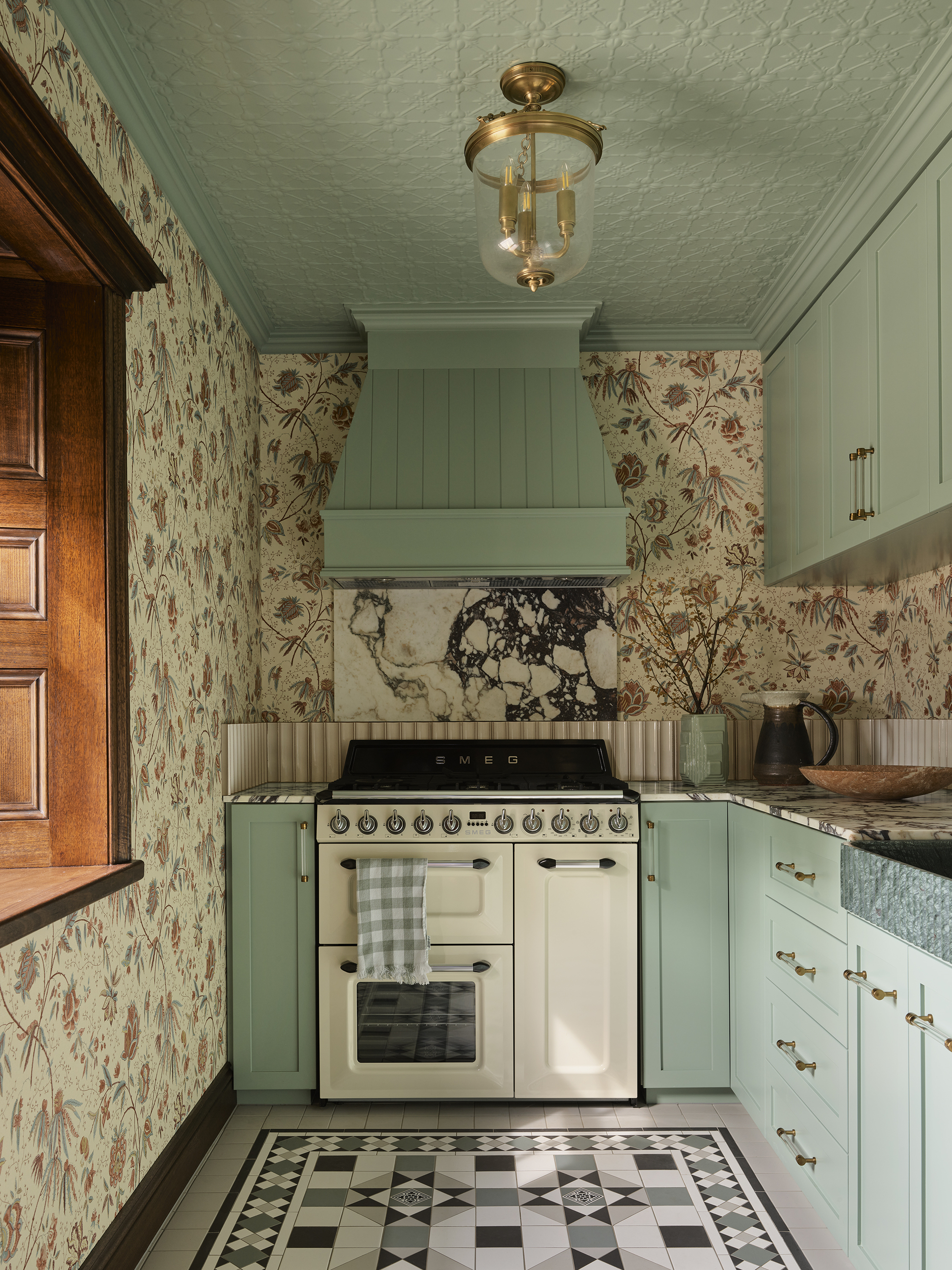
It might sound brave to mix mustard yellow, blue, and aubergine, but it’s scientific, says the designer of this Notting Hill project, who reimagined the kitchen using all three colors — plus black.
“These tones sit on different points of the color wheel, creating visual tension that feels dynamic but harmonious,” explains Romanos Brihi, co-founder of Studio Vero. “Importantly, they’re used thoughtfully across different surfaces, so no single color dominates.”
Mustard yellow cabinetry lays a warm foundation in this colorful kitchen idea due to its deeply saturated, earthy tone. “It feels optimistic and grounded,” says Romanos. Blue and aubergine — as seen in the Hanley Tube tiles by Balineum, French doors, and Sinclair Till checkerboard Linoleum floor — provide cool counterpoints.
“They’re richer and moodier, preventing the yellow from feeling too sweet or juvenile,” says Romanos. The black and bronze Rose Uniacke bar stools add structure and sophistication.
"This kitchen feels warm, expressive, and lived-in; it’s comfortable without being overly polished or 'showroom perfect',” says Romanos. “The mustard cabinets bring a sense of energy, while the blue and aubergine tiles add a handcrafted feel. It’s a kitchen that encourages connection, not just cooking.”
9 Make your hero color metallic
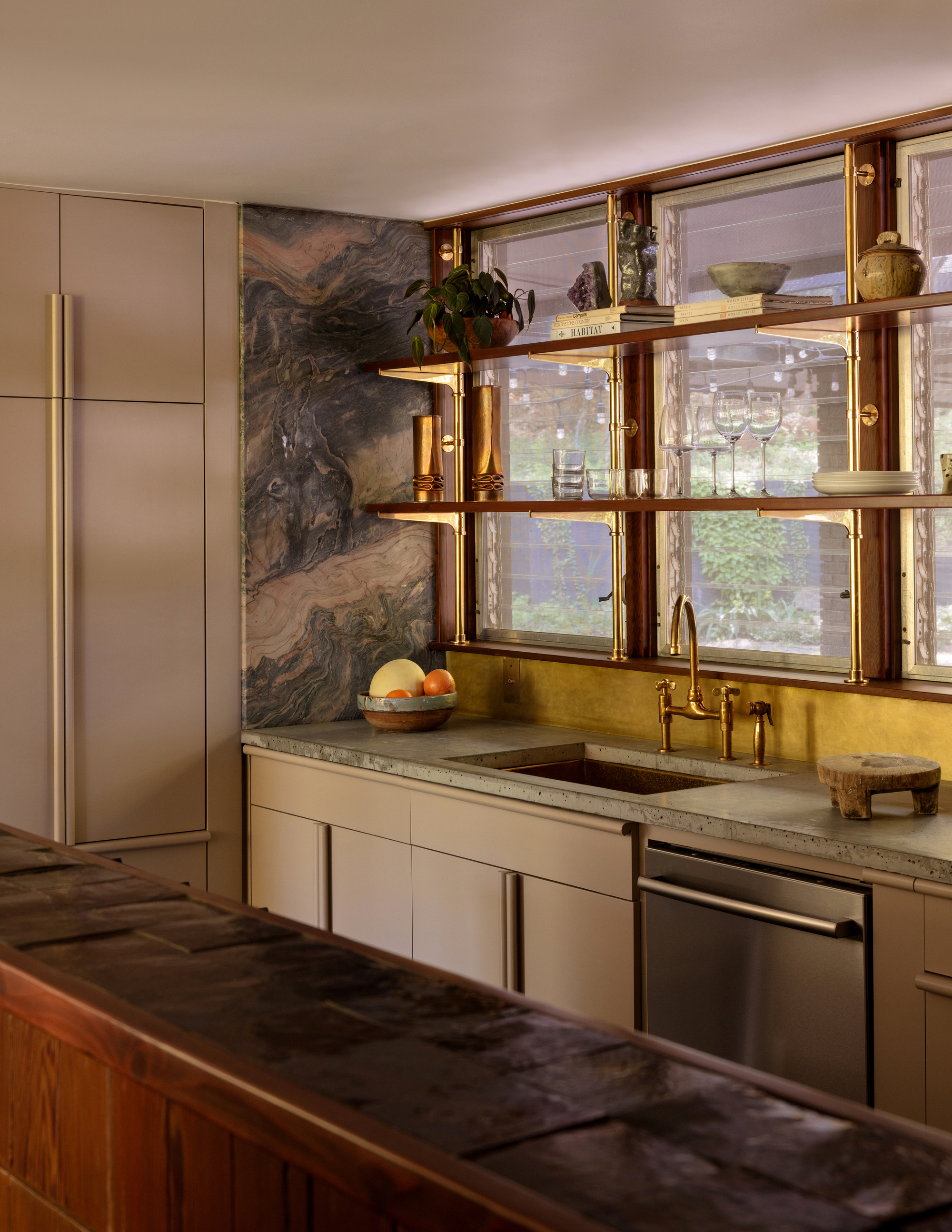
Meet West Studio founder Whitney Romanoff transformed this 1960s Fayetteville, Arkansas, bungalow into a cool Hollywood Hills-inspired home for a renowned creative director. And it demonstrates that metallics definitely count as color.
The kitchen is a heady mix of brass bistro shelving, an unlacquered brass backsplash, and brass tapware. Concrete countertops, crafted by the owner’s partner, offer neutrality so a piece of beautiful, honed quartzite, which reads more like artwork than kitchen surface, can shine. “We dreamed up the kitchen as a feminine jewel box,” muses Whitney.
The backdrop? A warm and creamy, pink-toned joinery (painted in Farrow & Ball Jitney). Providing a blink-and-you’ll-miss-it moment is a row of oxblood-colored Zellige tiles on top of the counter nib.
10. Be inspired by history, people and places
When Stefania Reynolds was redesigning her own apartment, she drew inspiration from her childhood spent in Greece. “I wanted something that would resonate, so I picked a peachy color from the bedroom I grew up in on Corfu,” recalls Stefania, head of interiors at Studio Johnston. “That color brings back so many memories. It felt right.”
It took time to zero-in on the perfect shade, though, since peach tones can shift dramatically according to light and surrounding materials. “We tested multiple paint swatches directly on the walls. The undertones were key — some leaned too pink, others were too orange or dull.”
Rounding out the colorful palette is an eggshell-colored Venetian plaster, walls painted in a subtle green, and the stripey legs of a custom dining table.
When curating a colorful kitchen scheme, consider the ‘60-30-10 rule’, offers Stefania: “Sixty percent of a dominant color (usually walls or large furniture), 30 percent is a secondary color (upholstery, rugs, curtains), and 10 percent is an accent color (decor, cushions, art). But don’t forget anchoring neutrals, which provide breathing room and prevent the space from feeling overwhelming.”
11. Look to Mother Nature, who’s never wrong
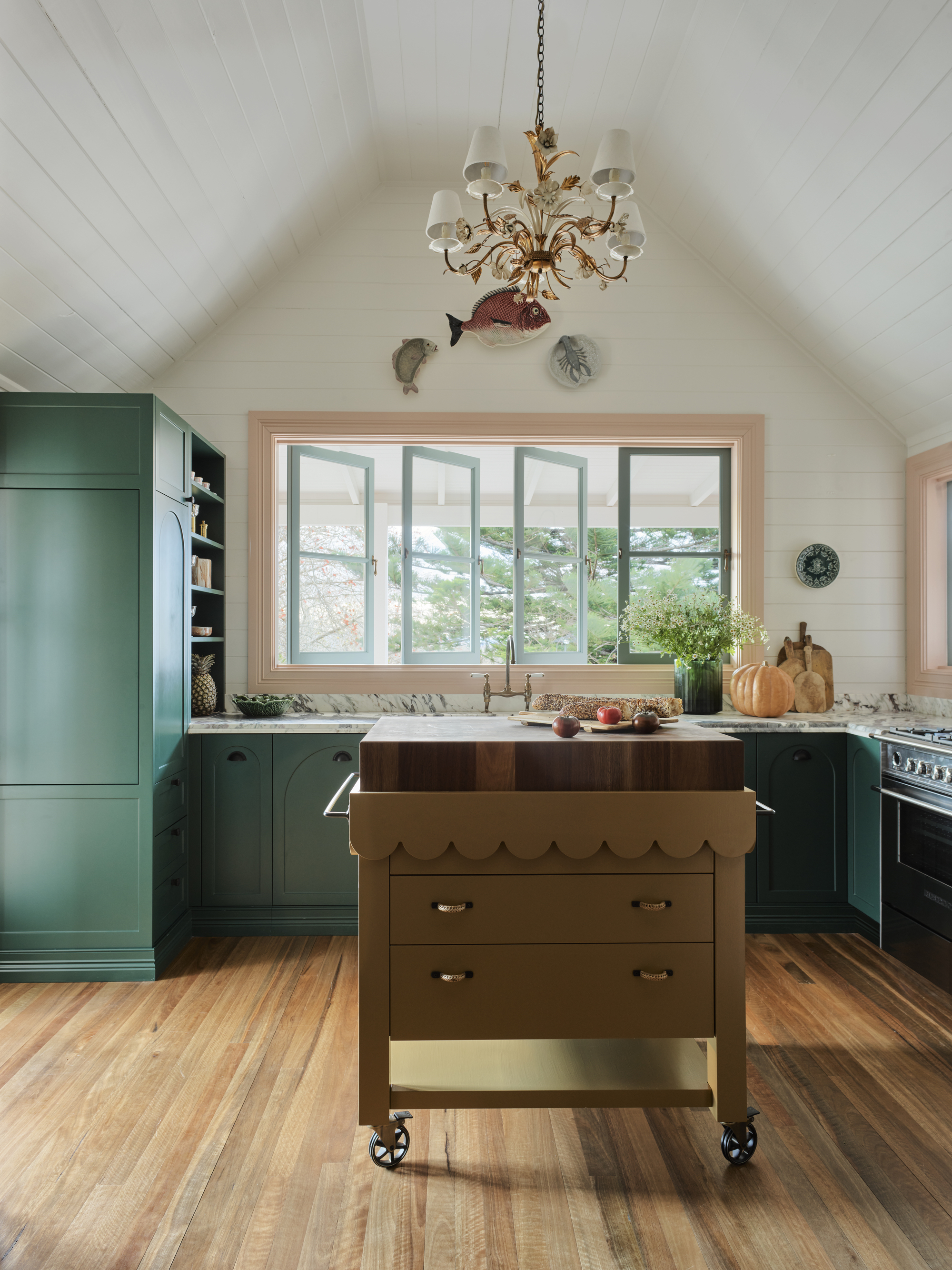
For interior designers and co-founders of Duet, Dominique Brammah and Shannon Shlom, nature and the immediate environment are always starting points when scheming up a color palette.
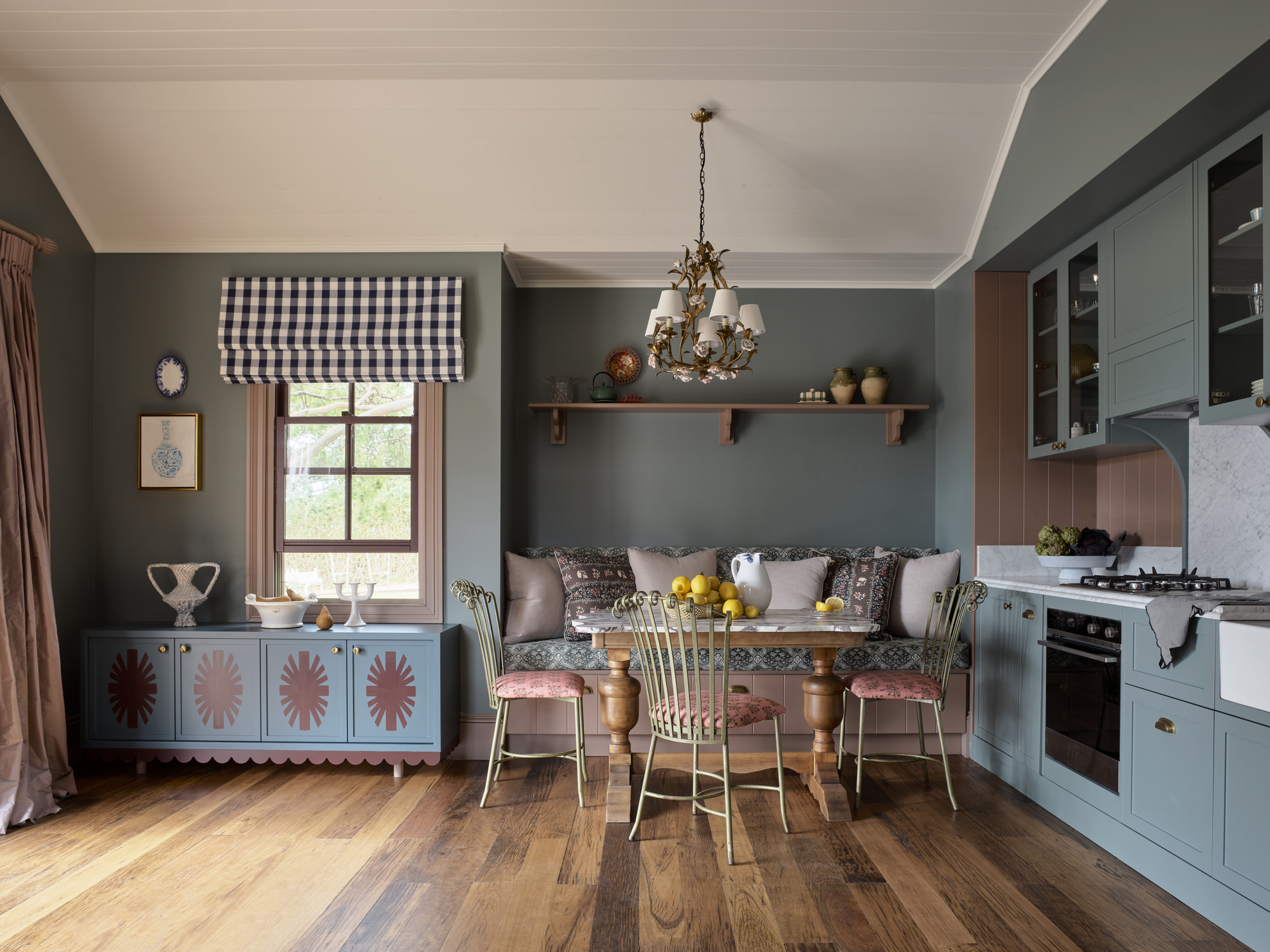
For their Greyleigh Homestead and Guest House project, on the New South Wales south coast, Dominique and Shannon incorporated eucalyptus greens and pebbly browns and pinks, as well as heritage-inspired maroon — in not one, but two, kitchens on the property.
In the homestead kitchen, joinery was painted in green, the butcher’s block was finished in a tan, the windows framed by soft white, and the window architraves were updated with a subtle pink. Four very different hues that live together harmoniously. “Kitchens have to be uplifting, dynamic, and joyful, and color is the easiest way to achieve this,” says Dominique.
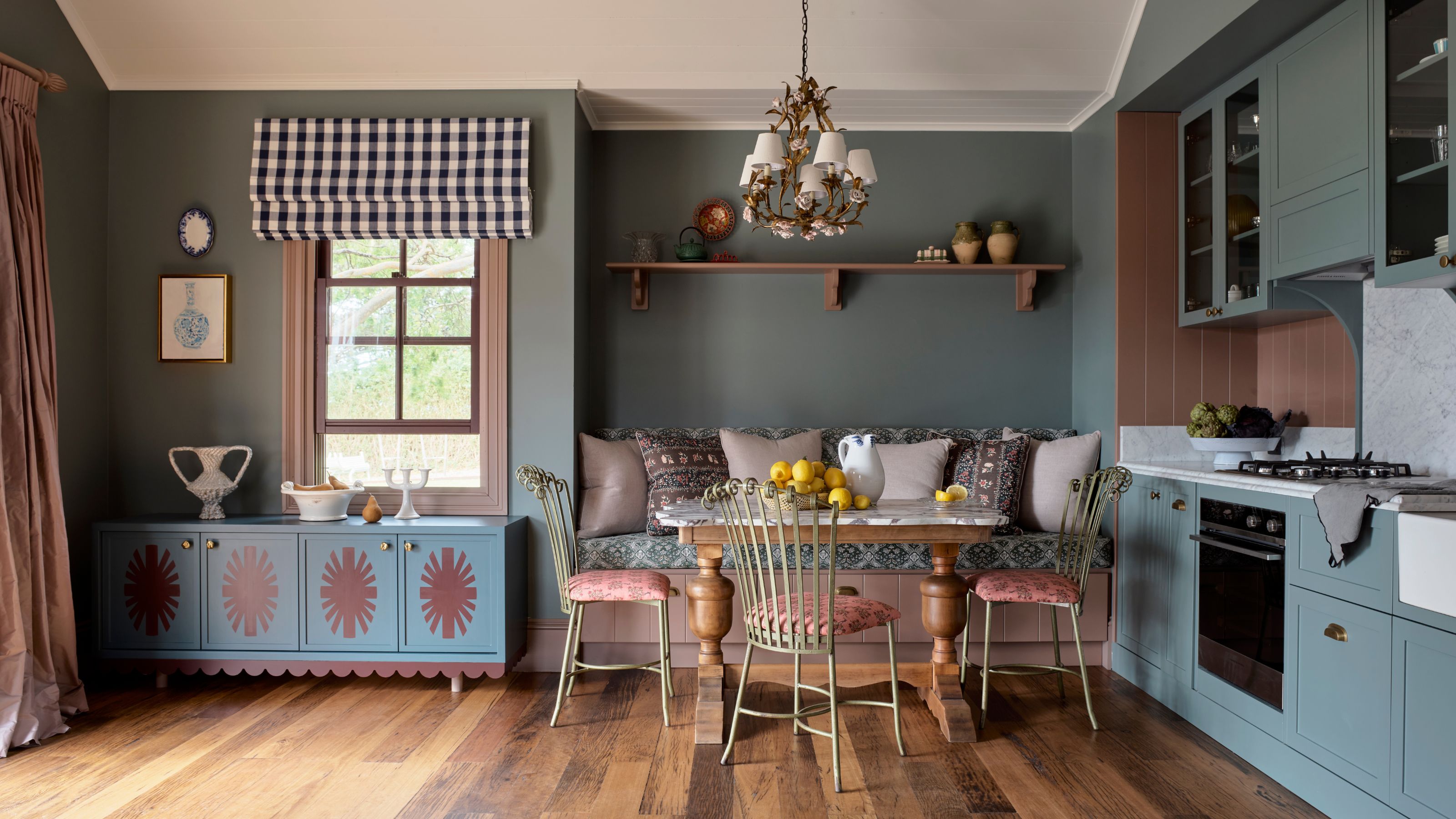
The compact guest kitchen, featuring murkier colors, punches well above its weight, thanks to a sweet custom buffet that solved a common problem. “The space was tight on storage, and had a low window, which meant it was challenging to source a piece of furniture,” explains Shannon. Enter, a custom buffet that was both commanding and whimsical, with a stencilled sunray motif drawn from the property’s original architectural fretwork.
FAQs
Does a colorful scheme work best in a big or small kitchen?
If you’re nervous about using bold hues in your colorful kitchen ideas, a smaller kitchen allows you to be playful with small features or moments, says Alex Raher, director and co-founder of Delve Architects.
Whether it’s big or small, Altus Design Studio principal Josie Simpson reckons colorful kitchen ideas should reflect the personality of its inhabitants. “It’s their home, and the colors should resonate with them first and foremost,” she explains.
That said, “In a smaller kitchen, a considered, nuanced palette can add incredible depth and character without overwhelming the space. In a large kitchen, you have more opportunity to play with multiple colors — introducing layers, contrast, and visual interest on a bigger scale.”
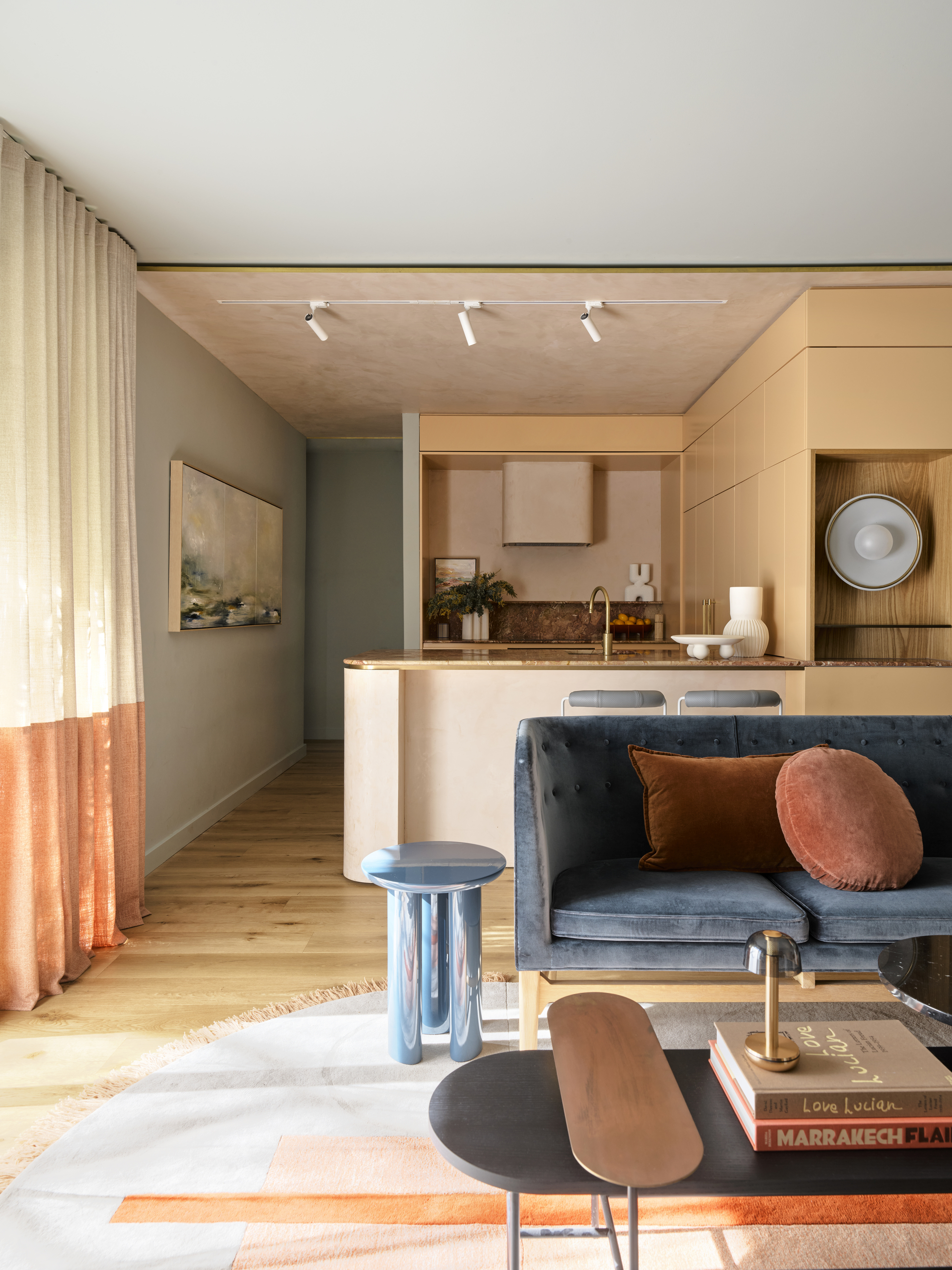
Still not sure where to start with your colorful kitchen ideas? Consider yellow, which is appearing in kitchens all over our Instagram feeds.
Whether it’s mellow butter, retro mustard, lively citrus or bold marigold, a sunshiny yellow kitchen idea could really transform your kitchen. It’s not that bananas.