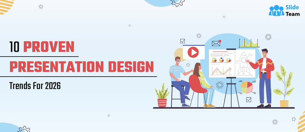
If there’s one thing we’ve learned over the last few years, it’s this: audiences have become far more selective about what holds their attention. In 2026, presentations aren’t just about looking “nice” anymore; they’re about being clear, human, and purposeful.
Based on how teams are actually designing and using slides today, here are 10 presentation design trends that are shaping 2026, not as hype, but as practical shifts you’ll want to pay attention to.
1. Clarity Over Complexity
Slides are becoming less complicated, which is a good thing.
Designers are removing unnecessary decorations and ensuring each presentation conveys a single clear message. White space, brief headlines, and planned images are doing the most work. The goal isn't to show off how complicated something is, but to make ideas like business operating plan easy to understand right away.
In 2026, being clear isn't about being simple for the sake of style; it's about respecting the audience's time.
2. AI as a Design Assistant, Not a Replacement
AI is now a big element of the presenting process, but most of the time it's in the background.
People are using tools that suggest layouts, organize material, or help build a deck as starting points, not as final answers. Many teams use AI-powered platforms (such as SlideTeam AI) to speed up initial drafts, then manually refine the story and visuals.
What did you learn? AI can help you get things done faster, but people still have to make decisions, tell stories, and see the big picture.
3. Bold Typography Takes Center Stage
Typography is no longer merely a way to support content; it is the content.
Modern slides feature large headlines, bold fonts, and high contrast. Designers are using words instead of icons or pictures to get people's attention.
If your headline doesn't seem well on its own, it probably has to be rewritten.
4. Data That Tells a Story
Slides with a lot of info aren't going away, but data dumping is.
Charts are made to show one main point in 2026. There are no more needless gridlines, the colors are planned, and the labels are clearer. It's a good idea to simplify the presentation if your audience requires you to tell them what to look at.
The finest data slides concisely answer one question.
5. Accessibility Is No Longer Optional
Accessible design has shifted from being a 'nice to have' to the norm.
High color contrast, legible font sizes, logical slide order, and clear hierarchy benefit everyone, not just accessibility users. Designers are paying attention to how slides look on smaller screens, including virtual settings.
If it’s difficult to read on a computer or phone screen, it’s probably not ready for 2026.
6. Soft Color Palettes With Purpose
While there is still a place for vibrant colors, there is a growing tendency towards less extreme color choices.
In presentations on topics like 10 Piece Puzzle soft colors, muted gradients, and comfortable neutrals may help prevent your eyes from getting tired, too, especially in long presentations to an audience. The emphasis is on mood and legibility, not visual clutter.
7. Subtle Depth and Layering
Flat design is still around, but it's changing.
Light shadows, layered cards, and soft depth cues are helping to keep things organized without making them look messy. These things give the slides structure and flow while keeping them clean and current.
The most important term here is "subtle." If you notice the change right away, it's probably too much.
8. Story-First Slide Structures
Presentations are made to look like stories, not lists of bullet points.
For PPT on detailed topics like Outreach Strategy Outreach Plan, introductions give background information, the middle parts develop tension or insight, and the conclusions make the point apparent. Even internal decks are getting better since they are based on stories.
More teams are starting with an outline or plot and then making slides around it. They typically try tools to organize their ideas before improving the visuals.
9. Modular and Reusable Slide Systems
Teams are focusing a lot on consistency these days.
Instead of building each presentation from the ground up, companies are using modular systems of slides to create reusable title pages, data displays, timelines, and summaries. This can be time-consuming and maintain the brand.
It also makes it easier to work together, especially if there are multiple users of that same deck.
10. Purposeful Motion (Less, But Better)
Animations are still done, but in a more planned fashion.
Designers are now using micro-interactions and micro-animations, rather than spectacular transitions, to attract attention and create relationships between objects. Motion works for the message, not against it.
If an animation does not clarify something, then it ought not to be included.
Final Thoughts
The presentation design in the year 2026 is not about trends for trend’s sake; it is about better communication.
Clear ideas, good thinking in the design of the visuals, easy-to-understand layouts, and good use of tools and technologies like AI that actually add value are the hallmarks of good presentations today. Pitching, teaching, or talking within the company: The better they understand you, the better the slides you have created.
And honestly, that's a trend worth sticking with.