The best car logos do a lot of work. Emblazoned on the front (and back) of what is one of the most expensive single purchases many people make, they're recognised all over the world and are often considered badges of pride, as well as signifying quality of design and engineering.
So what makes a good car logo? Some of the best car badges are so recognisable because we see them so often on the road and in adverts. But their success is also due to their design. Many have simple designs, which makes them easy to remember. But others have a surprising amount of detail, including details you might never have noticed, but they link the brand to concepts of tradition and excellence.
Below, we explore the stories behind 12 classic car logo designs. Many of these have stood the test of time, with only minor tweaks, while others have seen more significant redesigns over the years. See our pick of the best logos overall for more inspiration.
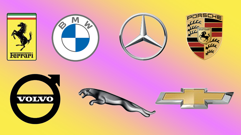
10 of the best car logos on the road today
01. BMW logo
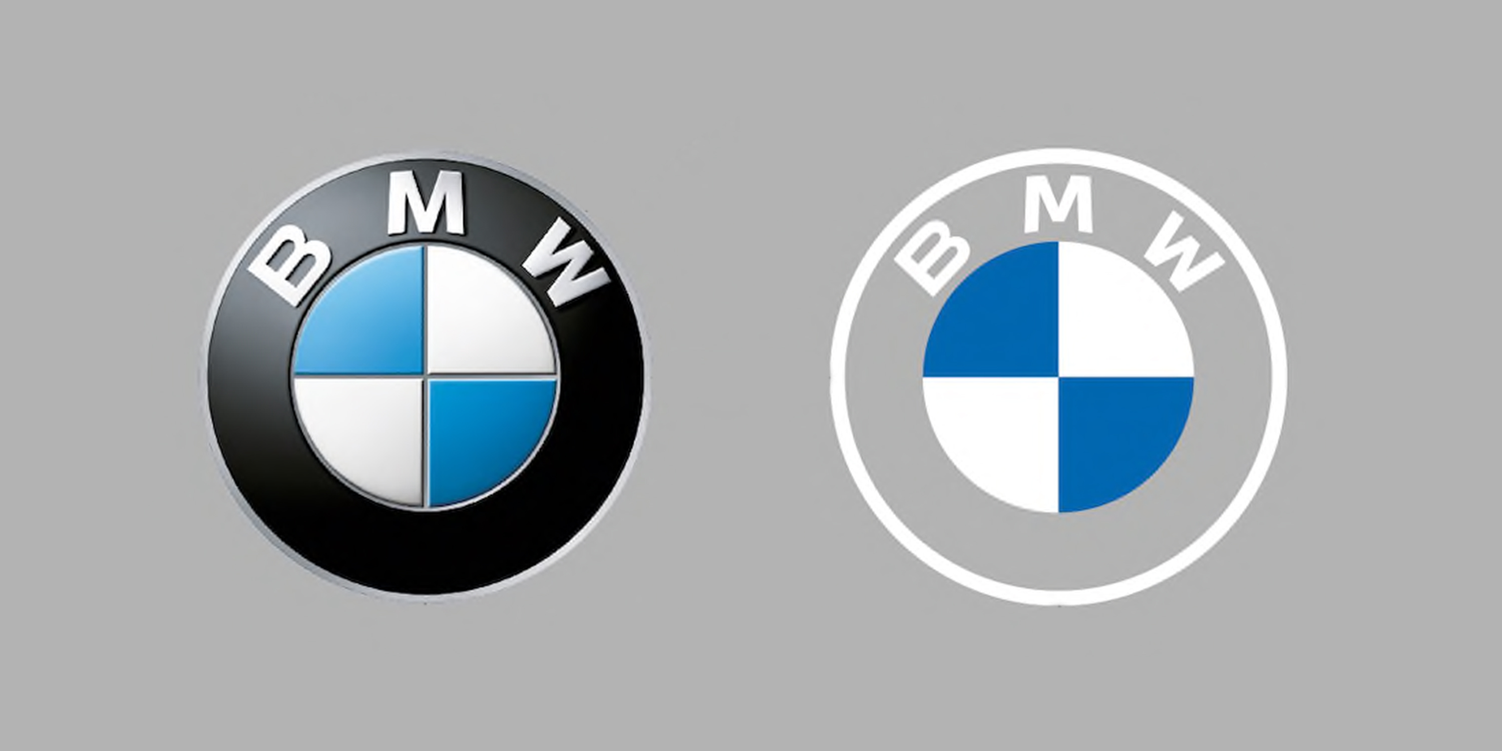
The BMW logo is simple and instantly recognisable, sporting the blue and white of the German company's home state of Bavaria. The current version, unveiled in March 2020, is a flat reimagining of the previously metallic emblem with the outer ring made completely transparent, and the 3D and lighting effects have been removed to create a minimal new look.
The clean, modern design initially drew some scepticism online, but it's been proven to work well in both physical applications as well as digital, earning a place in our pick of the best car logo redesigns. It adapts to new technology but acknowledges the brand's heritage.
02. Mercedes-Benz logo
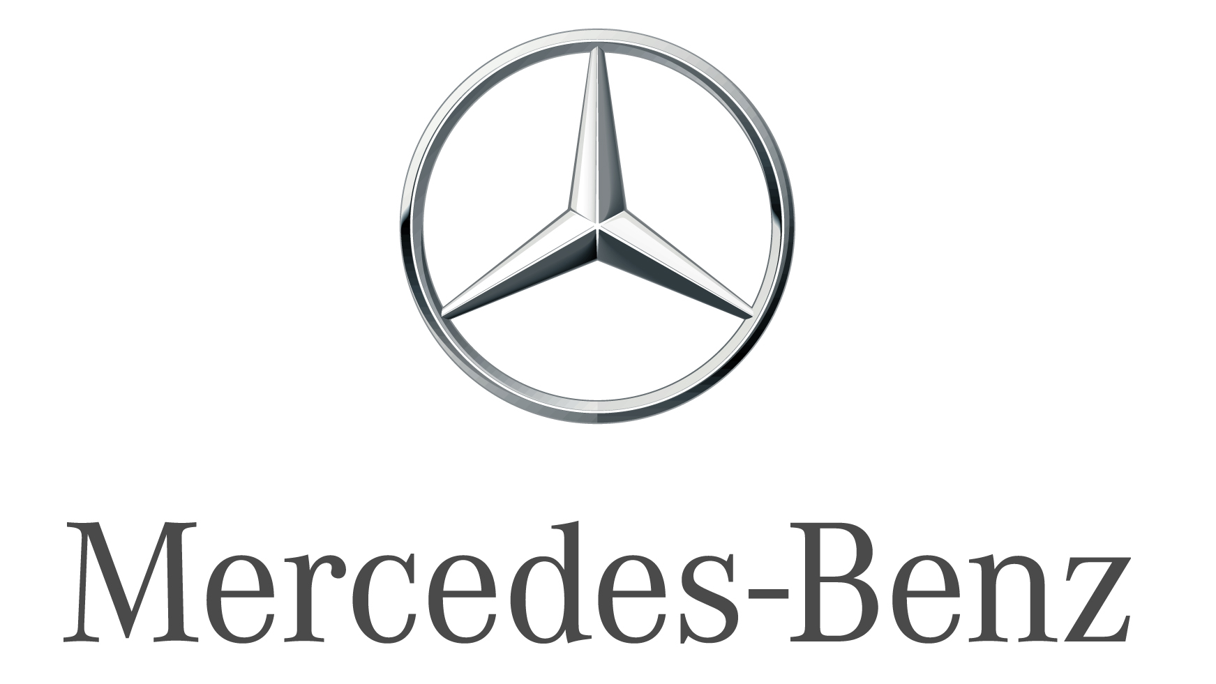
Mercedes-Benz's three-pointed star is another powerful statement of efficient German engineering and premium quality, but its roots are rather more charming. In 1872, Gottlieb Daimler, technical director of petrol engine manufacturer Deutz, drew a star above his house on a postcard of Cologne and sent it to his wife, vowing that one day the symbol would adorn his own factory.
Daimler-Motoren-Gesellschaft trademarked that three-pointed star as its logo in 1909. Following a merger in 1926, the company was renamed Mercedes-Benz and acquired the Benz laurel wreath, which became a simple ring in 1933. Mercedes-Benz doesn't just make cars, of course – and the three points are said to represent motorised dominance of the sea, air and land.
03. Ferrari logo

Enzo Ferrari first saw the prancing horse that would later adorn his sports cars on the side of a First World War fighter plane, flown by Italian pilot Count Francesco Baracca. Baracca's parents urged Ferrari to use the symbol as his logo to bring him luck, as they believed it had for their son. He did, when founding the Scuderia Ferrari racing team in 1929 – adding canary yellow to honour his home city of Modena.
If luck translates into profitability, it certainly paid off – nowadays, Ferrari-branded merchandise brings in almost as much cash as the cars. Count Baracca, however, was not so fortunate as he was later killed in action. As a mark of respect, Ferrari made the horse black – rather than red, as it was on the plane – to mourn the ace pilot that inspired the iconic logo.
04. Citroën logo
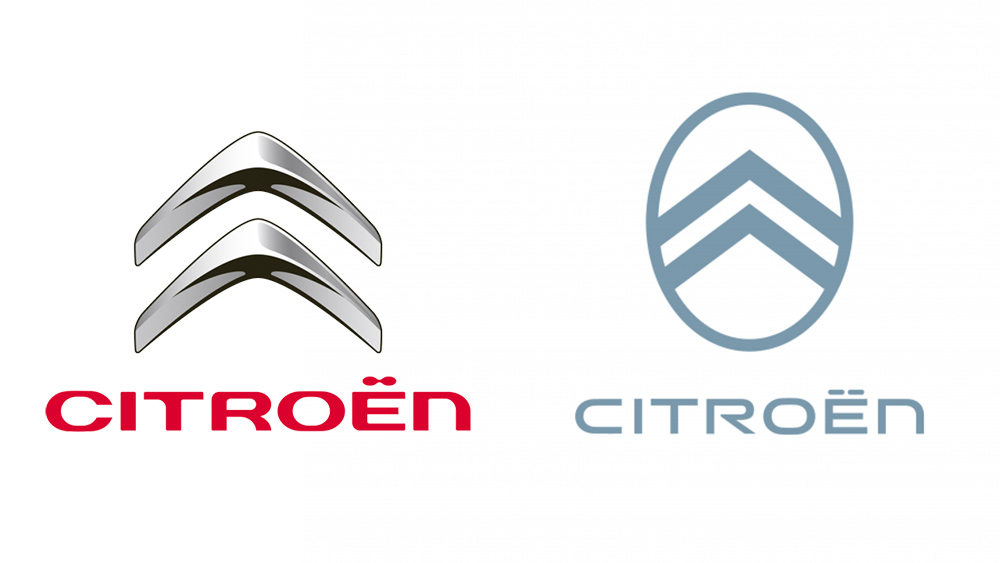
The latest version of the Citroën logo achieved a seeming contradiction in that it somehow looks both more modern and more traditional than the previous design. The company went back to its original logo from 1919, which had two chevrons inside an oval.
With a few tweaks and a more modern colour palette, the result is a logo that's both leaner and more in keeping with the brand's heritage. The chevron's themselves are said to have been inspired by the double herringbone-shaped Polish metal gear system of the early 20th century. Founder André Citroën discovered the system during a visit to his family in Poland and bought the patent to use it in France.
05. Cadillac logo
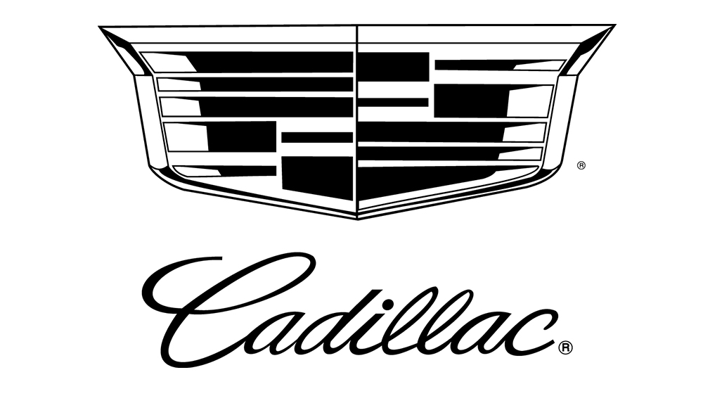
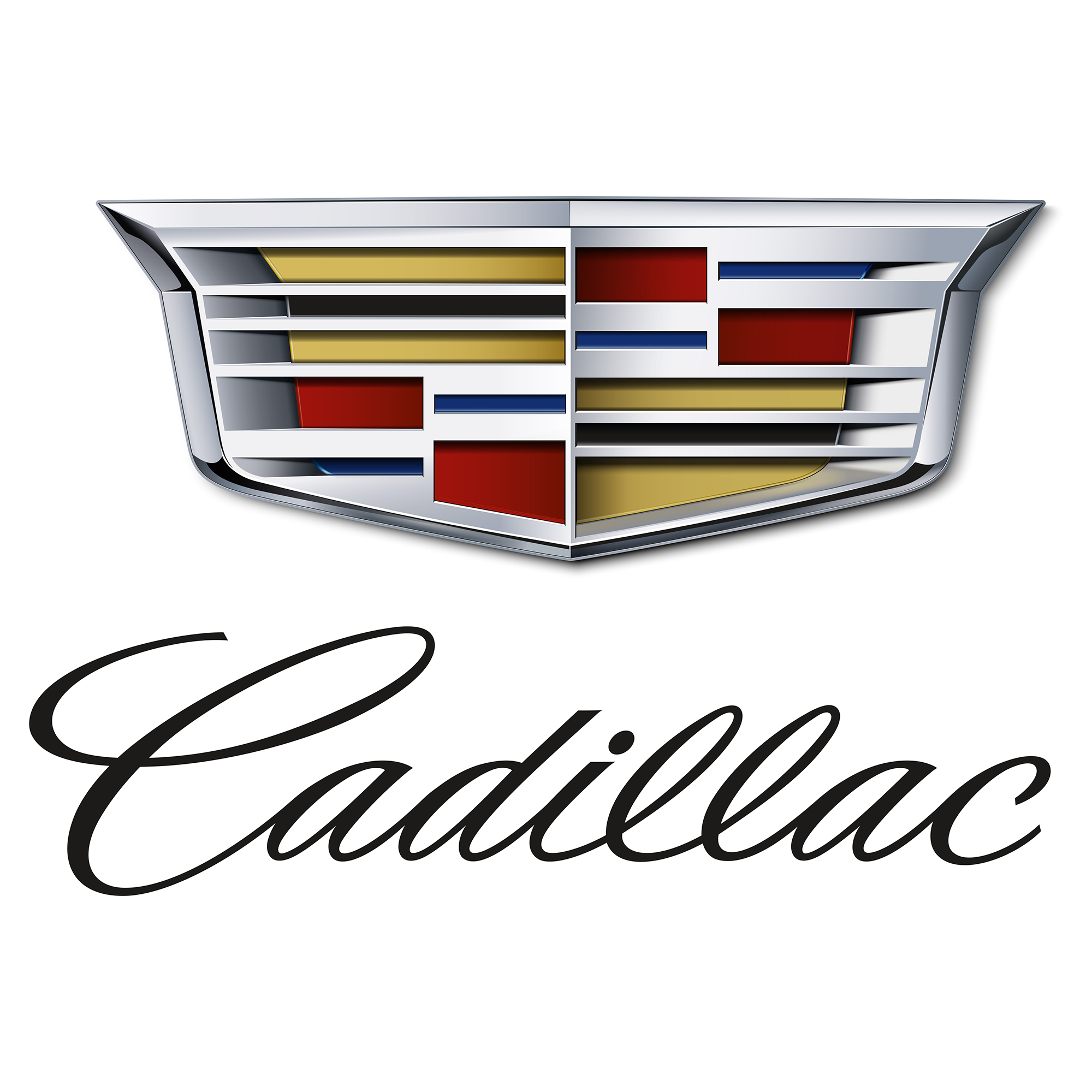
This one's a bit more controversial because some people think the Cadillac logo is way too chaotic, and the decision to drop its colours in favour of a black-and-white design has divided fans. But we think it deserves a place among the best car logos, because the fact that it's so unusual actually makes it work.
The story behind it is also bizarre. Many car logos were inspired by regional crests, and the Cadillac logo follows that trend in a way. Back in 1902, it decided to use the family crest of French explorer Antoine de la Mothe Cadillac, who founded the city of Detroit in 1701.
However, De la Mothe Cadillac's crest was entirely made up. Even his name wasn't real. He adopted it when he enlisted in the military at the age of 24 to give the illusion that he hailed from high society. When he arrived in the New World, no one could check his origins, so Cadillac assembled an invented coat of arms from various sources. He chose three coloured bands to represent boldness, virtue and valour.
The original design also incorporated a crown, a wreath and several merganser ducks. Those elements were reduced down over the years, but it's still one of the more complex car logo designs on the road.
06. Jaguar logo
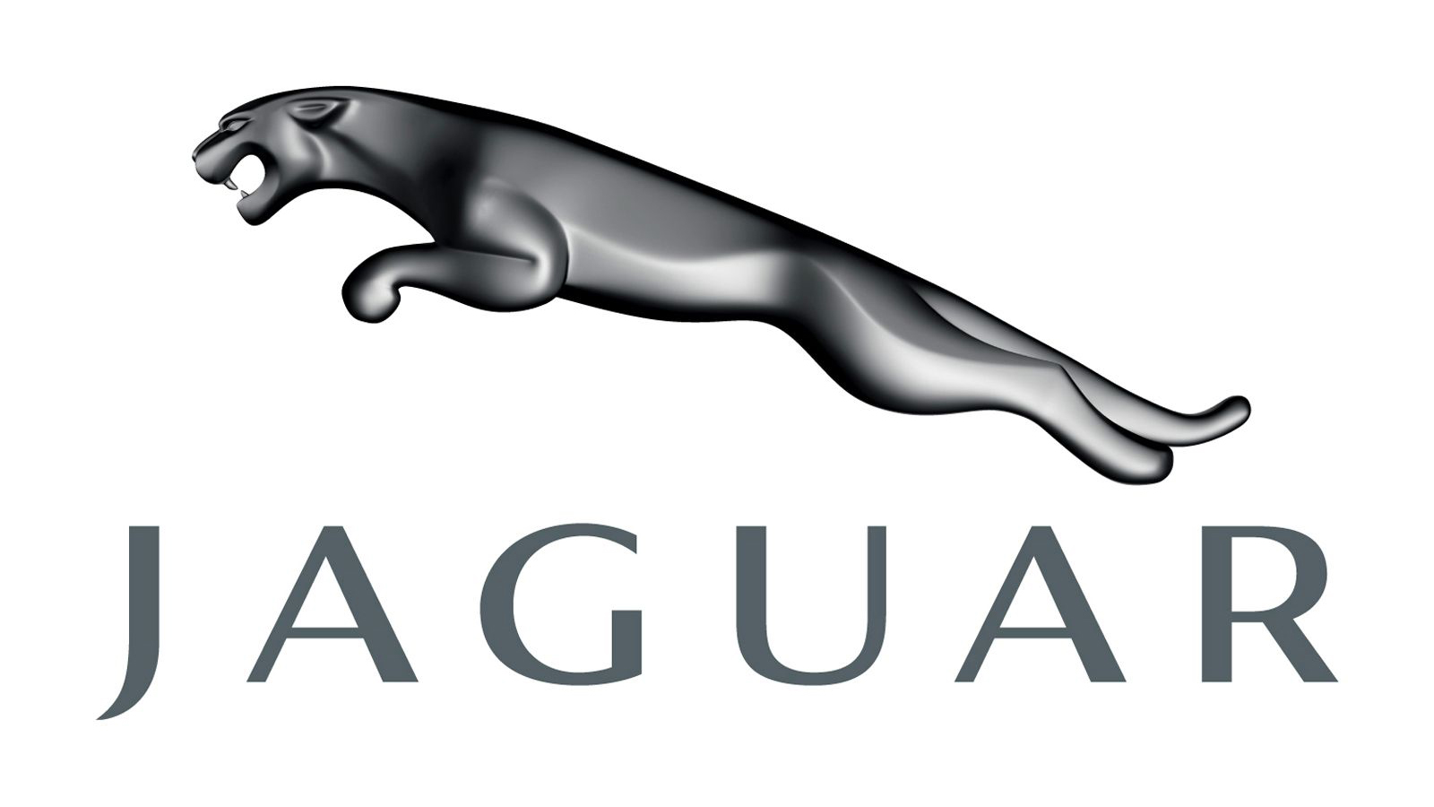
Symbolising speed, strength and power, the leaping jaguar is a hugely distinctive and highly energetic addition to our list of iconic car logos. It is usually depicted in simple yet refined colours such as black, metallic grey and gold – intended to represent elegance, integrity and high-performance, as well as class and sophistication.
A highly distinctive jaguar ornament use to be seen leaping from the hood/bonnet of classic Jaguar cars, but pedestrian safety regulations mean they are no longer permitted. The wild cat remains in the brand's logo, however, even after the rebranding of its parent company (see the JLR logo controversy).
07. Volvo logo
Swedish manufacturer Volvo is another carmaker that has chosen to flatten its logo, taking the shine out of its previous metallic design. Love or hate the new look, there's a fascinating tale behind the logo, and it's one steeped in mythology and ancient symbolism. The Volvo logo is the symbol of the Roman god Mars, long associated with war and weaponry, but it's also the alchemist symbol for iron and symbol of masculinity.
Volvo needed a badge that lived up to its reputation for safe, sturdy and reliable vehicles, and it adopted the circle with upward-pointing arrow in the 1920s. The name 'Volvo' itself means 'I roll' in Latin, although the association with wheeled vehicles is fortuitous because this actually refers to the company's original output: ball bearings.
08. Alfa Romeo logo
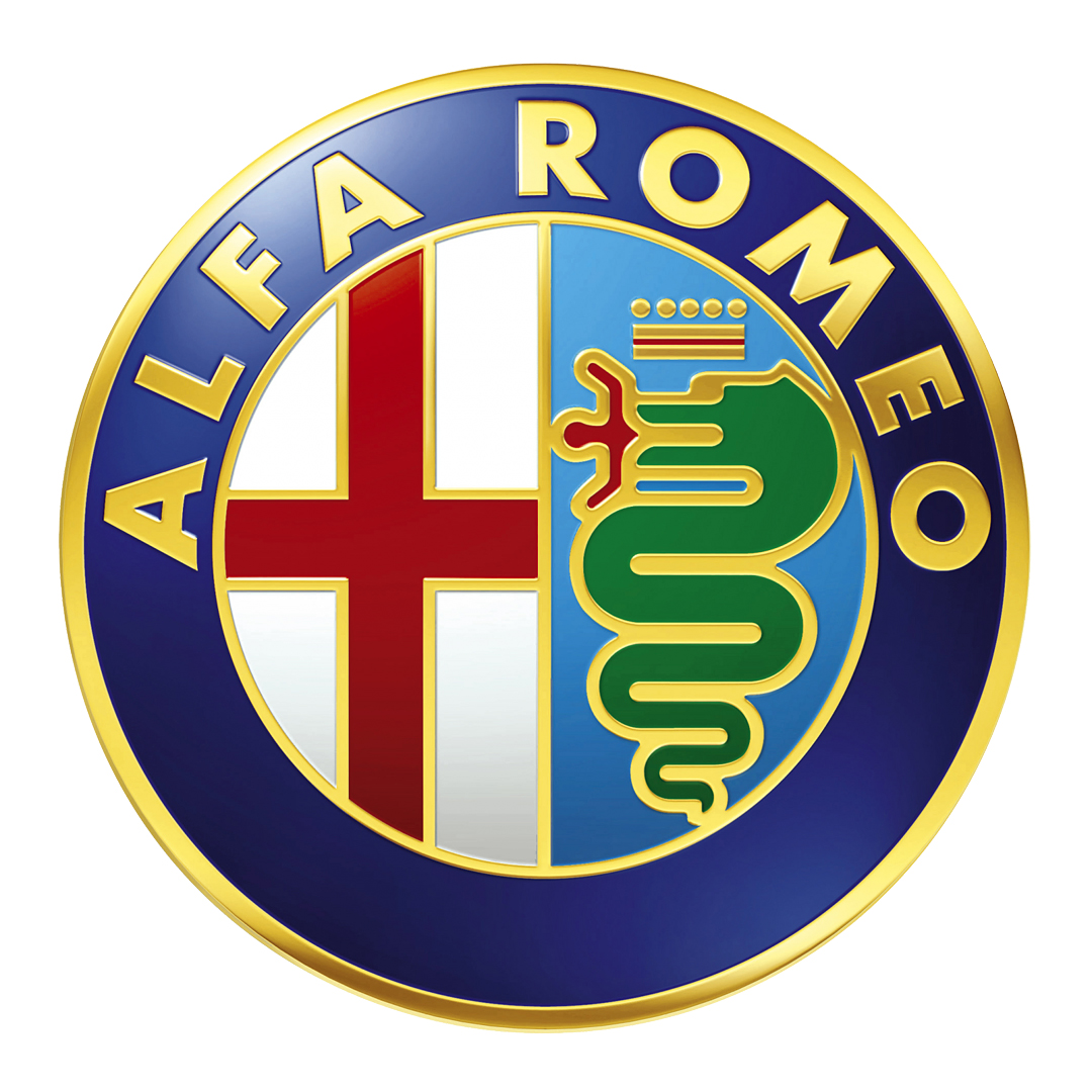
Even a quick glance at the Alfa Romeo logo is enough to tell us there's a decent story behind it, and you wouldn't be wrong. As we saw in our guide to the best logos with crowns, the red cross on the left-hand side is the symbol of Milan, home of the Italian car maker, and on the right is a man-eating snake.
Otone Visconti, a knight from the former ruling family of Milan who fought in the First Crusades, is said to have taken the symbol from the shield of a Saracen he defeated in battle. Alfa Romeo, however, claims that rather than being eaten, the man is in fact emerging from the snake, purified and renewed in a symbol of rebirth.
09. Chevrolet logo
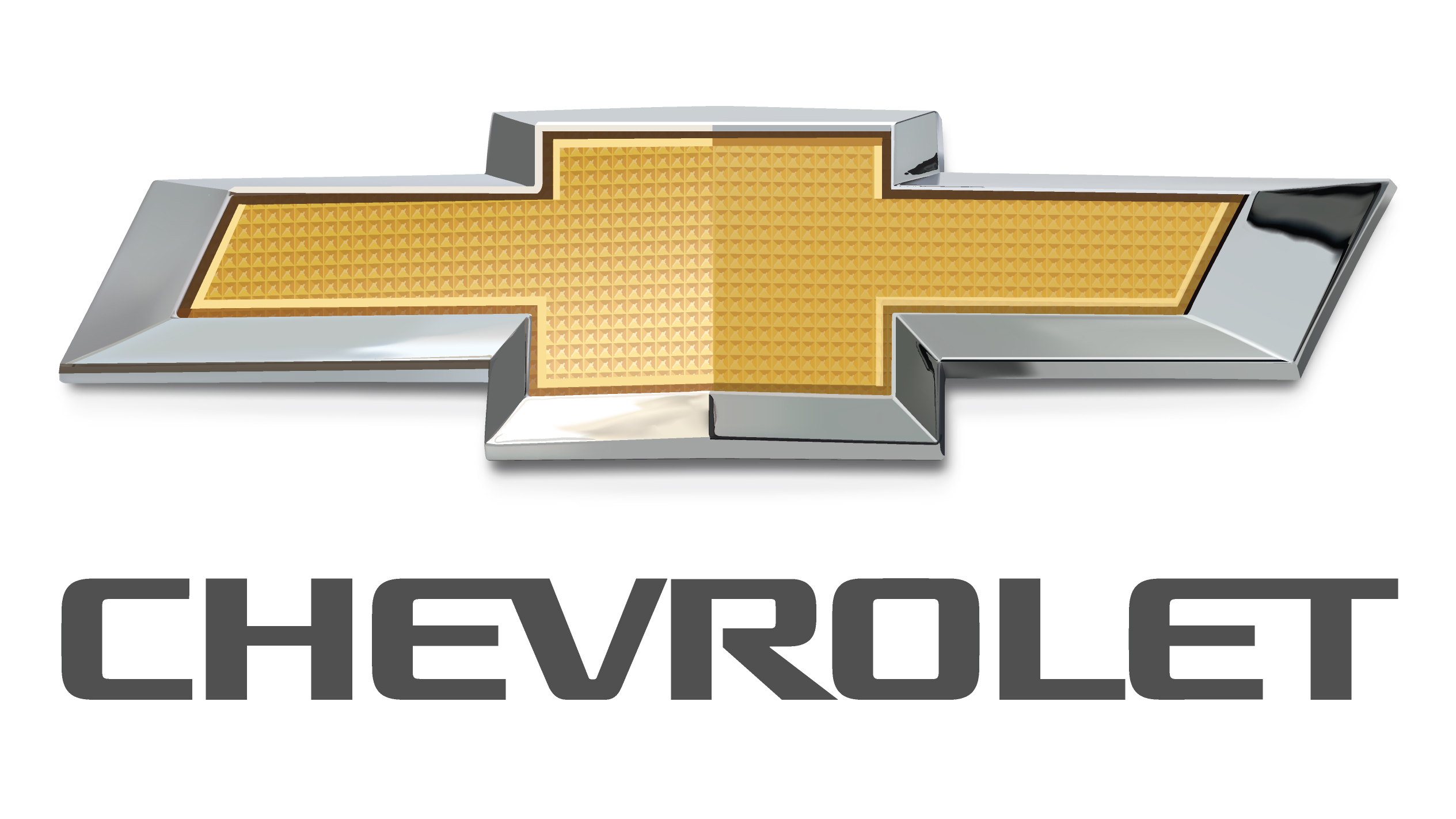
Sometimes the history behind the best car logos is a little cloudy, as is the case with the 'bowtie' marque adopted by American carmaker Chevrolet. There are three different versions of its origin story, from three different members of the family of company founder William C. Durant.
Durant himself claimed the design was inspired by wallpaper in a French hotel, and this version was upheld in Chevrolet's 50th-anniversary publication. According to his wife Catherine, a 1911 newspaper advertisement for 'Coalettes' fuel was the source of inspiration. Meanwhile, their daughter Margery, claimed Durant simply sketched out a nameplate design in a moment of inspiration "in between the soup and the fried chicken" one evening.
Chevrolet itself acknowledges the uncertainty, with its 100th-anniversary publication stating that logo's true origin is unknown.
10. Aston Martin logo
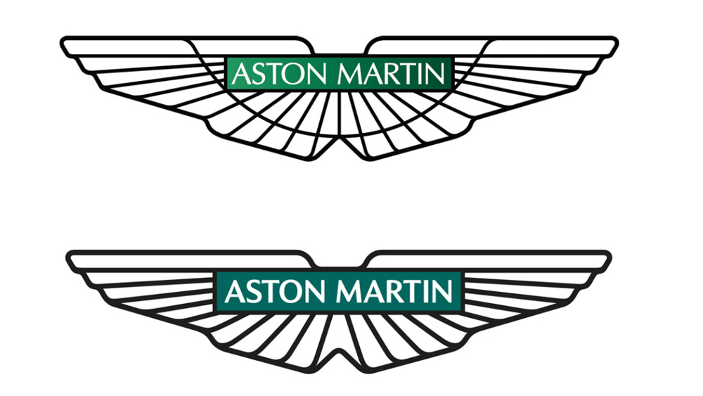
Last on our list of the best car logos is Britain's Aston Martin. Sleek and elegant, the Aston Martin logo was reworked by Peter Saville in 2022 to slim it down. Saville replaced the gradient background with a solid racing green and ditched the fussy semi-circular line on the wings, which seemed no longer necessary. It was a relatively subtle transformation but it made the logo look more modern while avoiding a design that feels flat and lifeless. This one also got a mention in our piece on the good, the bad and the ugly of car logo rebrands and our round up of subtle logo changes that made a big difference.
11. The Porsche logo
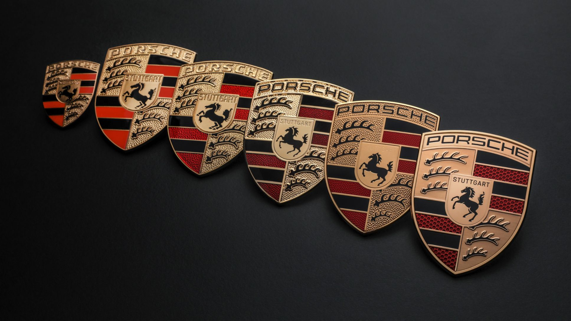
like many of the best car logos of its era, the Porsche logo carries significant influence from local heraldic crests and coats of arms – in this case a black horse from the coat of arms of the German city of Stuttgart and the crest of the former Free People's State of Württemberg. That contrasts with the more modern and industrial feel of the squared typeface.
The heraldic elements were intended to symbolise Porsche's commitment to manufacturing in Zuffenhausen. But their continued use today help to connect Porsche to notions of enduring tradition and a long historical legacy. They also contribute to its position as a high-end brand.
12. The Skoda logo

The Škoda logo came in for a sleek redesign in 2022, and we think the design deserves more credit. It's simple and recognisable but also quite distinctive among car logo designs. It also shows that while a logo needs to memorable, we don't necessarily need to understand what it's supposed to be. We also assumed this car logo was a cross between a bird and an arrow, but apparently the Škoda logo was inspired native American feather headdress. There's no obvious connection between native American attire and Czech automobiles, but it worked.
What is the most memorable car logo design?
Interestingly, several pieces of research have attempted to test how memorable car logos are. In one survey, participants were shown the real logos of eight major car brands along with slightly doctored versions. Their challenge was to choose which was official design. In this study, the BMW logo did best, with 50% of participants choosing the right one.
Another survey tried to test memorability by asking people to draw car logos from memory, with some amusing results. In this case people appeared to recall the Audi logo with most accuracy.
What makes a good car logo design?
Generally, we think a good car logo design meets the same criteria as good logo design in general: simple, distinct, easy to recognise and interpret and easy to apply in different placement (see our guide to how to design a logo). But there are some great car logos that seem to break some of the usual rules. Some of the older car logos were made without consciously taking modern logo design principles into consideration, and they have unusually busy designs.
It's unlikely that a new car manufacturer today would create a logo featuring a snake eating a man (Alfa Romeo) or with a many complex lines as the Cadillac logo. But these logos have become iconic partly because of the success of the wider branding around them.
Why do car makers redesign their logos?
Car manufacturers redesign their logos for several reasons, from changes in technology to fashion. In the 1980s and 2000s, many car brands had logos with 3D-looking effects on them. This looked contemporary at the time but started to look dated as trends shifted towards flat 2D design. There was also a practical reason for this: simple 2D logos are clearer and more readable in small placements, for example as mobile app icons, on in-car entertainment systems or as a favicons.
Which car company has changed their logo?
In the past decade, there have been a lot of car logo redesigns. In fact, almost all major car companies have changed their logos to some extent. For some carmarkers, the logo design was fairly drastic. For example, the new Kia logo is unrecognisble from the previous brand identity.
Other car logo redesigns focused mainly on simplification and making the logo flatter. Notable examples include the BMW logo and Mazda logo. Some car logo redesigns, like that of the Ford logo and the Porsche logo were so subtle that you might not even have noticed them.