It's part of the job of interior designers to be constantly attuned to the finer details. Other people's homes are always subject to the closest inspection, and those small elements that might go unnoticed by everyday guests will scream out to those in the world of interiors.
But what are the common mistakes that are constantly getting noticed time and time again? From trim paint to how we're laying our rugs, to the placement of the TV, I've spoken to a selection of interior designers to find out what the common errors are in the living room, so we can make sure we're avoiding them in our own homes.
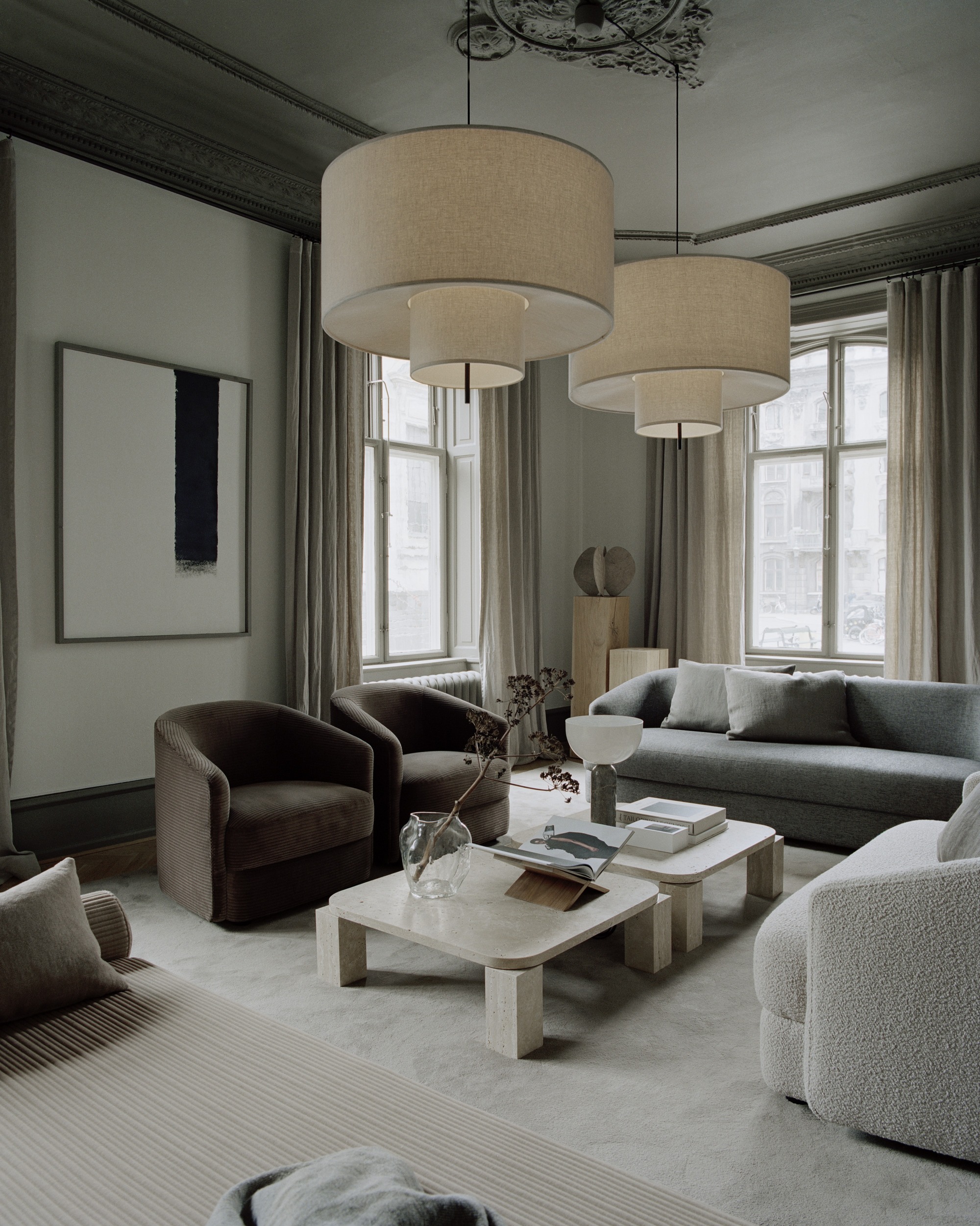
1. Bad lighting
Everything comes down to living room lighting, it can help create an atmosphere, enhance a mood, and accentuate your furniture in a flattering light. A good living room lighting design is a combination of ambient, task, and accent lighting; which essentially means a mix of ceiling, table, and floor lights.
'Multiply the sources of light,' insists Florence Charron principal of Indee Design. 'Ceiling light, floor lamp, indirect lighting, accent lamps, mix in every type of light source.'
'Without adequate lighting in your living room, it can feel uninviting and cramped,' agrees Kristin Marino, founder of KozyKasa.
It's also about the warmth of the bulb. A bright white spotlight can feel like an airport runway and can create a harshness that won't help you relax. 'Above all choose the color of light - not too white but not too yellow, find the right balance,' says Florence. 2700k creates a soft, warm light, and makes a great choice for living rooms where you would want to feel relaxed.
'Finally, you must always have the possibility of placing the lights on a dimmer.' says Florence. Depending on the time and the light, different scenarios can be created. The lighting in a project makes all the difference. And we feel much better, so we stay longer in space.'
2. Using rugs that are too small

Another common mistake that designers see in living room design is choosing an area rug that's too small.
'This can make the room appear smaller than it is,' says Emily Brown of Emily Lauren Interiors. 'To avoid this, make sure the living room rug is at least six inches wider than your sofa on each side and at least two legs of your furniture can sit on it. If possible, consider a larger rug to accommodate all four furniture legs.'
Area rugs that are too small are also big bugbear for Lauren Sullivan of Well x Design too. 'Bigger is often better when it comes to area rugs—and especially in the living room,' she says.
'A rug that is too small will make your space feel smaller than it is in reality. Make sure the rug is large enough to fully accommodate all legs of the furniture. If this isn't possible, the front legs of sofas and chairs should sit on the rug at the very least.
Layering rugs is a great solution if you have a smaller rug that you want to use in a larger space like the living room.'
3. Getting drapery wrong
Living room window treatment mishaps can make a living room look smaller, but the right approach can drastically elevate your space.
The trickiest part of installing curtains is getting the placement of the rod right – something that can instill fear in even the most adept DIY-er. It’s a slightly different measuring process based on the style of the window and the height of your ceiling, but get the basics right and you can adapt it accordingly.
As a general guideline for how high to hang a curtain rod, use a steel tape measurer, and place your rod 2-6 inches above the window: consider positioning the pole as high as possible to maximize the sense of height.
'For the width, extend the rod or track at least 8" beyond the trim to broaden your windows,' says Emily. This will make sure the room will benefit from maximum natural light and views, with the curtains “stacking” away from the glass when open.
'Drapery is crucial, so if drapery isn't an option, opt for Roman or bamboo shades to bring warmth and depth to your living room instead of blinds.'
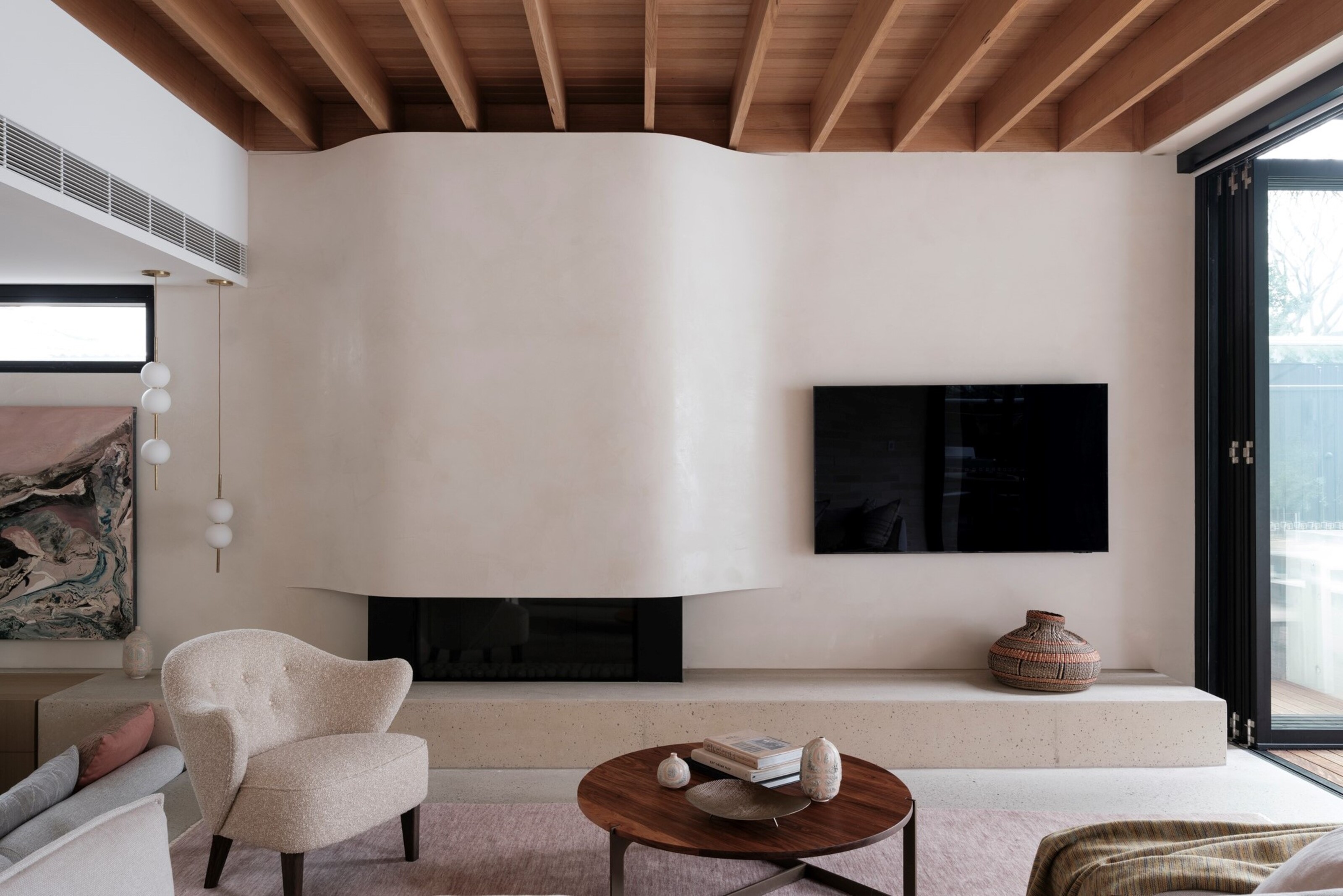
4. Creating a space that is too TV-focused
Every room needs a focal point, but many interior designers agree that it shouldn't be the TV. 'It's a common error that there is too much focus on the TV as an activity,' says Karolina Kulis of Studio Kulis.
Think about keeping it off center, not above a chimney breast or fireplace and reserve this area for something more reflective of your character - an ornate overmantel that sits on your mantelpiece and combines with a mirror to reflect the room; a piece of wall art that you love and reflects the colors of the space - anything but the TV.
TVs look best when they are off center, to the left or right of a breast, and lower down the wall, sat on a TV table. You might even want a custom media cabinet with doors that shut the TV away, or there are other great ways to hide your tv around the living room.
Ultimately, it's a large piece of tech equipment that will never look beautiful and in line with the decor and palette of your room - so try and avert the eye as much as possible.
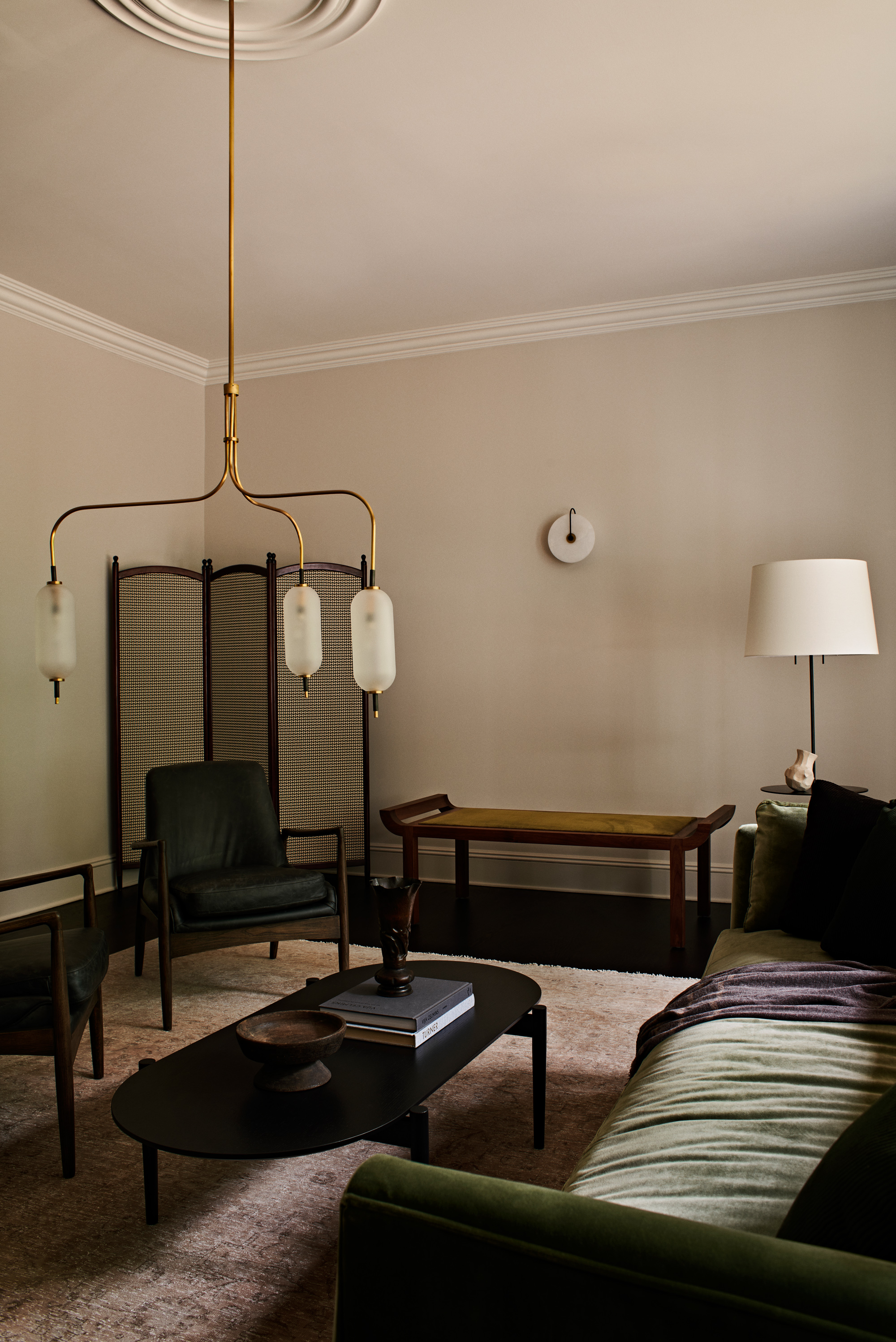
5. Not including enough texture
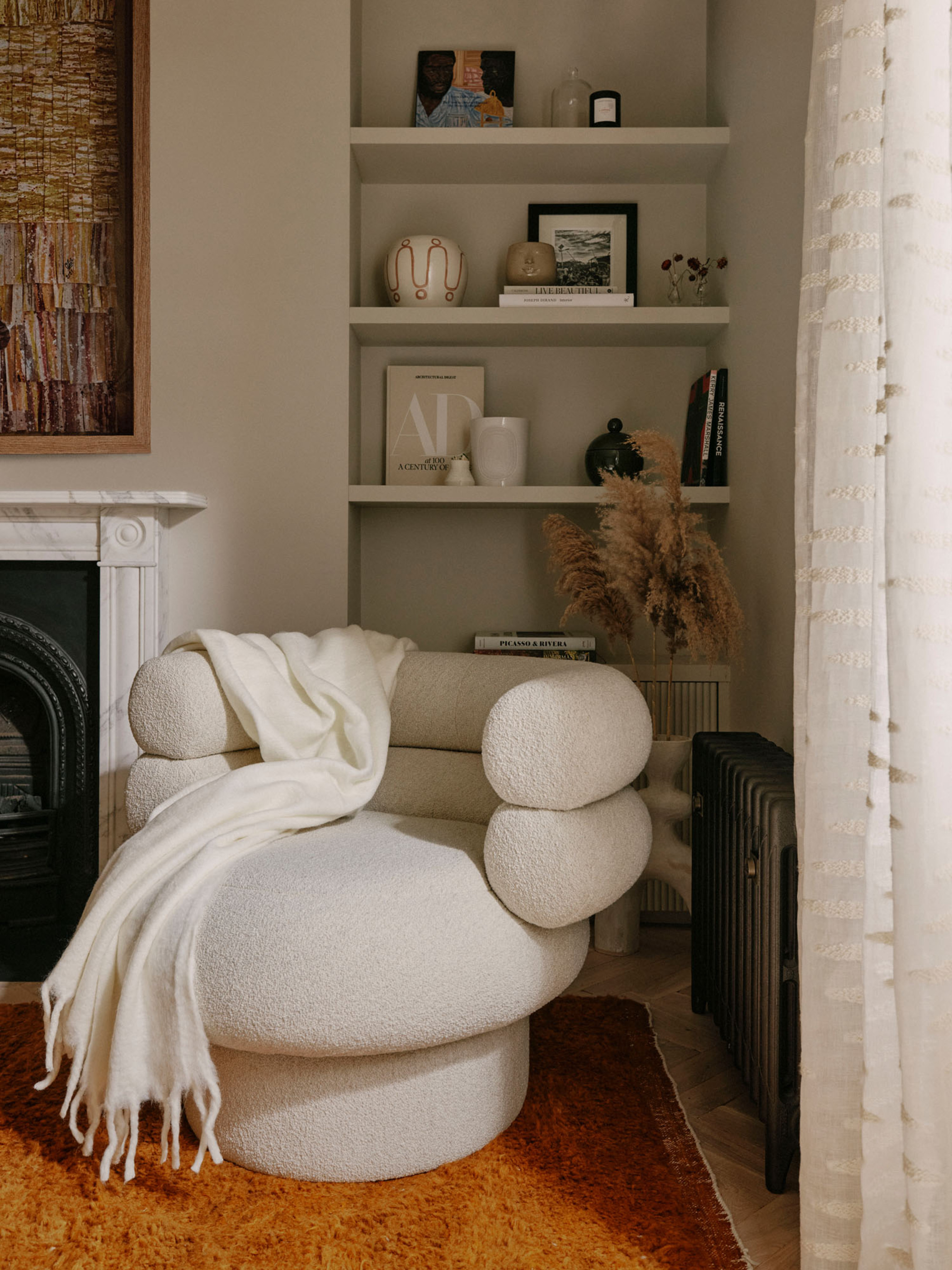
A living room that is lacking texture can end up looking flat, uncomfortable, and unwelcoming. We want our living rooms to feel cozy, so introduce the right amount of texture, but no more than 10 differing textures - urges designer Kelly Hoppen.
'Think about it, you have floors, wood, marble, carpet, you've got walls - paint wallpaper, then you've got sofas and chairs so there are more fabrics there. You've got art, you've got accessories - it could be glass, stone wood, silver it could be a decorative tissue box.'
When we introduce more than 10 textures is when a living room starts to feel overwhelming. 'If you counted how many textures you have in one room it's probably 30, so I would say choose 10 textures in one room. It will make your life so much easier.'
'Soft furnishings are the soul of a room,' says Danielle Thurston of SJS Interiors. 'Without these details the living room feels unfinished.'
6. Underestimating the importance of trim
Your trim, crown molding, skirting boards and doors all have so much potential and there is no rule that says they must be white. Unlock their potential by having fun with different colors, shades that are tonally up or down from the wall, picking out a color to help you really establish a color scheme.
f you're wondering whether you should paint your trim white, Kelly discourages you from doing so. While this can look clean and bring a classical feel to the space, painting all the same color really rejuvenates the space.
'People always ask me whether they should paint the walls, skirting boards, doors, architraves, and ceilings in two colors or the same. I think always paint in the same, it's really old fashioned to pick things out in white, especially in small spaces, if you paint it all one color - and I mean neutral color - it will give you the illusion of space, height and everything will flow.'
'Think about a corridor, lots of doors architraves, skirting if you start picking things in different colors, it's going to hurt your brain.
'You want to walk in and everything feel seamless and that's why it should always be in the same color.'
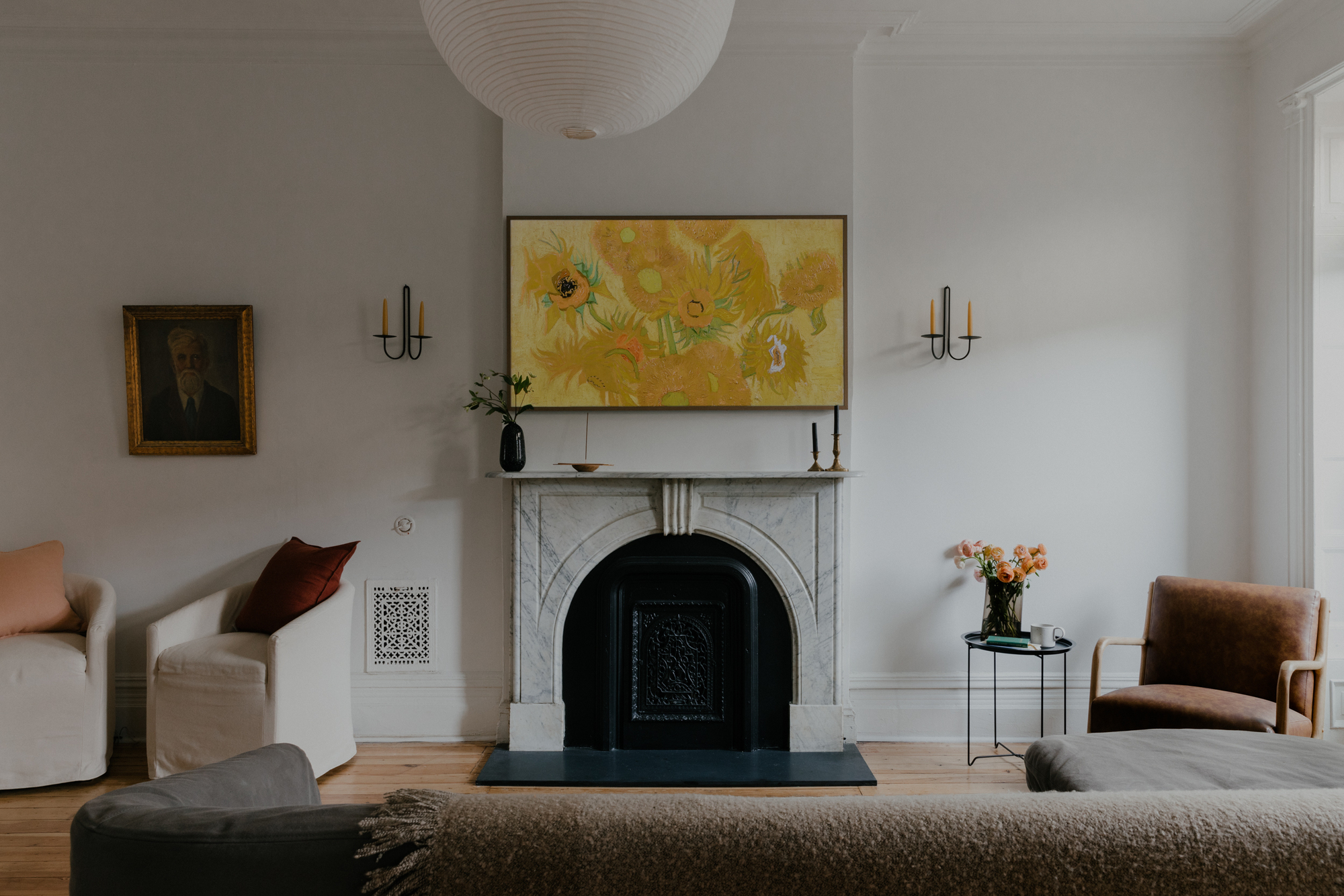
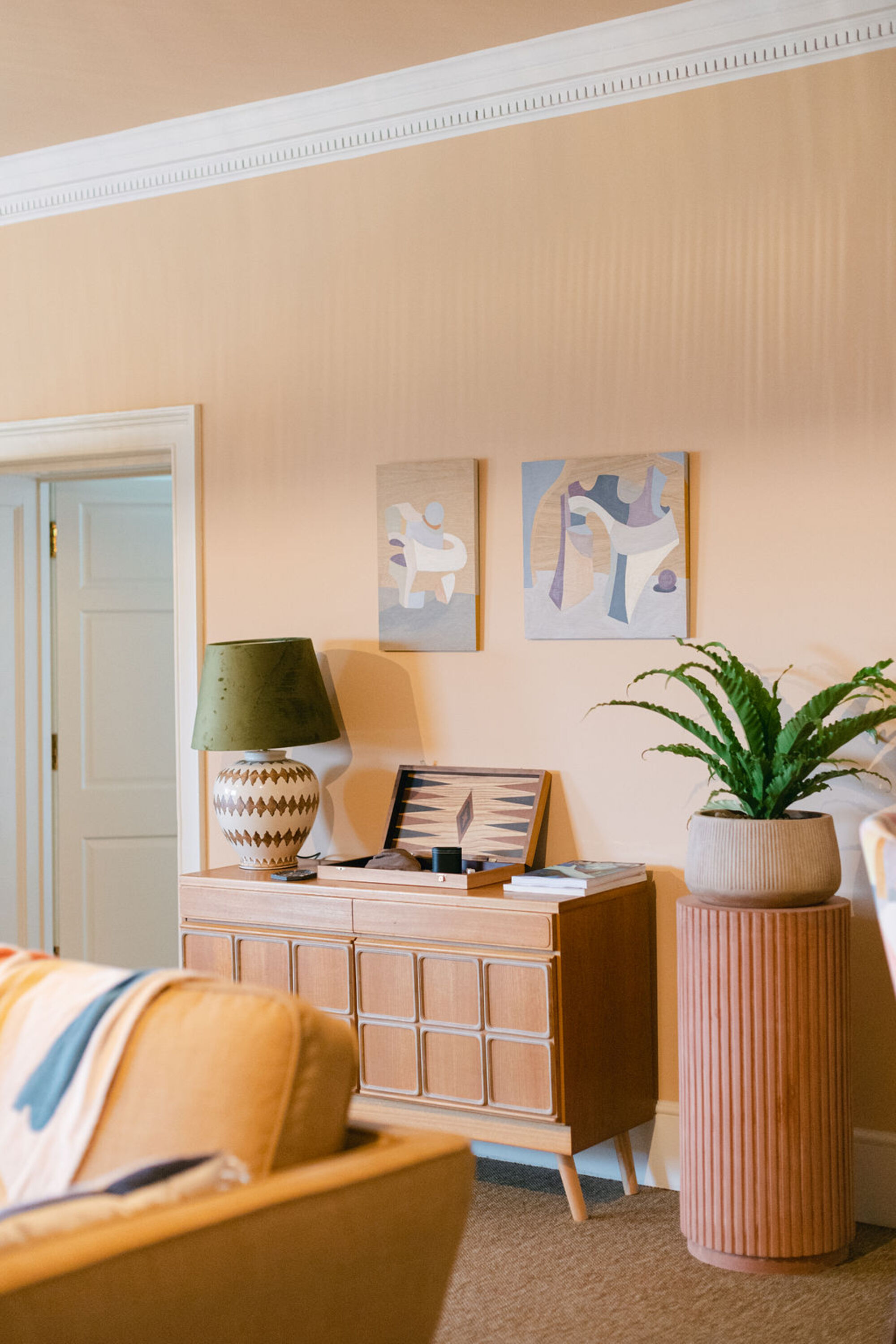
7. Choosing wall art that doesn't adhere to a color scheme
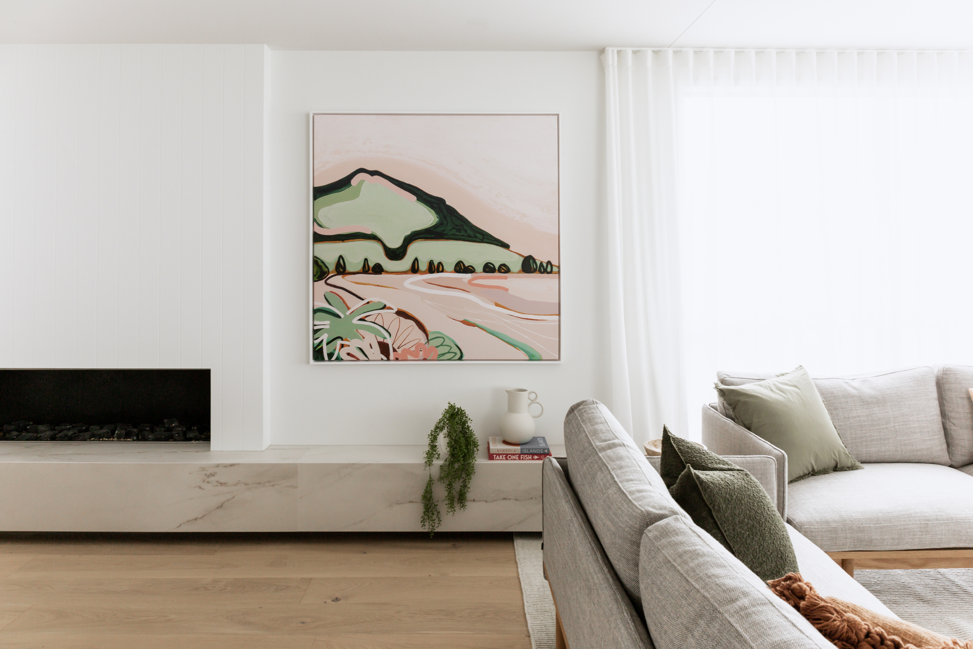
While living room art is a matter of taste, it's crucial to tieing a room together. Make sure your wall art takes color from the color scheme of your room. Think about the key pieces of furniture, the sofa, the rug - make sure the color complements these pieces to make the space feel unified.
It's about height placement too, and getting the perfect spot on the wall, says Emily. 'Artwork hung too high can be a common design mistake in living rooms. Aim to position the center of your art at eye level, around 56"-60" from the floor. When placing art above furniture, leave a gap of 4"-8" between the bottom of the piece and the furniture to create a cohesive look.'
8. Thinking that furniture can only be pressed against the wall
There is also no rule that says furniture must be pressed up against the wall, in fact, while it might be intuitive to do so, you can really help your big ticket items breathe by bringing them away from the wall. For the more statement items, this gives another side that you can appreciate - an arched back of a curved sofa, for example.
If you're wondering how to float furniture, pull it a few inches away from the wall, and anchor it all together with a rug underneath. Floating the furniture is often counter-intuitive. Though clients often think it will divide their rooms further, it actually gives the impression of larger spaces by letting the walls recede.
'Poor layout is really important,' says Kristin. 'Consider the traffic flow of your living room and ensure there's enough space for people to move around easily. Also, arrange your furniture in a way that promotes conversation. For example, consider a sofa with two armchairs across, rather than a sofa with an armchair to the side.'
9. Picking random throw pillows for the couch

Throw pillows on your couch can so easily go wrong. When thinking about whether throw pillows should match the couch, the colors of your pillows need to be just so, contrasting and playing against the color or pattern of your couch. You also need to think about the texture - something that contrasts beautifully and highlights the main fabric and upholstery.
'Too many wacky pillows on a living room sofa is a no from me,' says Bethany Adams of Bethany Adams Interiors. 'I usually notice that people either have no pillows (uncomfortable!) or way too many pillows, all generally too small and loudly patterned.
'Four is a safe number of pillows for just about any sofa size and be sure to choose two neutrals to tuck behind two more exciting pillows.'
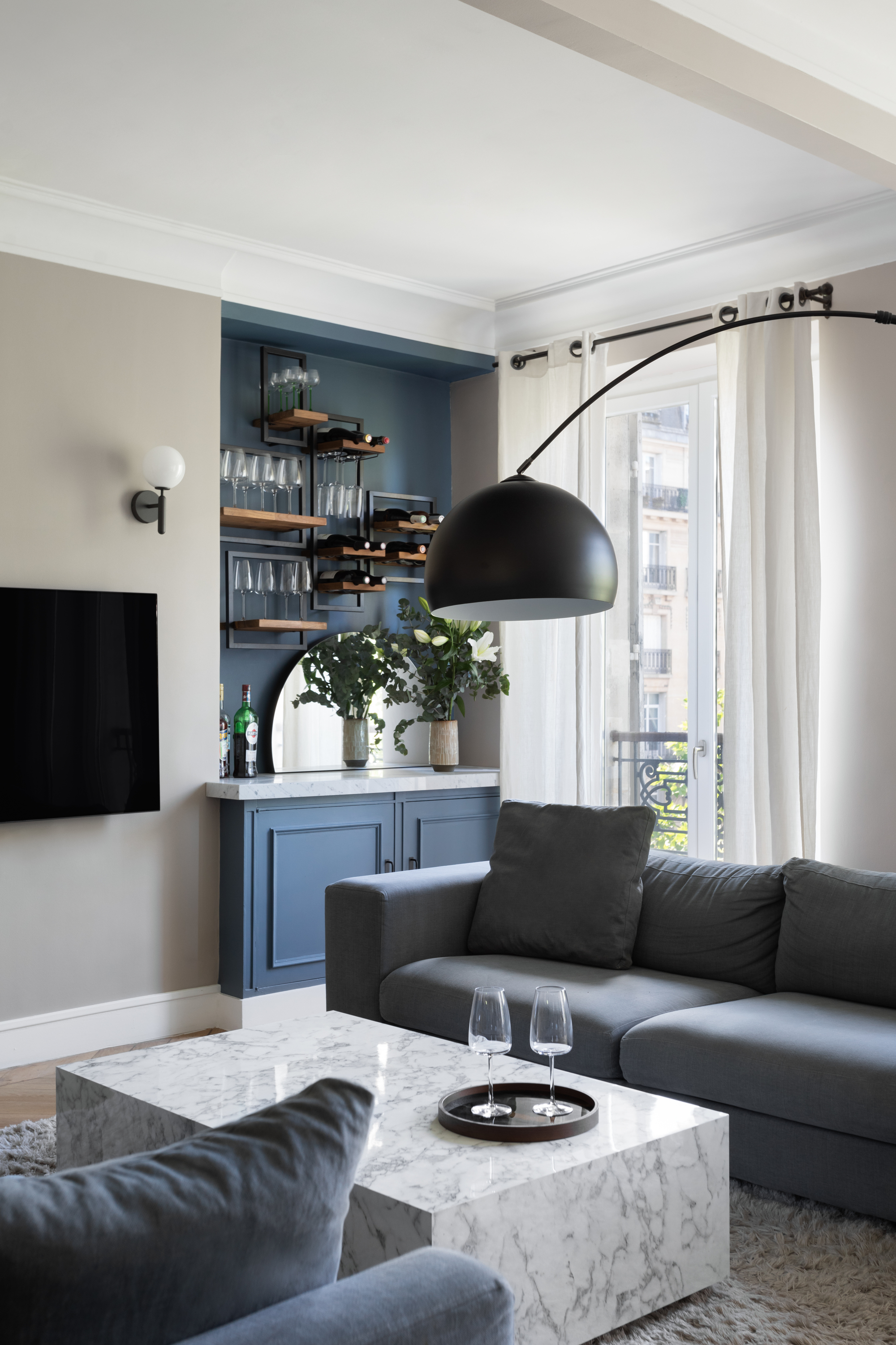
10. Creating a space without a cohesive color scheme
Finally, the living room color scheme is super important in creating a space that is welcoming and cozy.
It's not just the color of your walls either, it's how all the tones that you pick for your big ticket items, as well as your smaller pieces of decor, play against the wall color to create an overarching feeling.
It can be tricky to master, too. 'In decoration,, we follow the rule of three base colors max, like in fashion. More than three colors on clothes can look a little bit too much,' says Florence.
Another basic rule of thumb to help you is the 60-30-10 rule. I love this rule that really helps you focus your scheme, while perfectly balancing color. Start by picking three colors that go together in a seamless way, and divide them up. You want your main color for 60 percent - your sofa for example, 30 percent for a smaller item like a rug or coffee table, then 10 percent for the intricate decor dotted around the space. It helps you create a framework so you can't go too wrong and a space won't look too busy.