Changing a logo can feel risky. People get attached to familiar designs. When a company updates its look, it hopes for excitement. But sometimes, the reaction is the opposite. A new logo can spark outrage, confusion, or even jokes. For brands, this backlash can be costly. Here are ten classic logos that got axed after public backlash, showing why listening to your audience matters.
1. Gap’s 2010 Logo
Gap’s 2010 logo change is a textbook example of a branding misstep. The company swapped its iconic blue box and serif font for a plain Helvetica typeface with a small blue square. Fans hated it. Social media exploded with criticism. People said the new logo looked generic and cheap. Within a week, Gap went back to its old design. This case shows that even a simple change can upset loyal customers. If you’re thinking about a rebrand, test it with your audience first.
2. Tropicana’s 2009 Packaging
Tropicana’s 2009 redesign didn’t just change the logo—it changed the whole look of the orange juice carton. The new design removed the familiar orange with a straw and replaced it with a glass of juice. Shoppers couldn’t find their favorite brand on the shelf. Sales dropped by 20% in two months. Tropicana lost $30 million before bringing back the old design. This shows how a logo is more than just art; it’s how people recognize your product.
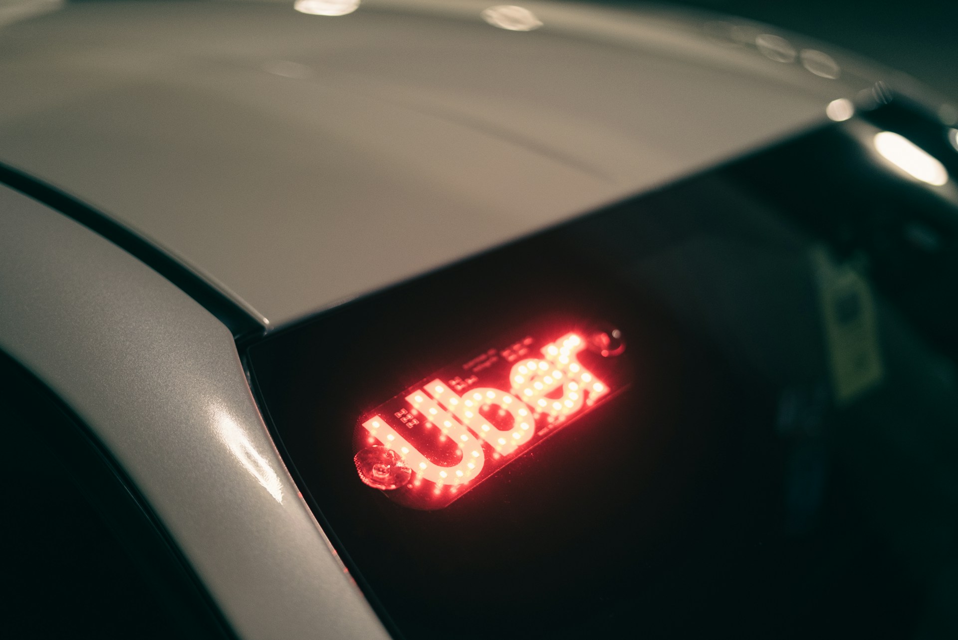
3. Uber’s 2016 Logo
Uber’s 2016 logo dropped the “U” and replaced it with a geometric symbol. The company said it represented bits and atoms. Riders and drivers were confused. Many didn’t even know it was Uber’s logo. The backlash was strong, and Uber changed its logo again in 2018, returning to a wordmark. This example proves that clarity is key. If people can’t tell who you are, your logo isn’t working.
4. Animal Planet’s 2008 Logo
Animal Planet’s 2008 logo ditched the leaping elephant for a green wordmark with a tilted “M.” Fans missed the playful animal. Critics said the new logo felt cold and didn’t match the channel’s spirit. After years of complaints, Animal Planet brought back animal imagery in its branding. If your logo has a beloved mascot, think twice before removing it.
5. Kraft Foods’ 2009 Logo
Kraft Foods tried to modernize its logo in 2009. The new design had a swoosh and a burst of color. People said it looked like a toothpaste brand. The backlash was swift. Kraft quietly returned to a simpler, more familiar look. This shows that not every trend fits every brand. Sometimes, classic is better.
6. Yahoo’s 2013 Logo
Yahoo’s 2013 logo update was meant to signal a new era. The company held a 30-day logo redesign campaign, then revealed a new wordmark. Many users felt it was underwhelming and lacked personality. The logo didn’t connect with the brand’s quirky image. Yahoo later refreshed its logo again, trying to recapture some of its old charm. A logo should reflect your brand’s true character.
7. Coors Light’s 2015 Logo
Coors Light’s 2015 logo update removed the iconic mountain. Fans were upset. The mountain was a symbol of cold refreshment. Without it, the brand lost a key part of its identity. Coors Light soon brought the mountain back. This shows that some logo elements are non-negotiable. If your logo has a strong symbol, keep it.
8. London 2012 Olympics Logo
The London 2012 Olympics logo was bold and abstract. Organizers wanted something modern. The public reaction was harsh. Many called it ugly and confusing. Some even said it looked like a broken puzzle. Despite the backlash, the logo stayed. But the lesson is clear: a logo should be easy to understand and connect with its audience.
9. MasterCard’s 2006 Logo
MasterCard’s 2006 logo update tried to simplify the overlapping circles. The new design looked flat and lost the familiar interlocking effect. Customers and designers criticized the change. MasterCard soon returned to a more classic look, keeping the circles but updating the font. This shows that small tweaks can have a big impact on brand recognition.
10. Airbnb’s 2014 “Bélo” Logo
Airbnb’s 2014 “Bélo” logo was meant to symbolize belonging. But many people saw other things—some not so flattering. The internet is filled with jokes and memes. Airbnb stuck with the logo, but the backlash was a lesson in testing designs before launch. If your new logo can be misinterpreted, it probably will be.
Why Listening to Feedback Matters
Changing a logo is more than a design decision. It’s about trust. When brands ignore how people feel, they risk losing loyal customers. The stories above show that public backlash can force even the biggest companies to reverse course. If you’re thinking about a new logo, listen to your audience. Test your ideas. Be ready to adjust. A logo is more than a picture—it’s how people see you.
Have you ever stopped buying from a brand because of a logo change? Share your story in the comments.
Read More
10 Insanely Good Dollar General Coupon Deals You Can’t Afford to Miss
10 Reasons Why Aldi’s Is the Best Grocery Store Ever
The post 10 Classic Logos That Got Axed After Public Backlash appeared first on Grocery Coupon Guide.