Looking for a good font for your latest web design project?
As a writer, I always pay close attention to typography. But a website with an accessible font that also flaunts a bit of personality can make a huge difference for any visitor who comes to your website.
Well, I'm happy to report that there are plenty of great web design fonts to choose from in 2025. Whether you're building a small business website, showcasing artistic work, or displaying photography — you're sure to find something you like.
Here are my top picks. Need more? See our list of top free fonts for designers.
01. Brandon Grotesque
Price: $249 (12 fonts)
Brandon Grotesque is a hugely successful font by HVD Fonts (run by the excellent type designer Hannes von Döhren). According to the designer, the font is influenced by the geometric-style sans serif faces that were popular during the 1920s and 30s.
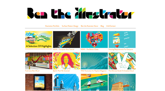
By coupling Brandon Grotesque for headlines with Brandon Text for body, you have a stylish solution for clean, crisp portfolio sites. See it in use at the portfolio sites of Jack Hughes, New Future Graphic and Ben the Illustrator.
02. Galgo Condensed
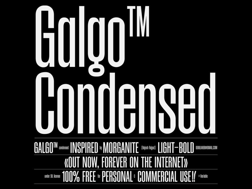
Price: Free for personal use
Galgo Condensed adds a bold yet sophisticated touch to web design. This elegant typeface has clean lines and enough character to stand out without cluttering your content. Its condensed style is ideal for headlines and navigation menus, where space matters. It also maintains great readability at different sizes.
The font shines in both minimal and expressive designs. It creates a modern vibe that suits fashion, lifestyle, and creative portfolio sites. Designers love Galgo Condensed for bringing a refined look to their digital projects.
03. Avenir
Price: $28.83 per style
Avenir was designed back in 1988 by renowned type designer Adrian Frutiger (he designed, amongst many others, Univers, Versailles and of course the eponymous Frutiger).
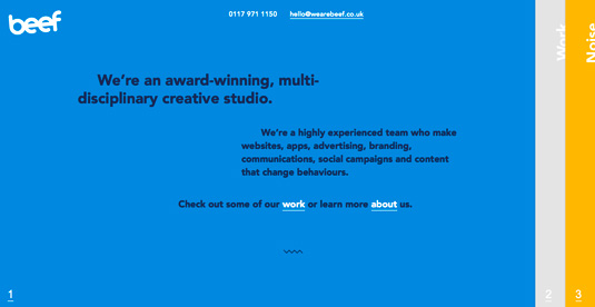
Avenir means 'future' in French and is as hugely popular as a web font as it is in print - and it works well in both body text and headlines. Bristol-based design agency Beef uses it nicely on its portfolio site as does Kerem Suer, the latter designer pairing it with Merriweather to great effect.
04. Geist by Vercel
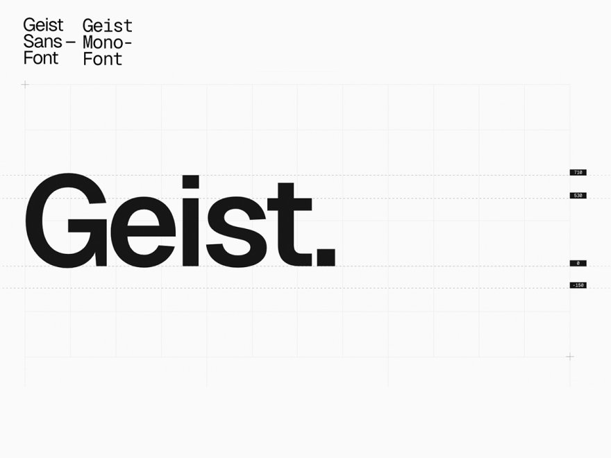
Price: Free for personal and commercial use
Geist is a modern sans-serif typeface that balances function and form. It’s an ideal choice for web apps and content-heavy sites. Its clever shapes and maximized space make it highly legible.
This font has a clear focus on screen rendering. Each character is designed to fit various devices and resolution settings. The font also comes in various weights, from thin to bold. This makes it easier to have a clear visual hierarchy for your content-heavy designs.
05. Futura
Price: $20.99 per style
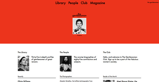
It's a modern classic, it's a fact. And in 2013, Futura saw a resurgence (although it never really went away). Futura was designed back in 1927 by Paul Renner, and you probably recognise it as Volkwagen's advertisement font. And it works beautifully on independent magazine site The Gentlewoman.
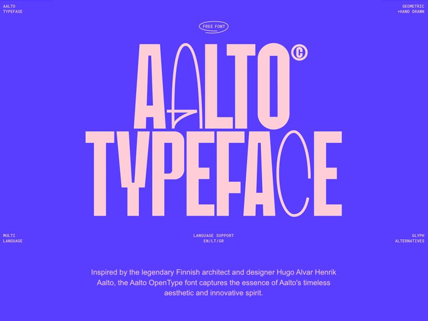
06. Aalto Display
Price: Free for personal and commercial use
Aalto Display has a very unique style to it. This expressive typeface has special character shapes and small quirks that make it interesting. It’s great for memorable headlines and brand identities. But even with its artistic flair, Aalto remains easy to read.
The font is very popular in creative fields, especially for design studios, cultural institutions, and brands that want to show artistic sensibility. Aalto's unique letterforms draw the eye, making it a strong choice when typography also needs to be a design element.
07. Sofia Pro
Price: $14.64 per style
Redesigned in 2012 by Olivier Gourvat, this typeface now supports a wide range of languages with more than 500 glyphs. Sofia Pro (not to be confused with the Google font, Sofia) has 16 fonts in total, so can be used across a whole site with ease.
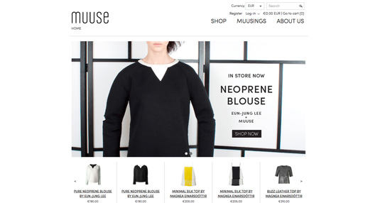
Lots of nods to Futura, but a really clean, classic typeface. Interesting fact, it was used as the font for the 85th Academy Awards (2013). You can see it in use at fashion house Muuse.
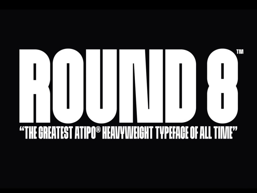
08. Round 8
Price: Free for personal use, paid commercial licenses available
Round 8 adds fun geometry and a friendly vibe to web design. This charming typeface by atipo mixes circular shapes with straight lines. The result is a modern yet timeless balance. Its rounded terminals give it a very welcoming character, perfect for brands that want to feel accessible and human.
The font family offers several weights. This lets designers create contrast while maintaining a consistent look. Round 8 fits perfectly into educational websites, children’s brands, and tech startups.
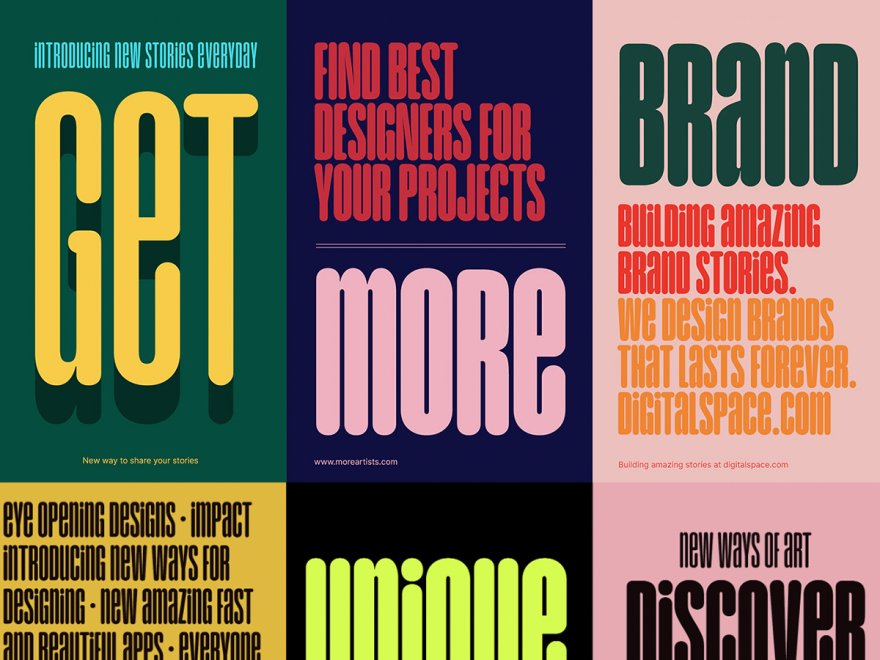
09. Unique Typeface
Price: Free for personal use, paid commercial licenses available
Unique Typeface truly lives up to its name. This display font mixes unusual proportions with subtle irregularities. The result is typography that grabs attention. Its unconventional letterforms suit brands and projects aiming to stand out.
Unique Typeface shines in headlines and short text blocks., since this is where its personality really comes through. The font works great in creative fields, fashion sites, and cultural projects. Though it may be too bold for body text, it creates memorable headlines and brand identities.
10. PP Mori

Price: Free for personal use, paid commercial licenses available
PP Mori is sophisticated minimalism with a Japanese flair. This elegant sans-serif combines geometric precision with subtle humanist touches. Its clean lines and balanced proportions make it versatile across many types of designs.
The font family includes multiple weights and styles. This gives you a full toolkit for refined typography. PP Mori pairs beautifully with luxury brands, architectural sites, and minimalist interfaces.
Like this? Read these!
- Top typography tutorials
- The best typography resources - click here
- What is type? Learn the basic rules and terms of type!