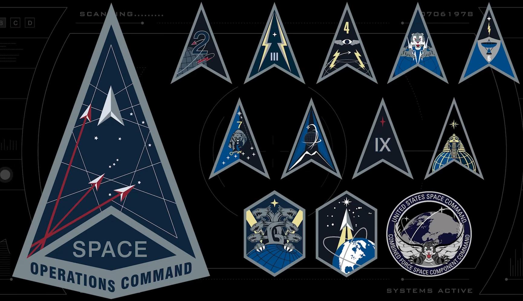
The US Space Force's mission is to secure the US's "interests in, from, and to space". And how's it supposed to do that without some classic science-fiction inspired visual design? We've already reported on the similarity of the Space Force logos to motifs from Star Trek. It turns out the influence also extends to its various insignia.
Reddit users are poring over the details of 13 designs that look like they could have been taken straight from several sci-fi series. Well, I guess they're better than that new Canadian Army logo that looks like it was made in Minecraft.
designporn from r/DesignPorn
Space Force is a branch of the US army dedicated too, well, space. Founded in 2019, it's the subject of a Netflix comedy series. And its designs do lend themselves to parody.
"Star Trek already sorted this out for us. Just use the Federation insignia and save millions!," one person commented on Reddit. "I feel that half of these are full frontal nerditry," someone else wrote "I see, aside from Star Trek, Battlestar Galactica, Airwolf, Dune, superhero comics, Stargate, and a couple of what are probably going to turn out to be from Thunderbirds or Twilight Zone, and also, cats and Furrys." "I like the one with the multiplayer mouse-cursor Asteroids," another person added.
Perhaps the similarities are inevitable. After all, sci-fi insignia are based on real armed forces insignia but relocated to space. The Star Trek 'delta' design came designs already in use by the US military, so perhaps Space Force would always have come up with designs like these; it's just that sci-fi took them to space first.
It recalls a similar conundrum with product design: are sci-fi writers prescient or do they end up making their imagined future happen? Several people have suggested in relation to things like the Tesla Cybertruck that talented and creative science-fiction writers imagined the future only for less imaginative businesses to then aim to make the future look the way they saw it in film and television.
For more logo design news, see the new Puig logo and the best Eurovision logos.