Some spaces are just so swoon-worthy that you instantly feel at home the second you walk across the threshold. These two rooms, designed for the San Francisco Decorator Showcase, embody just that. Swathed in ultra-calming green hues that wrap not only the walls but the floor and ceiling too, they remind us exactly why the color-drenching trend will always have a place in our homes.
Green shades have been at the forefront of interior design trends for some time now, and they show no sign of disappearing. Plenty of us are embracing this natural, comforting color inside our homes, but typically in smaller doses that are more 'liveable'. Drenching a whole room with green tones is another story entirely.
Decorating with a tonal color palette can make a real statement, but it's not the easiest of paint ideas to execute. It can be difficult to create enough depth, dimension, and visual interest relying on such a limited scheme, but these exquisite rooms demonstrate exactly how to master the idea and color drench to maximum effect. Each room of The Bliss Estate at 2898 Broadway in Pacific Heights - also known as 'Billionaire's Row' - showcases a different designer's work. Here, we hone in on the family room and guest bedroom to gather a wealth of green-themed inspiration that's sure to influence your spring decorating ideas.
The Family Room, by Jon De La Cruz
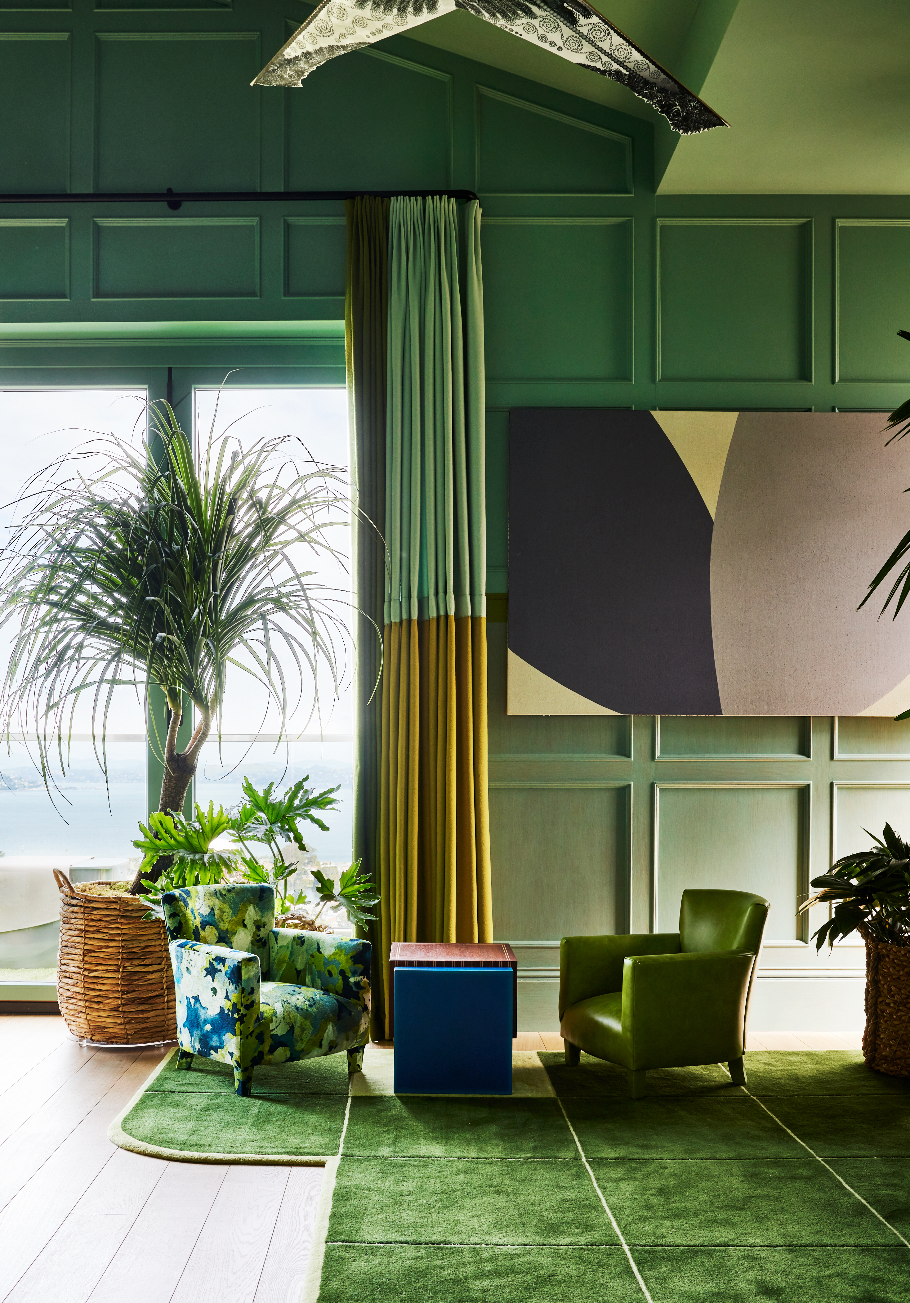
Interior designer Jon de la Cruz of DLC-ID debuted this stunning green living room space - dubbed 'The Observatory' - at this year's San Francisco Decorator Showcase. The lofty room offers unrivaled views of the Golden Gate Bridge and San Francisco Bay and is designed to act as a multipurpose family gathering area - a media room, game room, and breakfast nook all in one, as well as a cozy space for entertaining by night. It makes a real case for painting walls and ceilings the same color while demonstrating just how well green and blue can complement each other when used side by side.
Stained oak paneling reflects the calming teal shades of the horizon outside, retro floral sofas highlight the verdant landscape, and Prima Alpaca curtains by Sandra Jordan frame the views outside. Despite being cool tones, the green-blue shades feel so warm yet simultaneously zesty and uplifting - the perfect backdrop to this convivial space.
'This was a top-floor family room featuring a small balcony with oak paneling and a limestone fireplace,' explains Jon. 'Much of the golden oak paneling sustained sun damage over the years. We attempted to restore but it was beyond repair. Ultimately we were able to stain half of the paneling, the remainder and the ceiling were painted.'
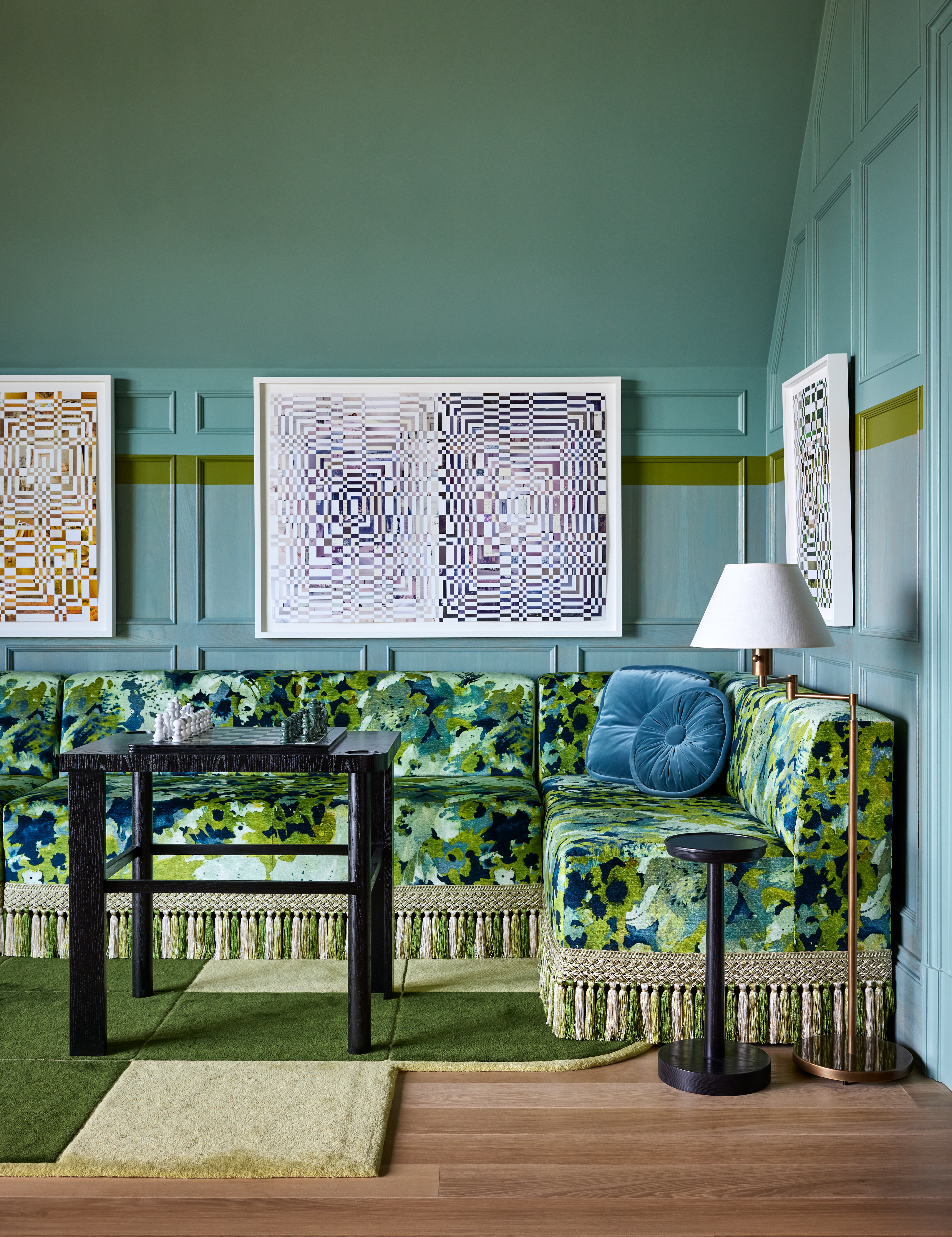
When deciding on the color palette, Jon let the room dictate the design direction. 'The sweeping views of the Golden Gate Bridge, the San Francisco Bay estuary, and Alcatraz Island dominate the experience in the room - so rather than fight or ignore it, we chose to magnify it with the color choices,' he says. 'All paints and stains are from Sherwin Williams: The foggy sky blue is "Calico", we then painted a stripe to extend the horizon line into the room with a tree-top green called "Verdant", and everything below the line was stained "Vintage Blue". The botanical prints and leafy shades of green were all applied to the rugs and furniture.'
If you've ever questioned do blue and green work together, this is the space that will convince you once and for all.
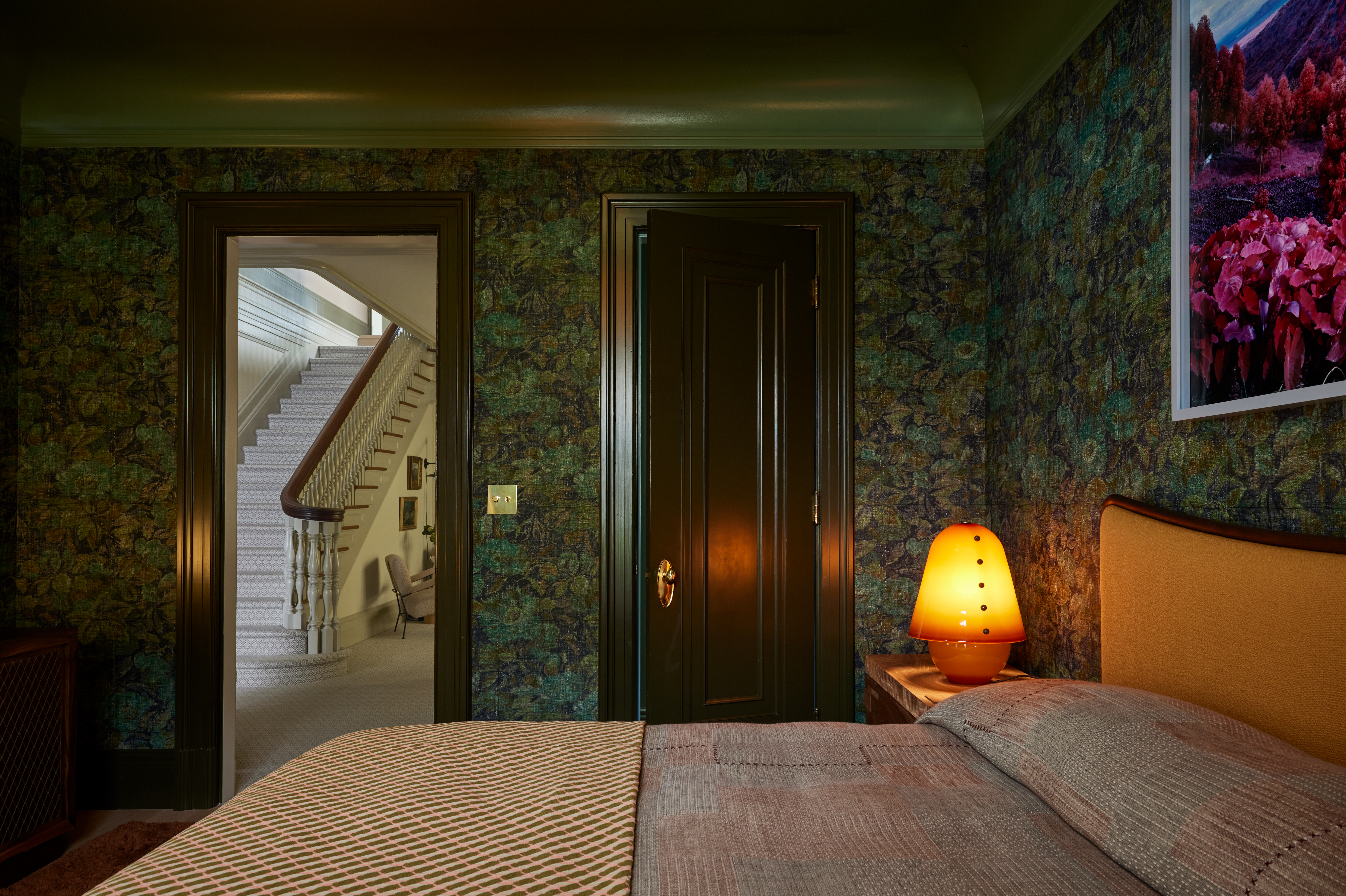
The guestroom, by Aubrey Maxwell
Green might be a cool shade for a sleep sanctuary, but this moody scheme has such a calming effect it's convinced us to give a green bedroom a go. Like the family room above, it gives green a warm and cozy quality by layering with plenty of texture, warm tones, and soft furnishings.
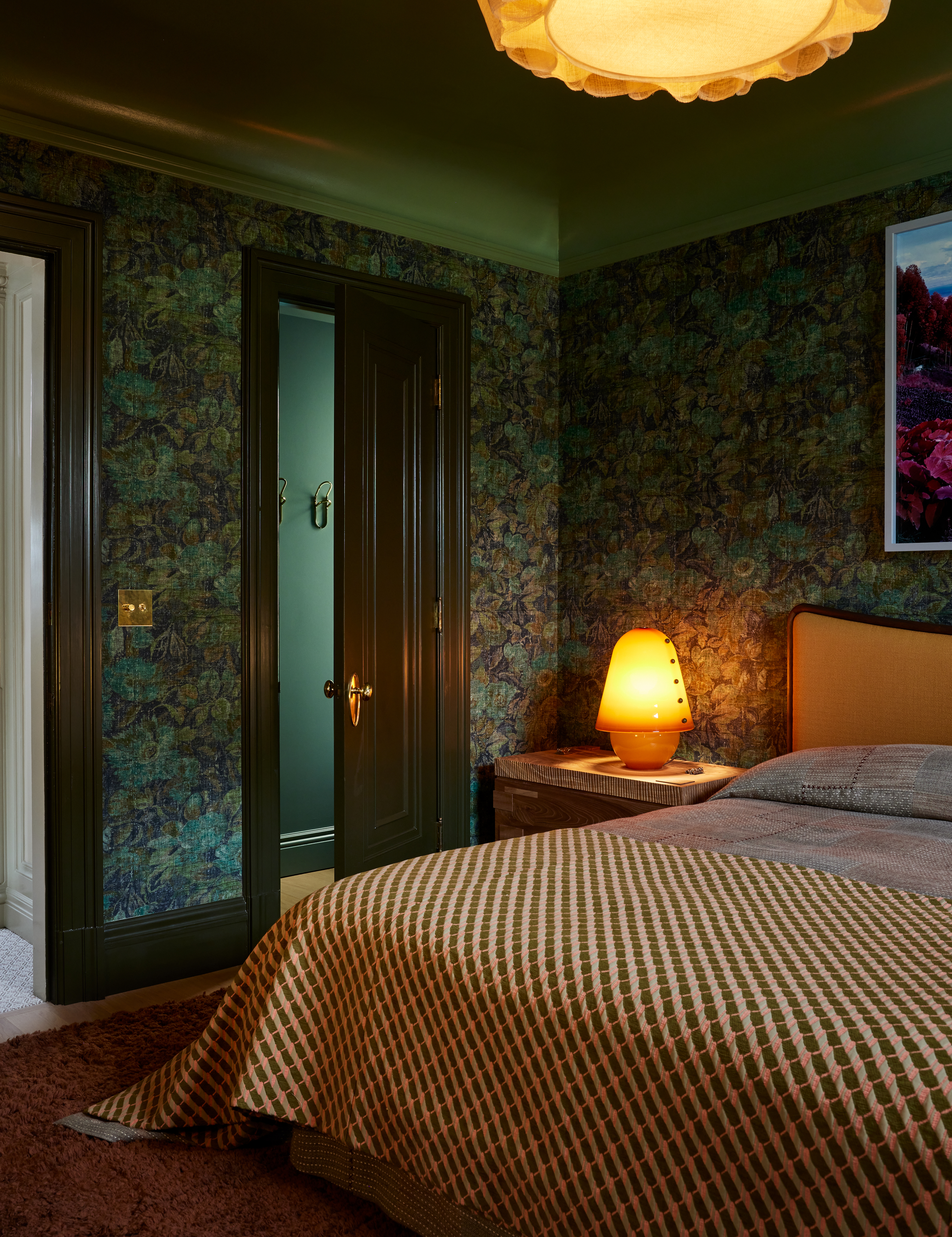
This guest bedroom, designed by Aubrey Maxwell, was named 'To the Dark and the Endless Skies: A Bedroom Retreat'. The title is a nod Roberta Flack’s debut album, 'First Take', since Aubrey's space melds music and memories to offer guests an immersive experience. Walls sheathed in botanical wallpaper by ARTE bring a vintage feel to the space, complemented beautifully by the dark glossy green accents on the woodwork.
According to Aubrey, this wallpaper was the starting block for the rest of her design. 'Our bedroom was directly influenced by the architecture and stately, traditional details of the home,' she explains. 'The ornate moldings, coved ceilings, and overall grand feeling of the interiors inspired us to work with saturated colors and a patterned wallcovering. The weathered floral pattern printed on a textural ground feels like it could've lived in that home for many years as it developed a faded patina in place over time. The whole design of the room kicked off from that first choice of the wallcovering.'
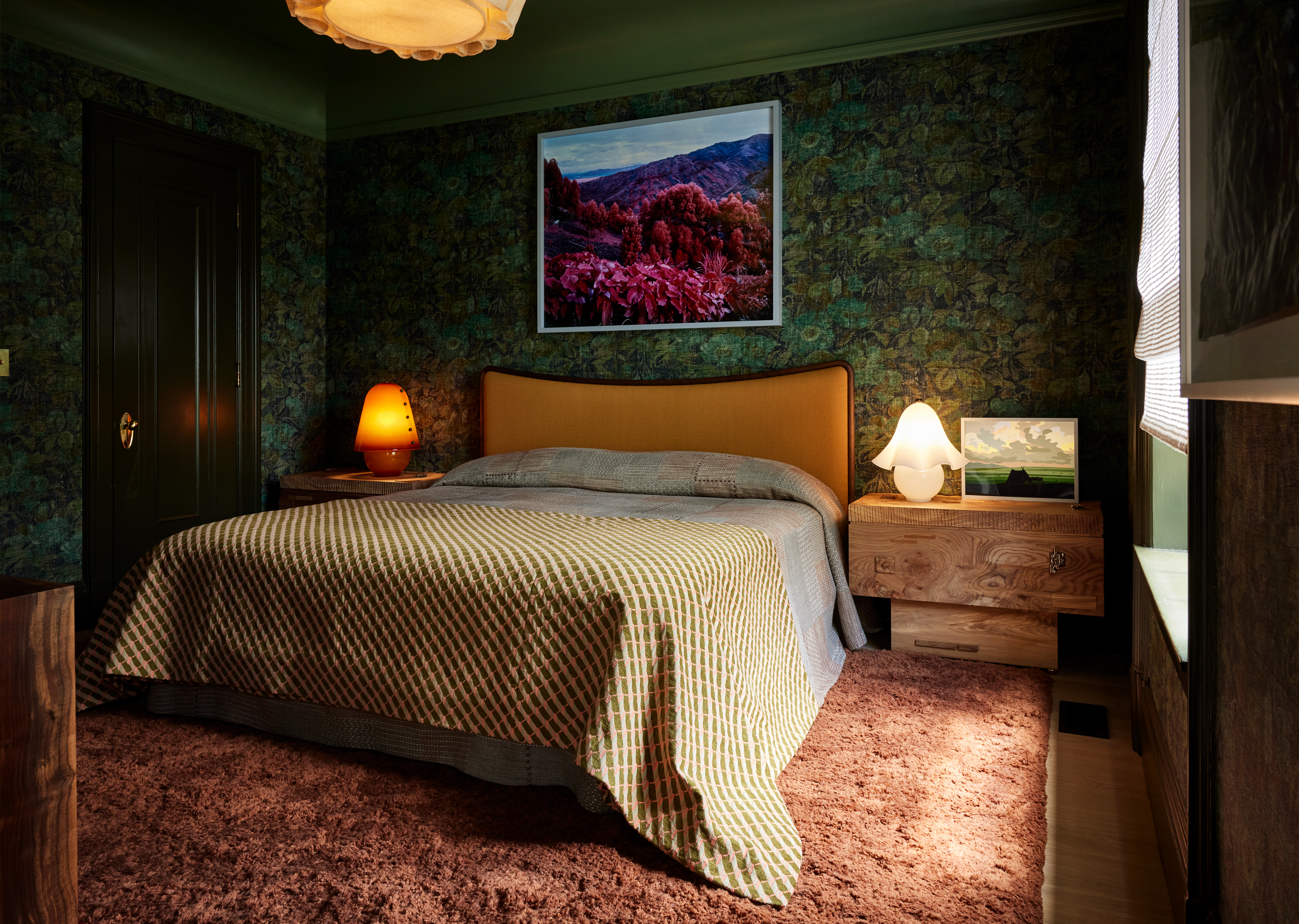
'Cool tones like these have a calming and comforting feeling which makes them perfect for a bedroom,' Aubrey continues. 'For the moldings and baseboard, we chose a dark, fatigue green that connected with the darker tones in the wallcovering and helped to ground the lower half of the room.'
The lighter green on the painted ceiling adds height to the dark space while the russet-colored shag rug below anchors the room with a plush layer of softness. There are plenty of colors that go with green, but this dusky pink tone offers a playful quality while simultaneously feeling oh-so-sophisticated. 'There's an earthy but warm quality to all the shades of green we used, and they're well balanced in the design by our use of equally earthy tones of russet brown, marigold, pink and naturally finished wood furnishings,' Aubrey notes. 'They're all colors that lend themselves to relaxation.'
Color drenching the space with such a deep green tone may feel like a bold move to make in your own home, but Aubrey says the overall effect can be both soothing and awe-inspiring at the same time. 'I think our selection of earthy green tones balanced by the subtle warm colors in the room strike just the right balance because they're not too bold or bright or loud,' she says. 'The colors feel like nature, even in the areas where darker tones are employed, and that has the effect of putting the mind at ease and slowing down the heart rate.'
How do you color drench a space successfully?
Color drenching is one of those bold paint ideas that sounds brilliant in theory, but needs serious thought and consideration before you commit. 'It's really important to consider textures when color drenching a space,' Aubrey says. 'The textures and dimensional elements in a room that work with light and shadow are as important, (perhaps slightly more important), than the choice of colors alone. The surface quality of things provides depth and creates visual interest because of the way light is absorbed and/or reflected around the room.'
Think about your existing furniture, flooring, and architecture before choosing a color or going ahead with this paint technique. 'The visual appeal of every element in a room design is absolutely affected by its adjacencies,' adds Aubrey. 'Considering that balance of how things sit alongside one another is critical to achieve a design that feels harmonious and visually balanced.'
Once you've decided on your desired shade, go forth with confidence. 'Be brave and paint over your white ceilings to unify the color mood of the room,' instructs Jon. 'Contrast trim also cuts and frames your visual plane into smaller sections, so paint the baseboards and casings the same color as the walls and ceiling to blanket the room in color. Focus on analogous colors (blue and green) and then spike it with their complimentary colors (orange-pink) for a no-fail recipe. This approach shouldn’t be relegated to textile choices and paint - think about the woods, metals, art, plants and lighting for visual interest in the chosen color schematic.'