Small rooms can often be overlooked when it comes to decorating and can be a challenge to design. However, just because you have a small room there’s no reason it can’t still make a big impact.
In fact, smaller spaces such as bathrooms, powder rooms, utility and boot rooms make the perfect spaces to be creative with color as they’re not in constant use, so you can afford to be a little more daring. Here we’ve rounded up a selection of inspiring small room color schemes alongside some expert tips on color combinations from the interior design experts.
What color combinations work well in small rooms?
To work out what color combinations will work best for your small space it’s important to first consider what mood you want to evoke as well as how much light the room receives. The orientation of the room and whether it receives cool or warm light will also have an impact on color choice. In addition, take into account the colors in adjoining rooms to ensure a flow between spaces.
Generally speaking, color schemes can be split into three groups: monochrome, analogous, and complementary. Monochrome schemes feature different tones of the same color, while analogous schemes combine colors seen next to each other on the color wheel. Complementary colors are those that sit opposite each other on the color wheel. Layering subtly different, analogous colors is a brilliant way to create a harmonious, soothing scheme. Alternatively, combining colors from different ends of the color wheel can achieve a bolder look - of course, it all depends on what depth of tone you use too, whether pastel, bold or dark.
While color is a very emotive thing and ultimately a personal choice, it is worth familiarising yourself with current color trends for inspiration. In terms of trending colors for small rooms, dark colors continue to be a favorite with interior designers.
'Light neutrals or whites are not the only options for small rooms, embrace a small space and create an intimate interior, with intense cocooning colors. Dark colors work really well to harness the character of a small space by creating warmth and intimacy. Intense but natural cocooning colors such as ‘Chocolate Colour’, ‘Sage Green’ or 'Jewel Beetle', are perfect for enveloping a space with a sense of relaxation and comfort,' says Ruth Mottershead, creative director and marketing director at Little Greene.
In addition to dark colors, we’re seeing bright jewel colors used together to create exciting, maximalist schemes.
'Mixing and layering rich colors are very on trend! I am seeing a lot of deep greens, from wall coverings to rugs mixed with golds and golden yellows in fabrics and accessories,' says interior designer Phillip Thomas.
'I love to mix deeply saturated colors in small rooms, specifically bright colors mixed with bold. The combination seems to eliminate shadows and make a room feel bigger. I like to keep colors dark on the walls and then incorporate brighter colors onto surfaces to reflect the light. The result is a deeply layered, little jewel box of a room that feels comfortable and chic.'
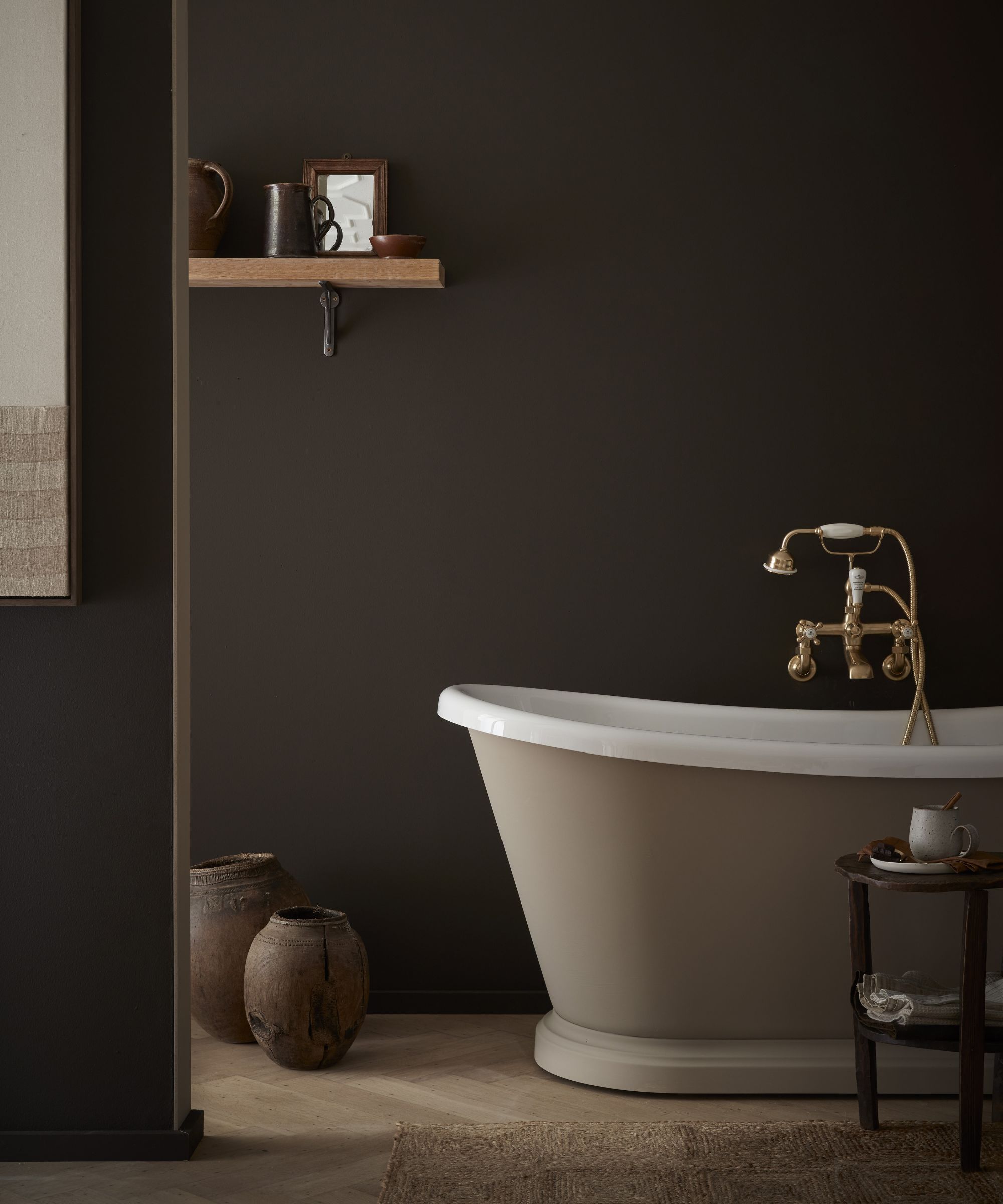
1. Don't be afraid to go for dark tones
When we asked the experts for their advice on color combinations for small rooms dark colors were a firm favorite. Used in the right way, they can make for wonderfully cocooning and atmospheric spaces. 'A really dark, moody gray works beautifully in a small room. Cyberspace by Sherwin Williams is one of my favorites. It's slightly mysterious. It's charcoal with subtle blue undertones so it reads differently in every room,' says Interior designer Sandy Yen, founder of Yen Collective.
Whilst it may seem counterintuitive to paint a space in dark colors, experts argue that it can actually make rooms feel spacious, especially when color-drenched over all surfaces. ‘Even though dark colors ‘advance,' you will blur the boundaries where all the plains stop and start (e.g. where the wall meets the ceiling, a built-in cupboard or a utilitarian radiator). The theory is that this helps give a feeling of infinite space rather than making it feel small and disjointed,' says Patrick O'Donnell, brand ambassador at Farrow & Ball.
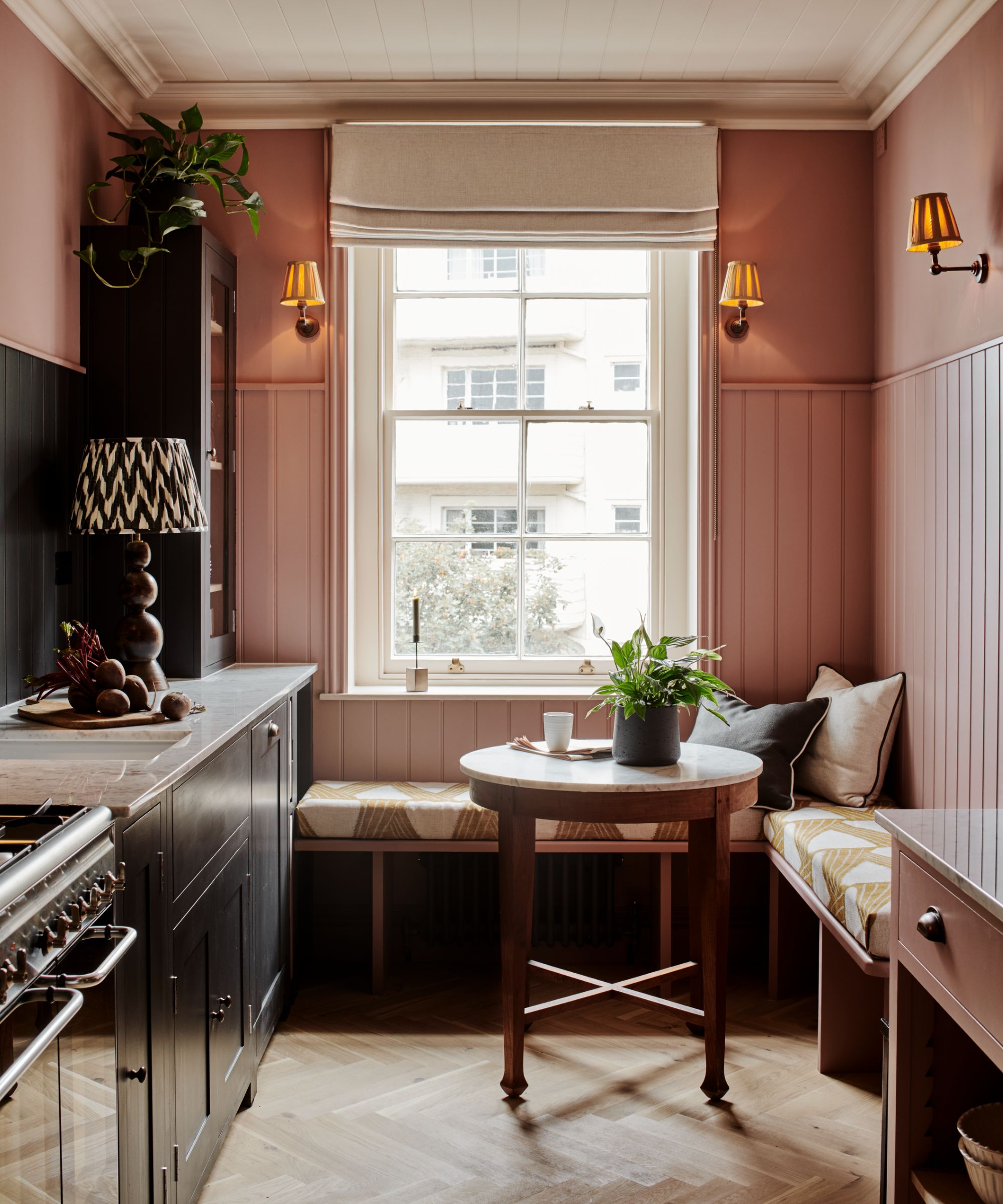
2. Pair plaster pink with deep hues
If going dark on all four walls is too much for you, why not go for a soft on-trend plaster pink with woodwork picked out in a deep charcoal for a soothing look with a contemporary edge? Plaster pinks – moving to warmer tones rather than sugary pinks, have been a popular color trend for a while and they see no sight of abating.
‘Softer pinks, those without too much blue through them, can be totally flattering to the complexion. They make a great color choice for something such as a small bathroom where their gentle tone will add warmth without overpowering the space. Think Pink Ground or Setting Plaster in Modern Emulsion for a delicate atmosphere,’ says Patrick O'Donnell, Brand Ambassador at Farrow & Ball.
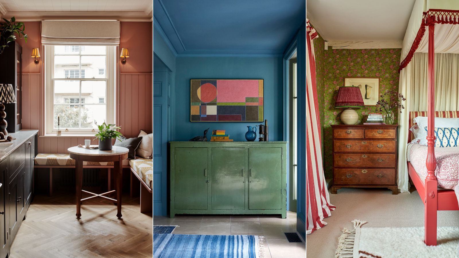
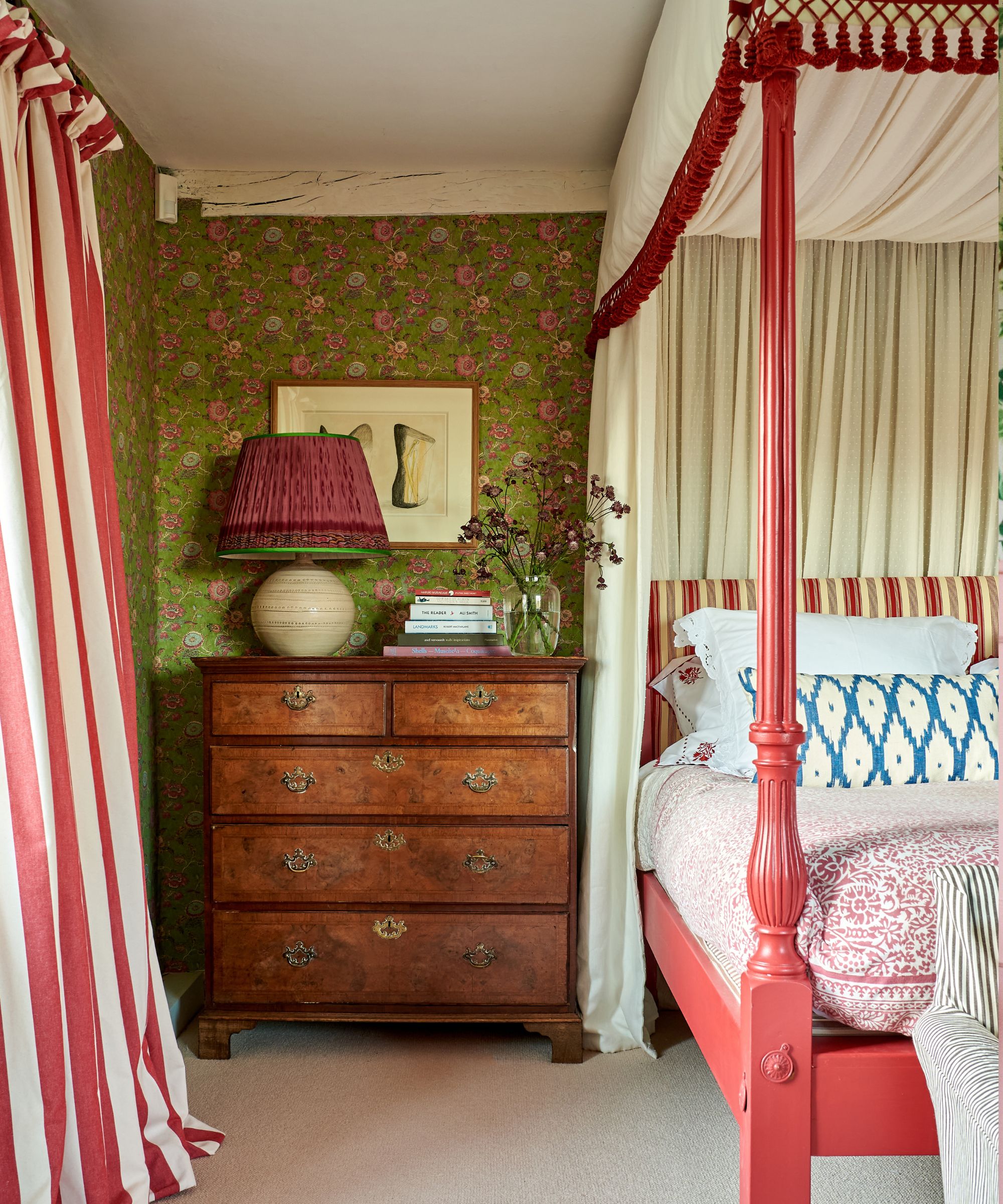
3. Turn heads with a mix of bold jewel tones
Increasingly we're noticing people being more confident with color in their homes, embracing bright hues on walls and furniture. Contrasting colors that sit opposite each other on the color wheel are proving popular, but we're also seeing colors that sit alongside each other often favored by interior designers, including red and pink, and green and blue – beautifully paired here by Nicola Harding.
'Color is like a very cost-effective magic spell that transforms the atmosphere of a space and blue is one of my most frequently used ingredients,' says Nicola. 'From a punchy peacock to an inky indigo, when used correctly it creates a soothing atmosphere and a sense of ease.'
'Blue works wonderfully when combined with warm tones of wood and pink hues but don’t shy away from pairing it with cooler colors,' she continues. 'For instance, they say that blue and green should never be seen but personally, I think it’s a great combination that's said to support relaxation due to its prominence in nature.'
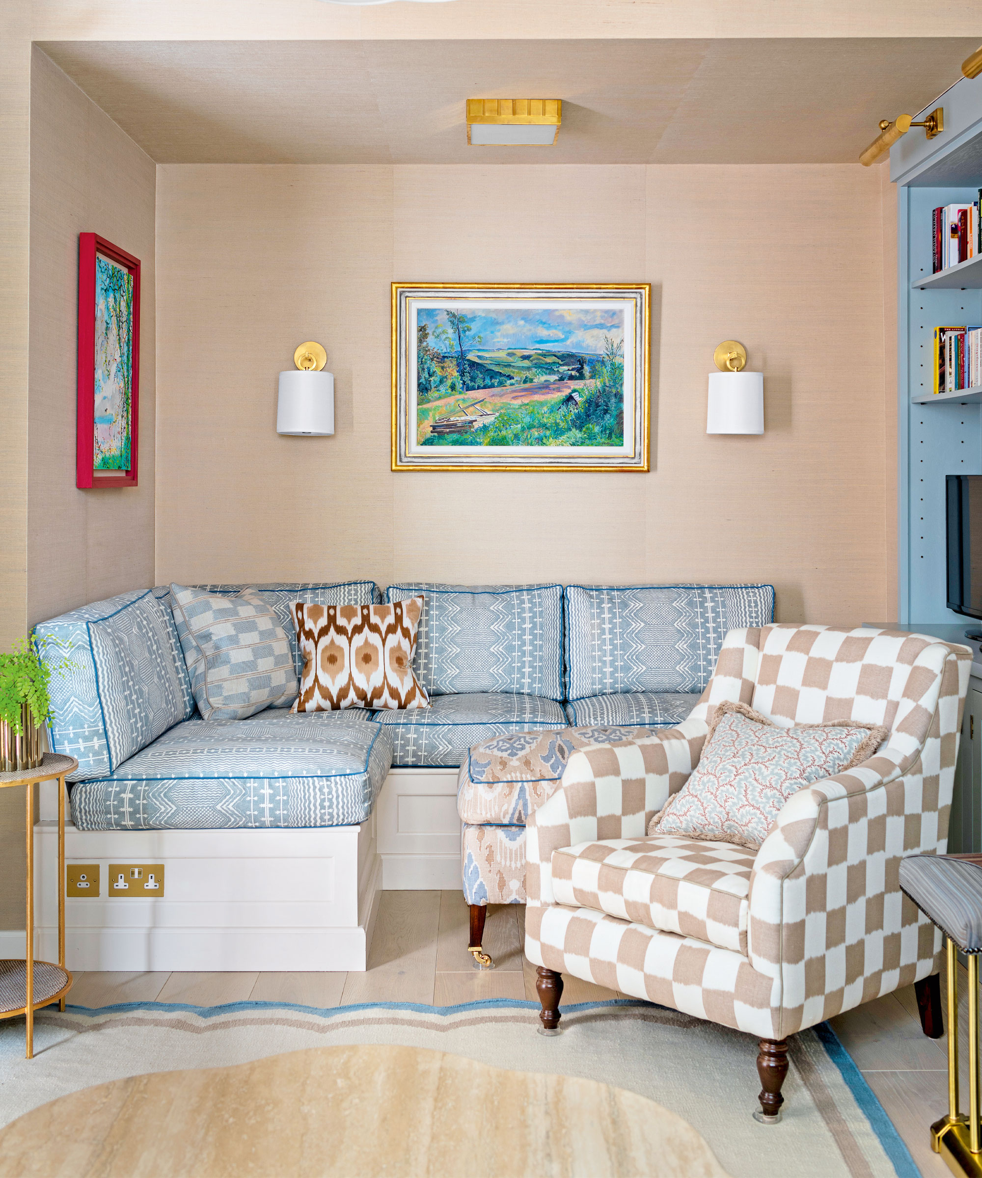
4. Layer warm neutrals for a bright welcoming scheme
Decorating with neutrals is a go-to palette for making small rooms like hallways appear larger, but take care when selecting your tone say the experts and consider layering neutral tones to soften the look.
'Many opt to use bright white in small rooms with the aim of making the room appear larger; however, light neutrals used in a tonal scheme will have the same effect whilst not appearing too stark. If there is a lot of natural light in a small room then using soft, light tones will make the room feel more spacious,’ says Ruth Mottershead creative director and marketing director of Little Greene.
‘If you opt for white, choose whites with warmer undertones such as 'Clay Pale’ or ‘First Light’ which bring warmth and coziness along with a bright fresh feel to small spaces.'
5. Create a contrast
Decorating with contrasting colors is a big interior trend at the moment and is a great way to create a head-turning space with balance and harmony. In this home office interior designer Laura Stephens chose green and red and has livened things up with a touch of bold blue.
'Just because a room is small doesn’t mean you can’t make the scheme interesting. A pop of color can really lift a small space and in this room we went for a dark tonal wallpaper with bright blue woodwork which acts as a border and picks up on blues in the soft furnishings elsewhere in the room,' says Laura Stephens.
6. Soften contrasting colors with pattern
A scheme that embraces bright, contrasting hues can be overwhelming without the right treatment. Introducing bold colors through patterned fabrics and wallpapers is a wonderful way to soften the look in a small bedroom says interior designer Sarah Vanrenen who has a passion for color.
'I think contrast is my second name, however, it is usually always balanced out in my schemes. I will almost always use contrasting colors or pattern, perhaps without even realizing,' says Sarah Vanrenen. 'As a former painter, it is something that comes as second nature to me, but there has to be relief. If I have pale walls, I almost always punctuate the scheme with stronger, darker accents like some blue, red or black furniture that stands out. Then there is usually an area of pattern that balances out the neutrality, and often even another pattern, with a different scale to add to the layered look, that is still not too hectic.'
7. Balance bold colors with the 60:30:10 rule
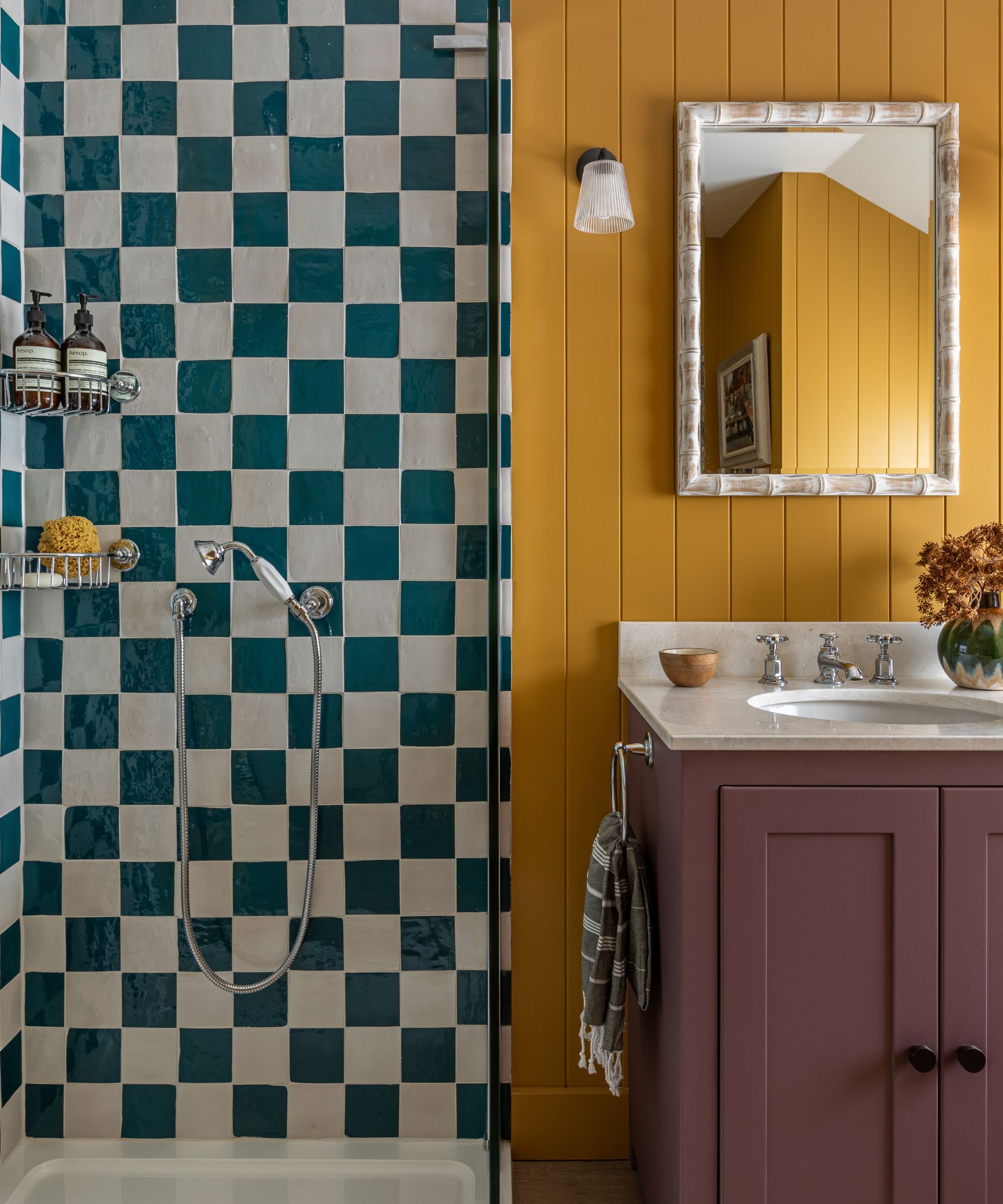
Bathrooms can often feel cold and void of personality so decorating with bold hues is a great way to bring them to life. If you’re looking to create a colorful bathroom always use three colors rather than two say the team at Otta Designs. To help create balance within a multi-tonal scheme consider following the 60:30:10 rule.
‘Using three colors creates a layered visual harmony without overwhelming the space with too many colors. Also known as the 60-30-10 color rule - 60% is the dominant color, 30% is the secondary color and 10% is the accent color,’ says Ali Johnston, founder at Otta Design.
‘Mustard yellow panelling and an aubergine vanity unit create a fresh, splashy character to this shower room, to suit its use by the younger members of the family. Schemes always work best with three key colors rather than two, so sea blues were introduced through the zellige checkerboard tiles and the patterned blind.’
8. Layer greens for a soothing space
Synonymous with nature, green continues to be a hugely popular color in interior design, bringing the healing powers of nature into the home. Decorating with green and layering subtly different hues as part of a tonal scheme is a lovely way to create a tranquil space with depth.
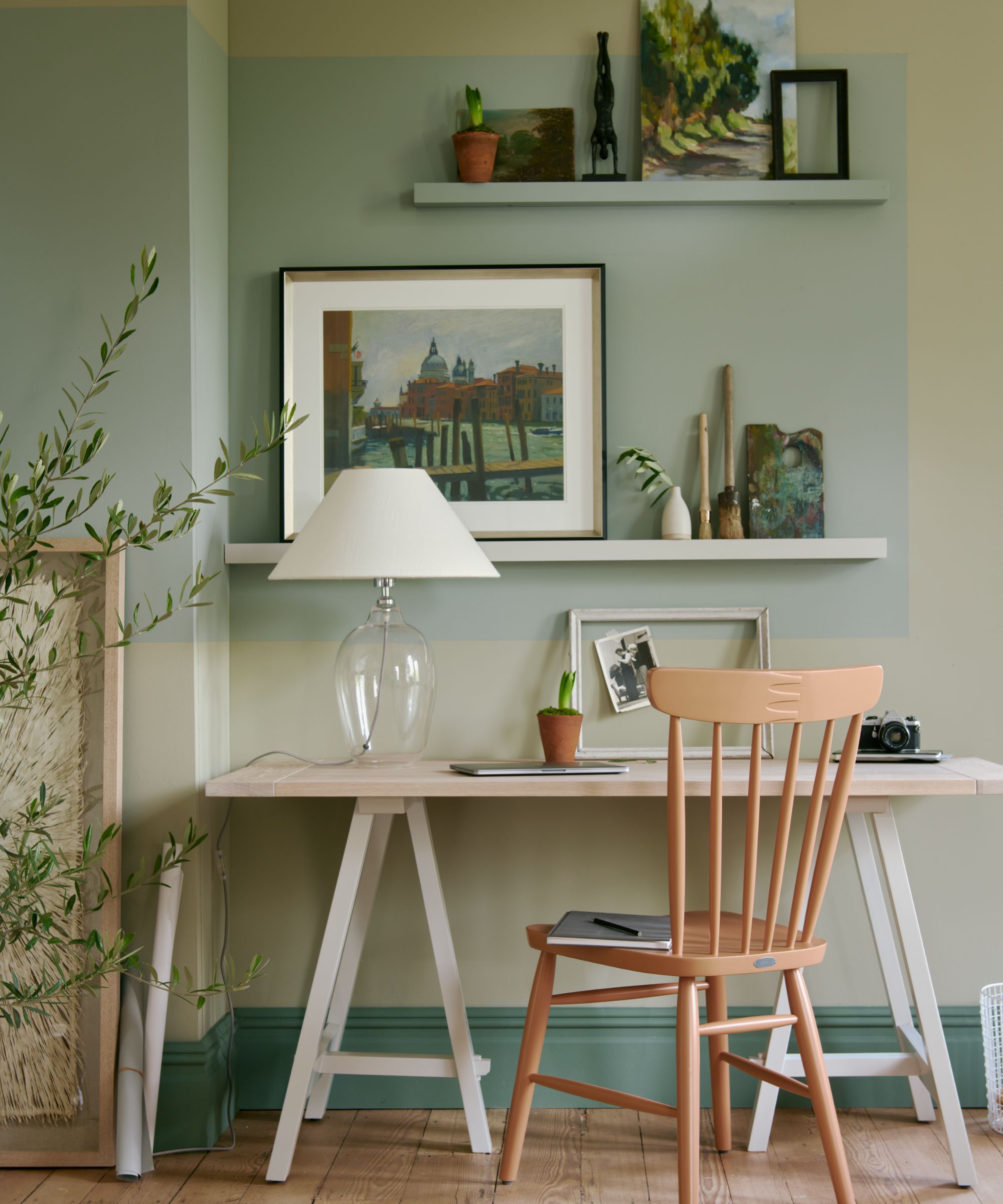
'Working with a green/blue palette will ensure a feeling of peace and tranquillity as both colors appear strongly in nature. Sage and moss green sit beautifully with aqua to create a well-balanced scheme, especially when you layer warm and cool greens together,' says Simon Temprell, interior design lead at Neptune.
'This is a calming scheme for a home office, child’s room or bathroom but may need a contrasting color to warm things up. We used our Burnt Sienna paint on the chair, adding a lovely flash of apricot from the opposite side of the color wheel.'
Erika Woelfel, VP of color and creative services at Behr also recommends looking to nature for color inspiration. 'Earthy tones, especially in the blue and green color families are popular for small rooms. Opt for a similar shade of the wall color for the trim to create a cohesive look for a nice visual flow that gives the perception of space. For an on-trend color scheme, try layering greens such as Mountain Olive and Pesto Paste.'
9. Go bold in a home office
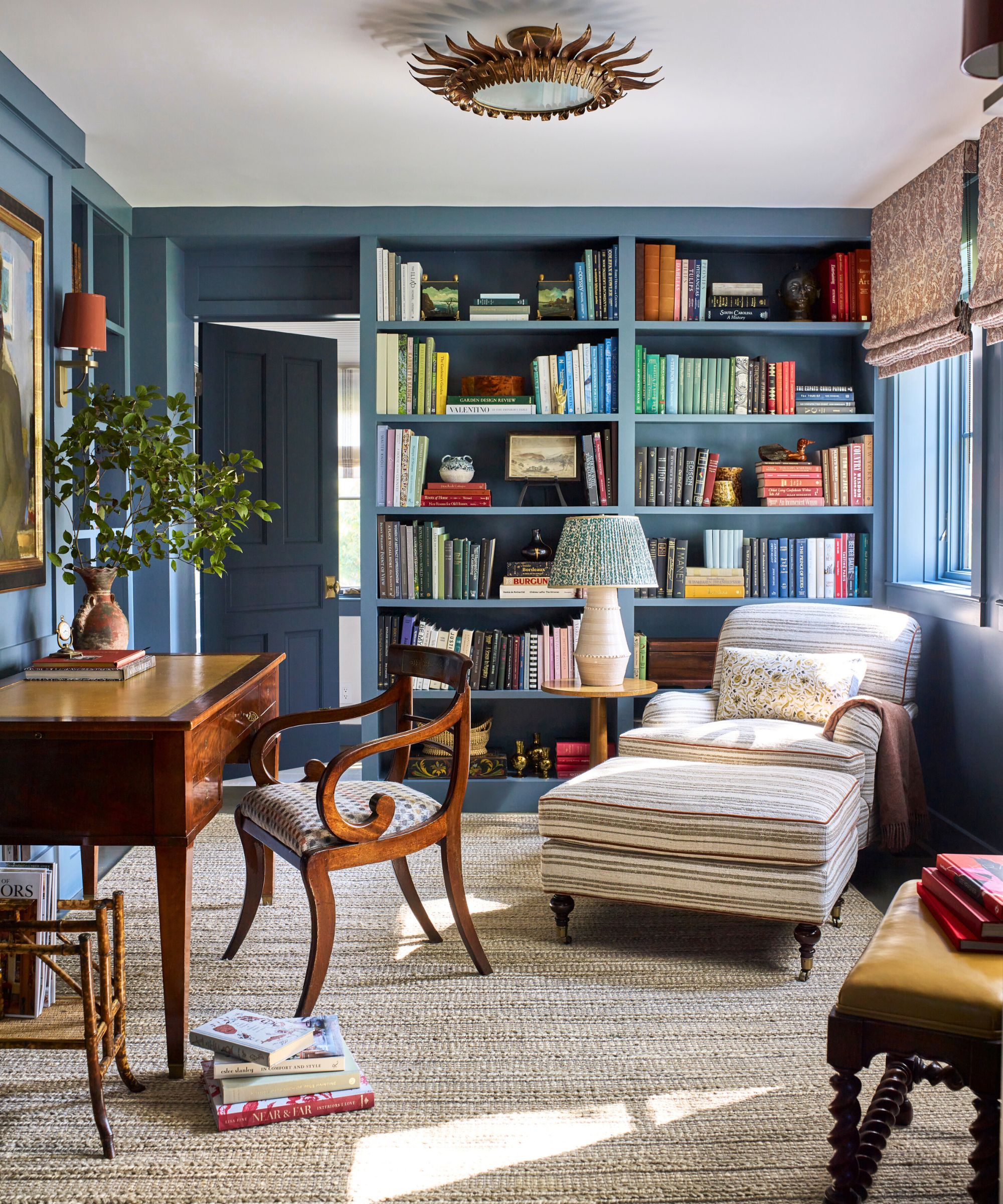
When decorating a small home office it’s important to consider how the color will affect your mood and if the room will be used for other functions, too. Bold blues and greens can work fantastically well, bringing an uplifting, motivational feel, however, used in the wrong way they could be distracting. For this project in Germantown, NY, interior designer Louise Copeland chose a bold blue as a base for layering.
‘The color choice for the Germantown study room was key, as it serves as a daily workspace. We opted for a calm yet bright and fun blue. It's bright and fun without being overly saturated, creating a relaxing and stimulating atmosphere that's ideal for a productive work environment,’ says Louise Copeland, founder of L.B. Copeland.
‘In small spaces, I say lean into the coziness of the space and choose darker paint colors to give a bit of moodiness. A more colorful base creates a less jarring contrast than white when you add additional colors through window treatments or artwork.’
10. Create a warm and welcoming kitchen with black and dusky pink
While dusky and smokey pinks are a popular choice for bedrooms they can also look wonderful in small kitchens, as this amazing small kitchen by Nigel Hunt proves. He chose Neptune's Suffolk Kitchen in Ink pairing it with a rusty rose on the walls to create a warm and cozy space which is bold yet still soothing.
'A drab pink is a brilliant neutral to base a room scheme; warm, playful, and so much more interesting beige. Stay on the brown end, avoid the saccharine and sugary, and it will elevate a room instantly. And for an added bit of drama, team it with a red-tinged charcoal,’ says Nigel Hunt, head of design studio Huntreay, @nigehunt
11. Build your color scheme around a favorite print or position
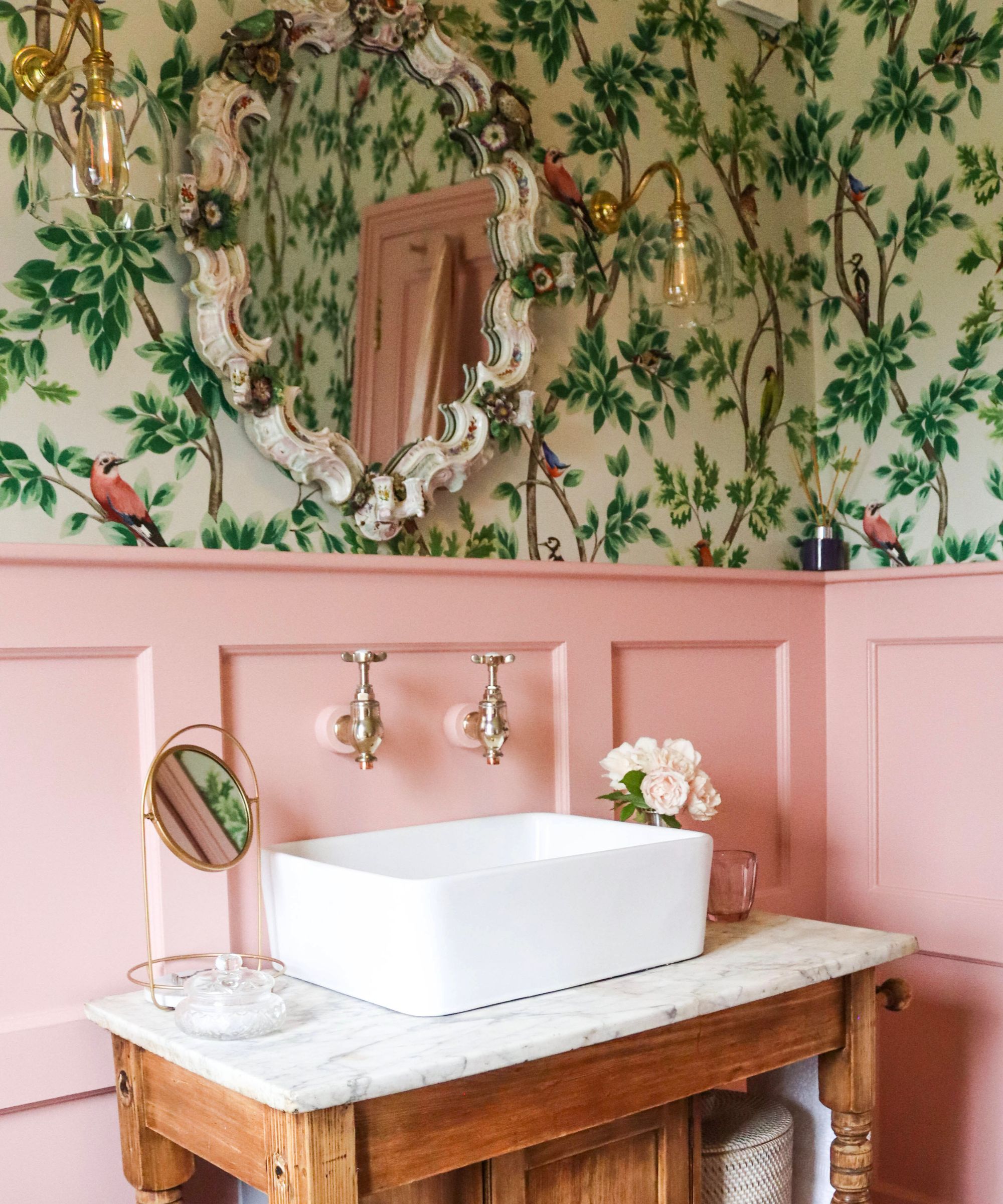
If you're stuck with where to begin when designing a color scheme then a piece of patterned fabric, wallpaper, artwork or accessory can make a wonderful starting point as demonstrated in this fun bathroom scheme.
'This green and pink scheme evolved from the Meissen porcelain mirror (which I inherited from my grandmother) and is one of my most cherished possessions.
I love Edward Bulmer's 'Rose' pink which is rich and bright, but not too sugary. The gentle 'Celadon' green ceiling is a good antidote to the busy wallpaper and the strong pink woodwork. Edward Bulmer's natural paints not only give a beautiful finish, but they are eco-friendly, too,' says Suzy Maas, founder of Maas Interiors.
12. Go bold in the bootroom
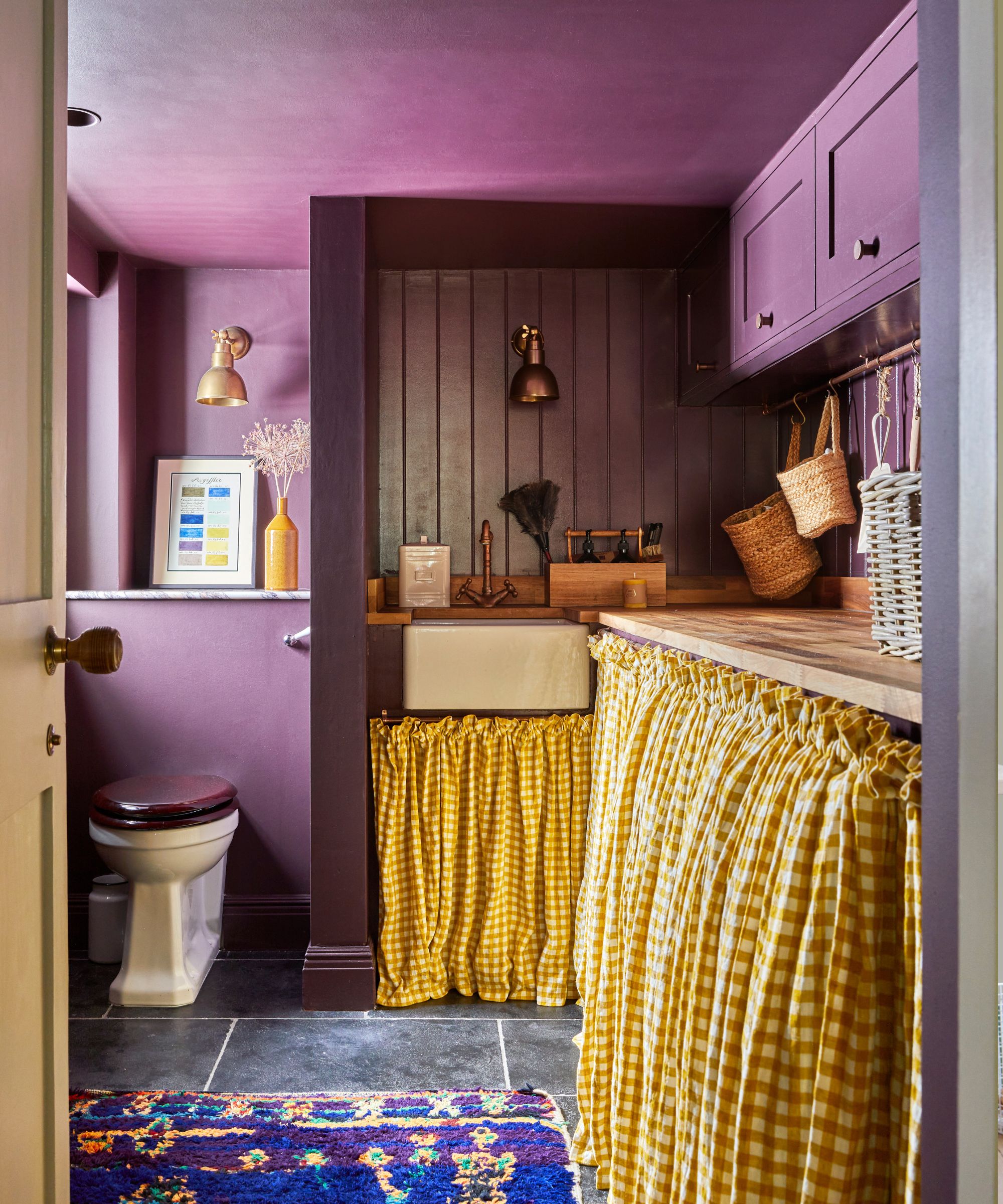
Practical spaces such as utility rooms, boot rooms and powder rooms needn't be bland - opting for bold color combinations is a great way to bring an uplifting feel, plus it will make laundry and chores a more pleasurable task. 'Small spaces are made for bold color combinations, this is where you bring the drama with a statement color and go all the way with it!' says Emilie Fournet, founder of Emilie Fournet Interiors.
'In this small and dark utility room, we re-used the color combination we had in the adjoining kitchen of mustard yellow cabinets and a plum-colored island and really made a statement by using Plum Tree by Mylands all over the walls, cladding, ceilings and cabinets.'
'We chose a mustard gingham fabric to lift the color-drenched plum and link back to the kitchen cabinets. The owners also had the vintage boucherouite rug as a starting point to the scheme which worked perfectly.'
Color can be a wonderful device for changing the look and feel of a space. Traditionally white and light neutrals are the preferred colors for making small rooms feel bigger, but increasingly designers are embracing dark colors to create cosy spaces.
‘White paint colors are a go-to option as they reflect light and create a blank canvas to work within a room. However, if there is great natural light, a dark paint color can work on the walls without making the room feel small. Dark paint colors add depth to the room and can play well with the shadows throughout the day as the light changes,' says Erika Woelfel, VP of color and creative services at Behr. 'Also, a small room creates the opportunity to use bold hues that may be too overwhelming in a larger space. For example, a dark green such as Vine Leaf or a soft black like Cracked Pepper are the perfect choice for a dining nook or bathroom for a sophisticated and moody ambiance.'