Beer is one of the most popular drinks worldwide, and has been for centuries. There are so many beer brands out there that beer aficionados are spoilt for choice, and with so many types of beer all varying in appearance, aroma, and taste, marketing and branding are hugely important.
The logo of each brand of beer is a huge part of this. Many beer brand logos have become iconic, potentially up there with the best logos of all time, forming important parts of coherent brand identities. But others aren’t so good, either because they don’t match the feel of the brand, or simply because they just don’t look all that great. So, let’s take a look at some of the beer logos on either side of the scale.
Beavertown
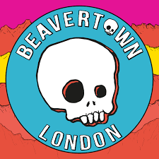
This craft brewery has some serious rock ‘n’ roll origins, being founded by the son of Led Zeppelin frontman Robert Plant, Logan, in 2011, before being acquired by Heineken in 2022 – and it’s collaborated with American desert rock types Queens of the Stone Age too.
The sans-serif typeface used in Beavertown’s logo features fairly clean, easy-to-read block capitals in white, making for a modern, slightly alternative look. The skull, which takes up the centre of the logo – and is also the ‘o’ in Beavertown – has become synonymous with the brand, and looks sketched, almost like a cave drawing, and helps add to the edgy feel.
Madrí
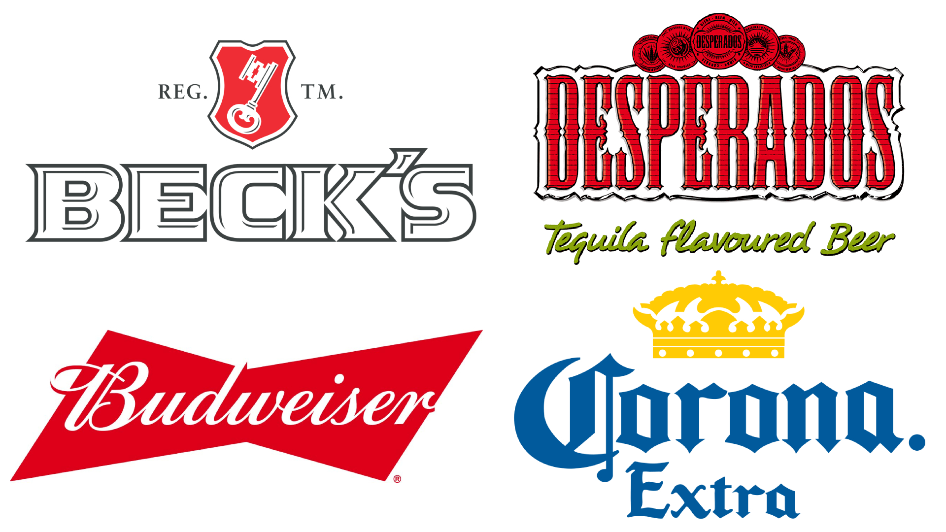
Desperados
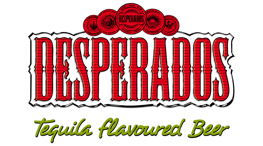
The popular tequila-infused pale lager is produced by a Slovakian subsidiary of Heineken, but its branding relies heavily on Mexican design. However, it doesn’t do so in a corny way, for an end result that is actually quite understated.
The name of the beer is written in red lettering with black stripes going across horizontally, and the letters are all surrounded by white to give them more emphasis. The letters are serifed but in quite an attractive way, while there are three red circles above them, each giving some quick information about the beverage. The phrase “Tequila flavoured beer” sometimes goes at the bottom in green cursive writing, using another colour from the Mexican flag.
Budweiser
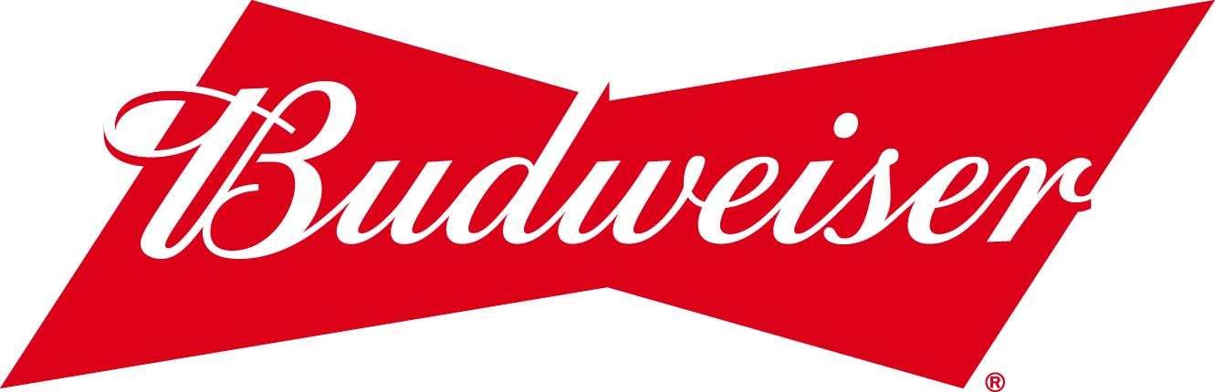
This might be a controversial choice, but I’ve never thought much of Budweiser’s logo. The iconic American-style lager has been a popular choice for well over a century, but their logos throughout history have left a lot to be desired.
For me, the current logo, despite a nice retro nod, is just a bit plain and boring. It does what it needs to, but there’s nothing to set it apart from other logos which might have two or three colours – white and black and something else – and a classic, cursive-style typeface. It’s just a tad dull.
Brooklyn
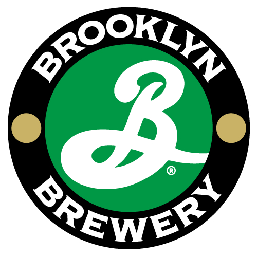
I think the logo of Brooklyn Brewery, established in Brooklyn, New York City, in 1988, is really nicely done. Brooklyn doesn’t market itself too heavily, focusing more on strategies like word-of-mouth and donations to non-profits, but its logo – designed by the legendary graphic designer Milton Glaser – is eye-catching in an understated way.
It has a roundel design with a large cursive ‘B’ in the middle, and then ‘Brooklyn Brewery’ written around it, punctuated by two circles either side of the ‘B’. The best-known logo is black and green, but the logo lends itself well to modifications, and different Brooklyn beers sport different colour combinations. I’m yet to see one that doesn’t look at least pretty good.
Beck's
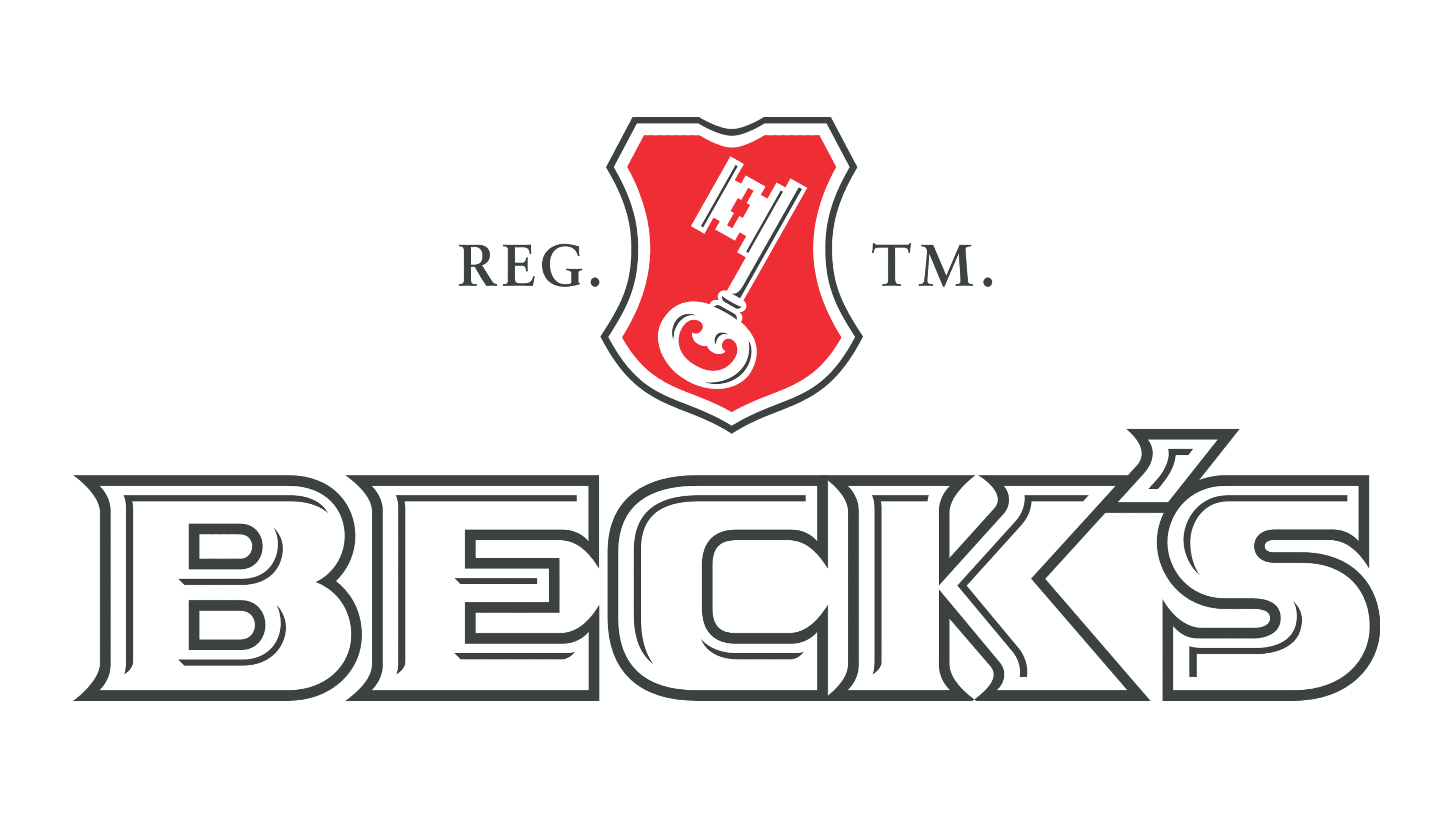
The German brewery Beck’s is another one with a boring logo. The wide, serifed letters are a little forgettable, and the black and white colour scheme isn’t exciting. The key that forms the other main part of its logo is based on the coat of arms of Bremen, where it’s based, and has a nod to St. Peter, the patron saint of the city.
Like a lot of logos from established beer brands, it’s not that there’s anything objectively bad about it. It just doesn’t really do much. In truth, it doesn’t really need to, though – Beck’s is a huge, well-known beer brand.
Corona
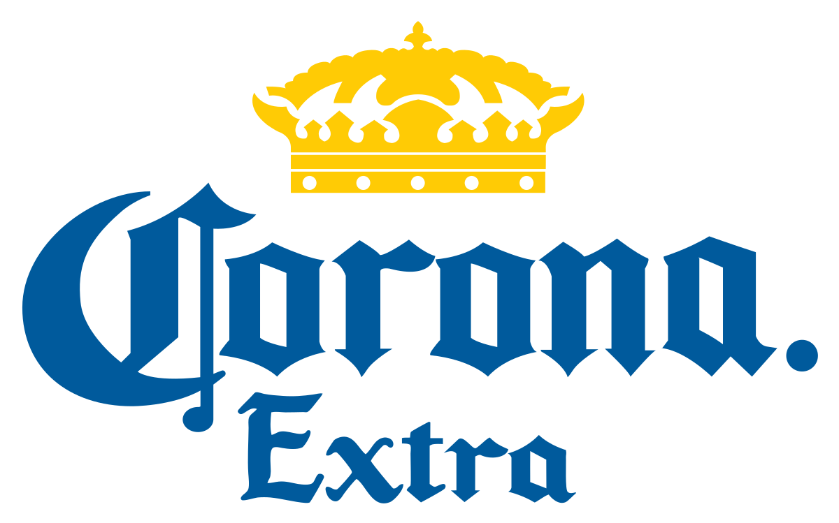
Some of Corona’s adverts might have divided opinion last year, but I do think its logo itself is quite a good one. This Mexican beer brand is best known for its Corona Extra pale lager, but it boasts a range of other beers as well as hard seltzers, too.
Its logo consists of its name in a bold, gothic-looking font, and it’s in a nice blue colour – something that feels quite unusual for big-name lagers. Under the lettering is a yellow medallion that says “the finest beer” in Spanish, while the crown above the lettering is a classy, elegant touch.
No matter your thoughts on the beer logos I’ve both praised and pilloried here, why not take a trip down memory lane and check out some of the beer labels we enjoyed back in 2015? Or, for an alcohol-free experience, take a look at our favourite Dry January ad campaigns this year.