The Alien franchise (okay, maybe just the first two movies) is a cult classic for many cinephiles, famed for its groundbreaking art design and genuinely terrifying plot. One of Alien's most defining yet underrated elements is its iconic minimalist logo, but alternative concept art suggests that it could've looked completely different.
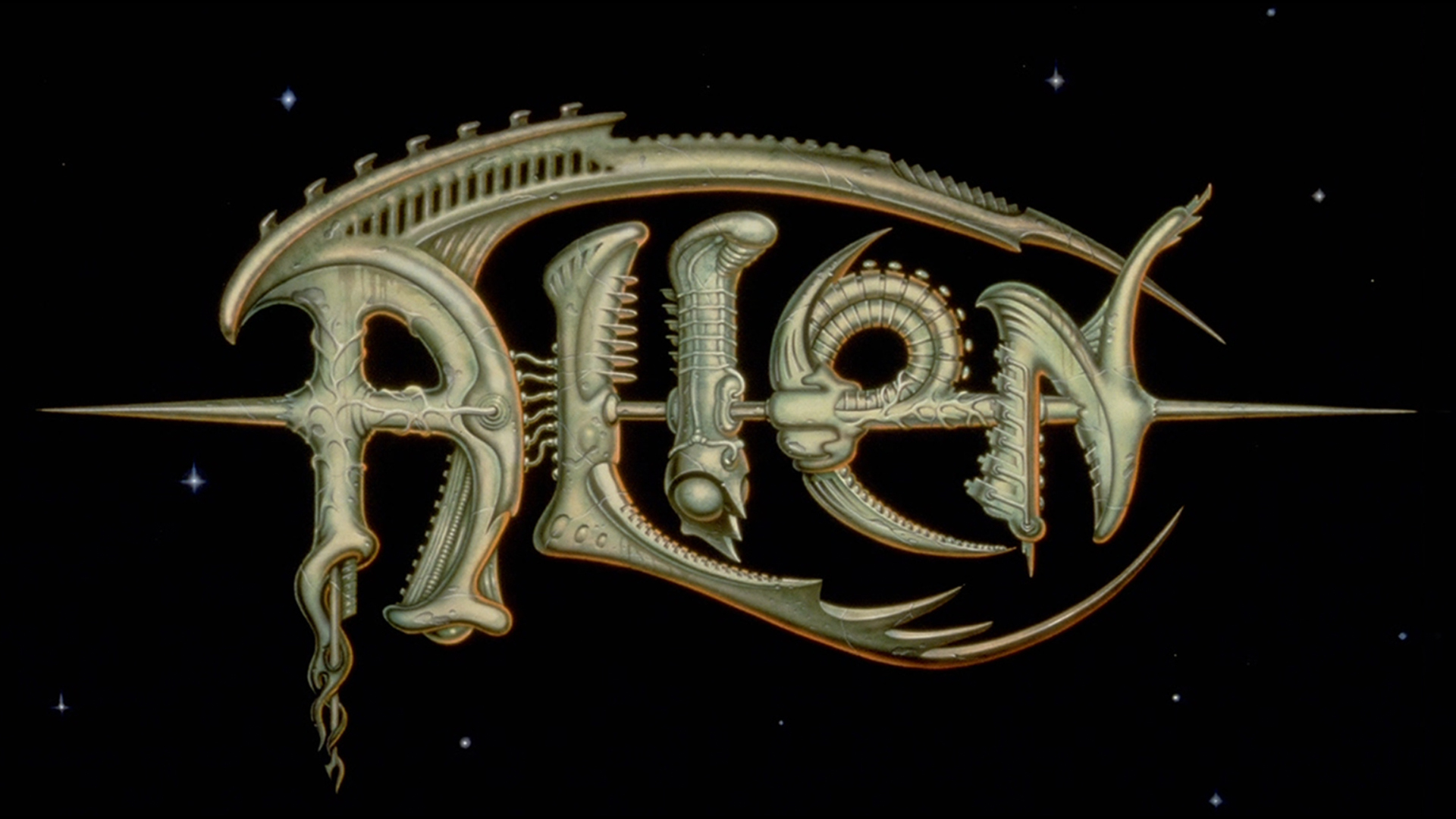
An alternate logo designed by Michael Doret caught the attention of Alien fans who were divided by the creation. The 70's creature feature style is certainly a dramatic shift from the original and in itself, tells a completely different tale. (To find out why we love the original Alien logo, check out our collection of the best movie logos).
Michael Doret is a renowned American designer, illustrator and lettering artist who has created works features across a vast array of media. His edition of the Alien logo takes heavy inspiration from the Xenomorph design, using organic elements from the creature to form unique and detailed typography. With vein details, curved spines and sharp lettering accents, the logo embodies the Xenomorph in an intricate and more literal representation of the classic movie.
Fans of the film took to the Alien subreddit r/LV426 to share their thoughts on the alternate logo. Many applauded the design but felt that it captured a video game essence that was unsuited to the movie. "It's cool but it gives a 'pulpy' vibe," one user wrote while another stated that the logo was more "Hey, there's a monster with these cool bits sticking out of it!" in comparison to the subtlety of the actual design.
While I love the timelessness of the traditional Alien logo, it's a shame that Doret's illustrative design wasn't utilised in a game franchise or comic series. I adore the H. R. Giger style that he's captured but agree with the general consensus that it's perhaps a little too literal for the movie. Ultimately it reminds us of the importance of considered logo design that tells a story in tadem with the movie.
For more inspiring logo designs, check out the best logos of the 1970s or take a look at the world's oldest logos that date back to the medieval period.