I’ve spent most of the last twenty years trying to make brands work. Not brand building or ‘creating iconic brands’, just trying to make them work. And it’s hard. Through some wonderful successes and some abject failures, I’ve developed strong beliefs about how these odd things we call ‘brands’ work.
One of the most central of these is that design is your biggest lever. It’s the most powerful thing you can use to make your brand work. Think about brands that have sustained amazing results over time – it’s really hard to think of one that has bad design. There are plenty of weak brands with good design, but the strong set, that iconic group we all want to be part of, they all have great design. So, why does this happen? I think there are three main reasons.
First, design can’t be ignored. About seven years ago, Bruce Duckworth did some work for Carlsberg, the multinational brewery, to explain design to my team, and I’ll never forget what he said: ‘Design is the marketing people can’t, and don’t want to, ignore.’ You’ll hear more and more about how consumers are actively avoiding marketers’ efforts to intrude into their lives and burrow into their conscious and unconscious minds. They are smart about this, and they increasingly (for a price) have ways to easily opt out.
I see so many design briefs that are basically saying, ‘Make it look better.’ That’s not a brief
But they can’t opt out of design and, better yet, they don’t want to. They want to see the new iPhone, they like picking up beautiful products on the shelf (even if they don’t need them), they obsess over the design of the latest Nike release, and they post beautiful things on their own social media channels to share with all their friends. All of this is driven by design, not by intrusive content that we must beg, cajole and pay them to watch or listen to. People welcome beautiful things into their lives. And let’s be honest: they don’t do that with most of the things we create as brand people.
Second, design communicates more clearly than anything else you have as a brand. We constantly hear the cliché that ‘a picture is worth a thousand words’ and yet, even in a world where most social media video content viewed on a smartphone is done so with the sound off, clients and agencies still obsess over storytelling through words and pictures. When attempting to explain brand ideas, they foolishly begin by asking, ‘What will the TV advertisement look like?’ I see so many design briefs that are basically saying, ‘Make it look better.’ That’s not a brief. Sometimes we try a little harder and write phrases such as ‘Improve standout/make it look contemporary’, but that’s the same thing. You can’t simply ask for something to be ‘better’. It’s lazy and misses the point. You must be specific about what you want the design to say. Every element of your design must be intentional; it has to tell your story, because it will communicate: your job is to make sure it communicates the right thing. As Bruce said, ‘Everything communicates something.’
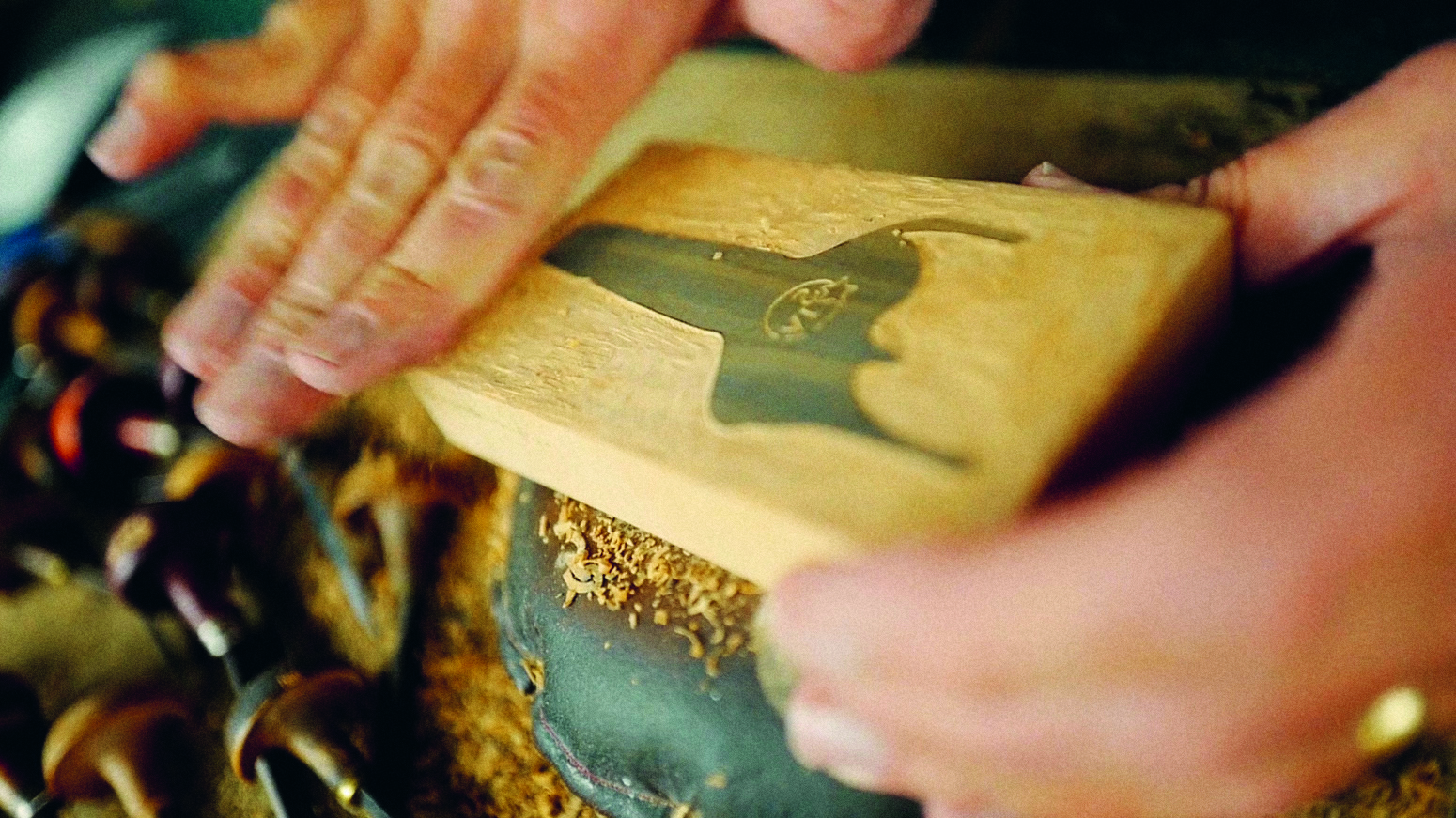
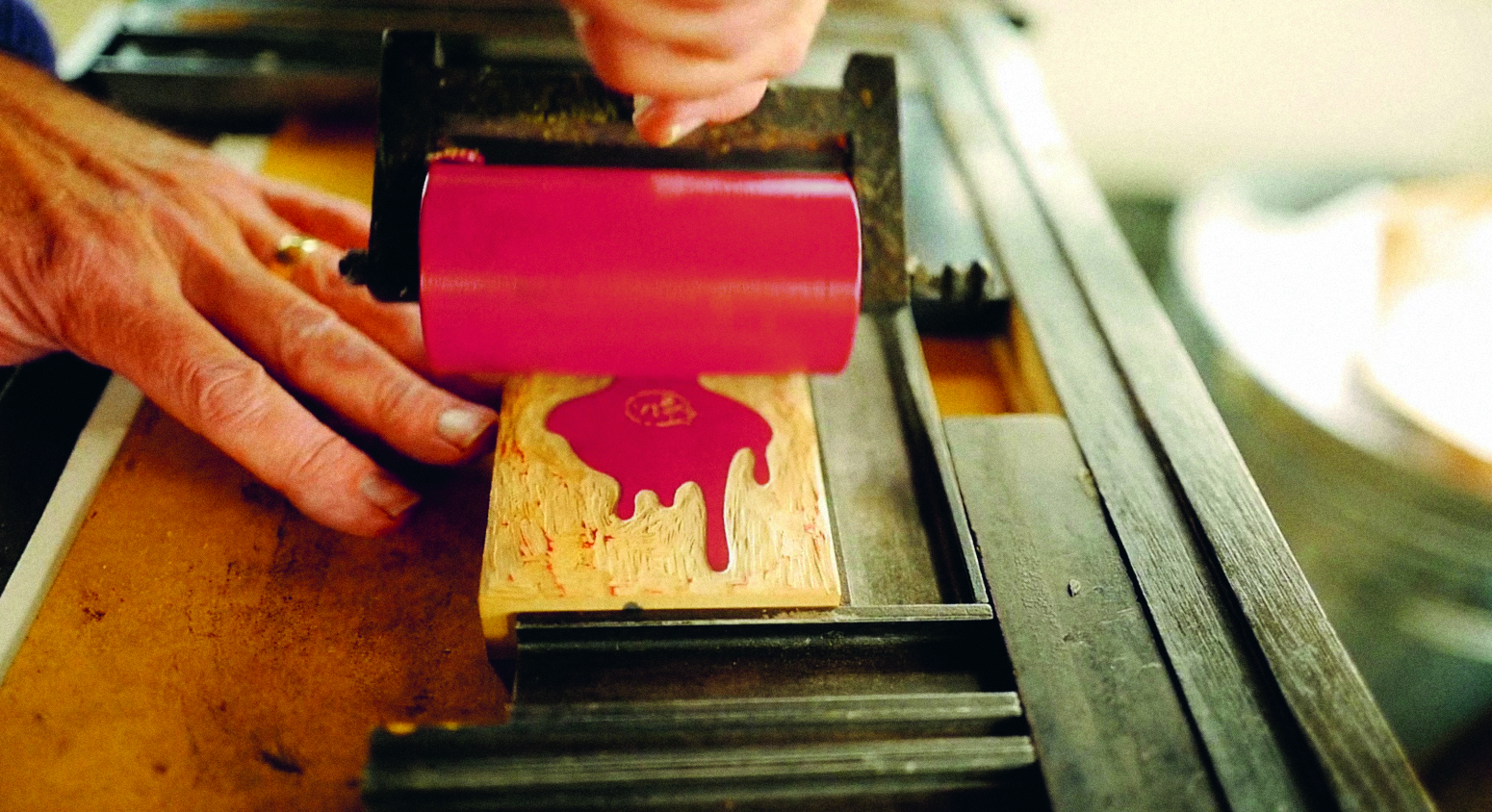
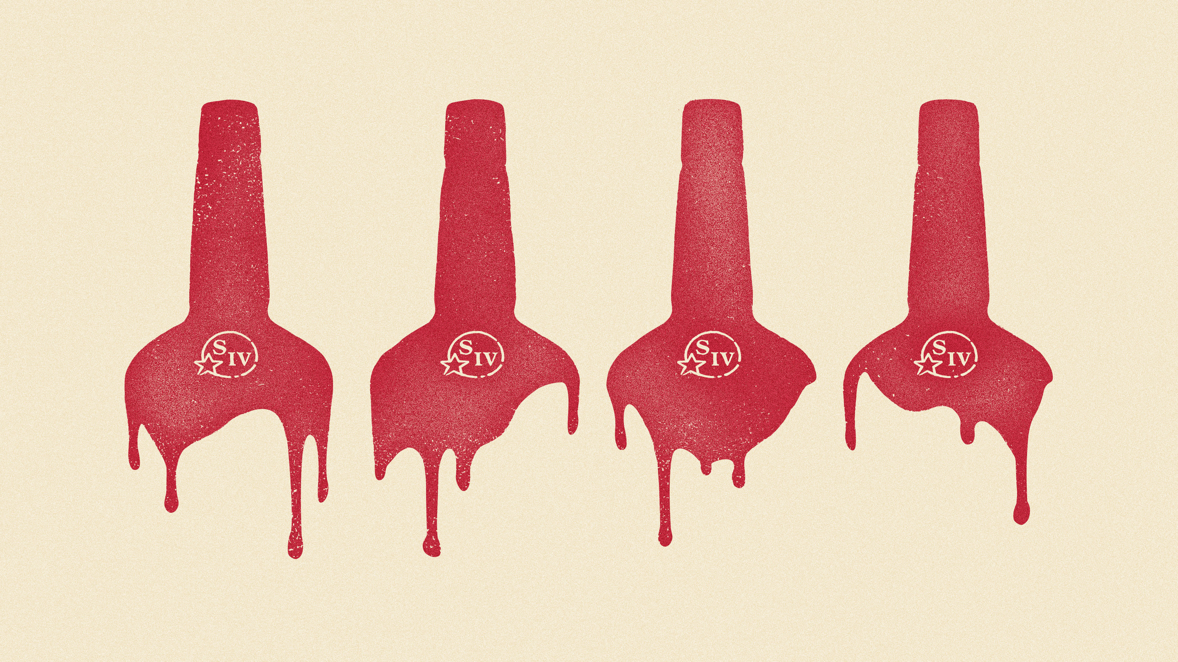
When we started work on Maker’s Mark, a hand-made bourbon whisky, we knew it was different from other brands. But the image from the design was slick, black, shiny, communicating that it was made by a machine. It didn’t matter how much we told people the brand was hand-made: everything they saw was screaming the opposite. And guess what? They listened to the design (they always do), not to the words that we were saying.
However, when you get the design right, people will feel what you are saying. They can’t always put it into words, but it’s there – loud and clear and doing a lot of the hard work that a thousand words never could.
Third, design lasts – and you should want it to. It usually requires a significant investment (people and money) to change design, so we tend not to do it all the time, thankfully! But there are also reasons beyond cost and effort. People learn to know and love what a brand looks like, and you change that at your peril. This means it’s the element of your mix that should have the most senior attention, the most long-standing agency relationships and the most control. People are pretty forgiving of brands producing terrible social and mainstream media content; ultimately, this content is ephemera, even in today’s world. But when it comes to design, they won’t forget – or forgive – when you get it wrong.
The biggest brand declines are generally driven by quality issues or design changes. Very few brands fall off a cliff because of a bad piece of content. But change the design in the wrong way, too much, too soon, not done in a way that feels authentic, and you will lose people fast. Treat it well and it’s an incredible asset. On Carlsberg, we had (probably) the most recognisable and loved brand logo in the world of beer. And, when we realised this, it became unbelievably powerful. We once ran a sponsorship campaign that only showed the word ‘Probably’ in our unique font. We had the second-highest brand awareness of all sponsors, from a set that included Coca-Cola and McDonald’s! The power you gain from absolute consistency in your visual assets is immeasurable. So, treat your core assets with immense respect, control them at the most senior level, know and love them, and protect them with the same vigilance that you protect your product quality.
So, there you have it, three big reasons why design always comes first for me. As I continue my journey to ‘make brands work’, I get more fixed in my view of how this happens. I tightly hold onto these thoughts and principles as my North Star, and as a reminder of where to put my time and energy. And beyond all the good reasons to do this, it’s just fun. There is nothing like the experience of creating a beautiful world for your brand to live in; one that protects and honours its heritage, communicates its story and brings joy to people who experience it. I love it.
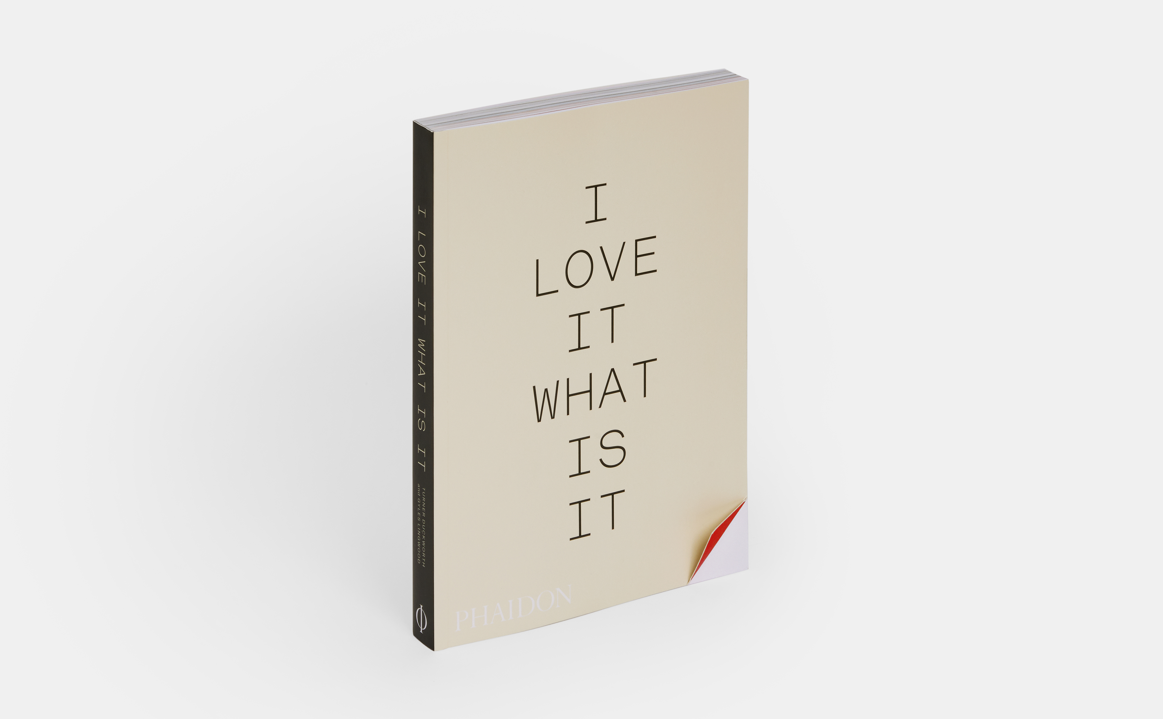
Excerpted from I Love It. What Is It?: The power of instinct in design and branding © 2024 by Turner Duckworth and Gyles Lingwood. Reproduced by permission of Phaidon. All rights reserved.


