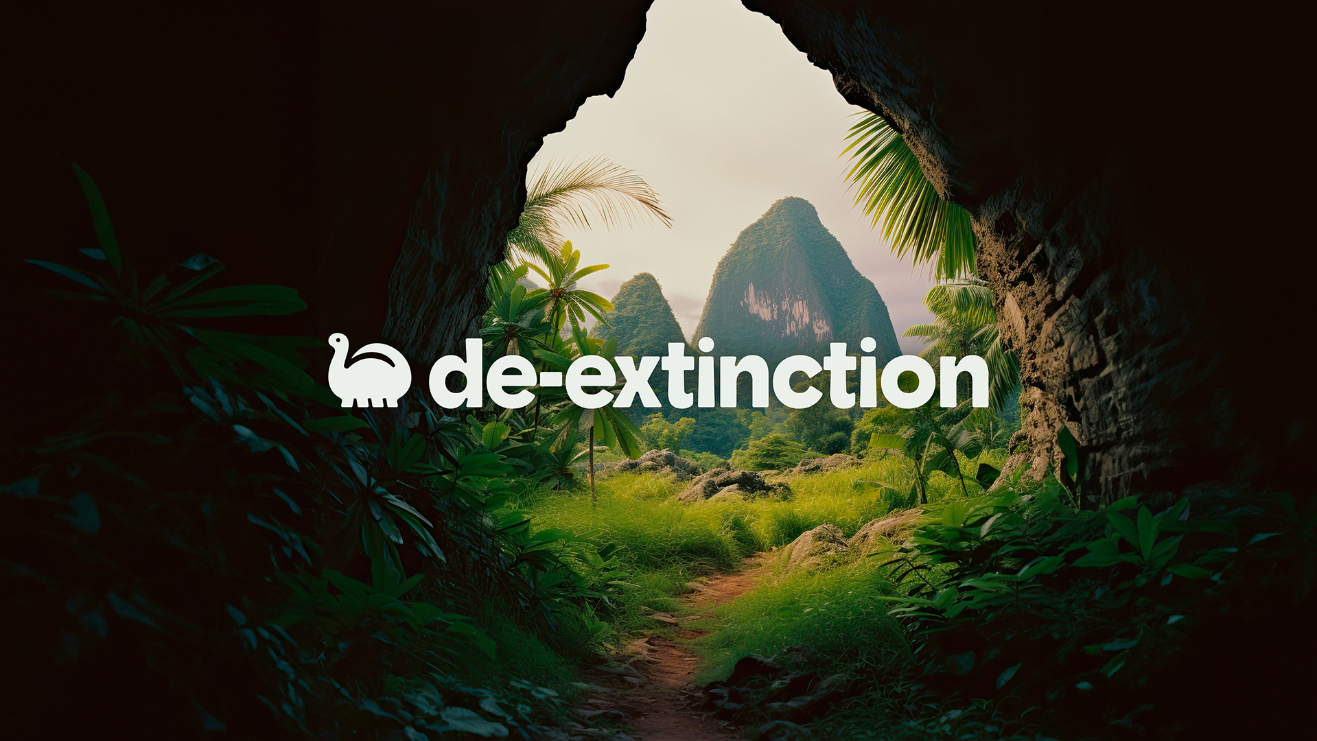
Design agency Koto has teamed up with the packaging company De-extinction to launch a new campaign focused on all things eco-friendly. As we move to a more environmentally conscious society, purging plastic packaging is at the forefront of our minds, but all this eco-conscious design can quickly turn into a blur of beige.
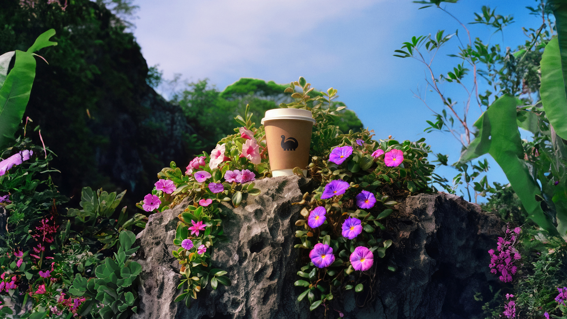
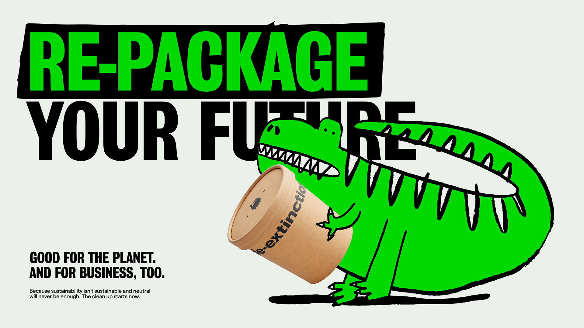
De-extinction is a brand that wants to change second thought plastic packaging into a primary concern, with aims to banish single use plastic for good. The brand is passionate about creating packaging that is eco-friendly yet playful, breaking the mould of its environmentally conscious competitors. We love brands that aren't afraid to push the boundaries, and these standout packaging designs are a masterclass in creative excellence.
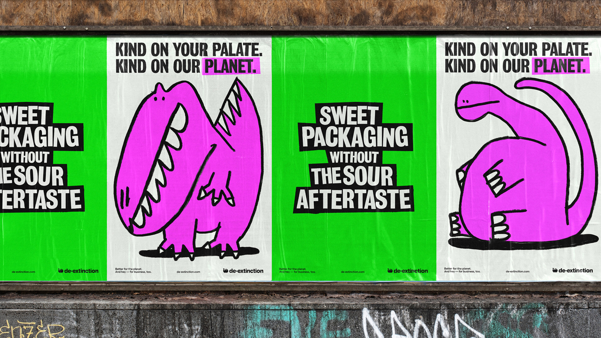
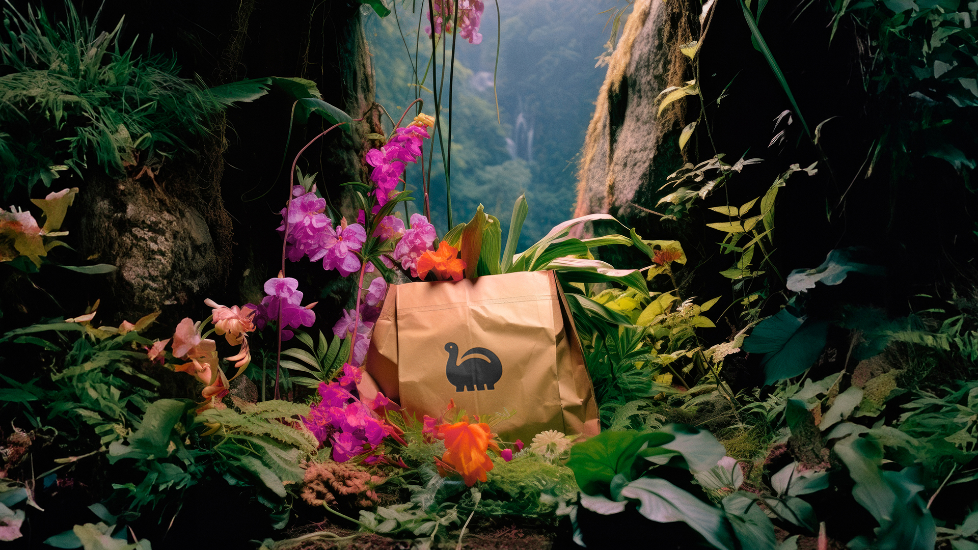
The brand has launched a campaign featuring pre-historic motifs to accommodate its brand identity. Adopting playful dinosaur illustrations in a rounded, childlike style, the brand maintains a level of contemporary playfulness that aligns with its rebellious spirit. The dinosaur imagery is an obvious link to the concept of extinction, a thought provoking metaphor for our fate if we continue to neglect environmentally conscious choices.
Moving away from the typical muted green and neutral colour palette that we've come to associate with eco-friendly packaging, the brand has instead opted for bright pinks and purples against a striking highlighter green. The logo uses Grotesque no.9 font, a bold typeface that embodies the importance of the brands ethos.
"Our vision was to stand out from a sea of sameness," says Koto's creative director Arthur Foliar. "Every choice focused on breaking conformity to give De-extinction a provocative point of view." The brands bold and confident style certainly helps it stand out against its competitors. By binning the beige of traditional eco-conscious brands, its already established itself as a frontrunner in unique and visually engaging marketing, a hopeful sign for prospective brand partners.
De-extinction's launch is an exciting ripple in the world of eco-friendly packaging, proving that not all eco-conscious design has to be drab and beige. It's engaging to see a brand embracing playful imagery in tandem with a serious topic that has become somewhat overwhelming to process as a consumer. If you want to find out more about what the brand has in store, check out Koto's website to unearth more about De-extinction's environmental ethos.