You may not have realized the outdated living room colors in your space are holding back your aesthetic and the enjoyment of it. As with fashion, the popularity of colors rise and fall in home decor, too.
If you love to follow those trends, our expert guide is for you. In it, our interior designers reveal the nine outdated living room colors to swerve, and what to try instead including, aquamarine, plaster pink, and mint.
Settling on the best living room ideas for you will bring full enjoyment whenever you're in this space, so it's key to get the main color right, whether that's from paint or wallpaper.
Outdated living room colors to avoid
It's time to say goodbye to interior paint color trends that aren't working for you anymore, and hello to fabulous expert-approved alternatives to breathe life into your space again.
Where our experts have product suggestions, our in-house shopper has curated carefully matching buys to help you get started on your living room color ideas.
Prices were correct at the time this article was published.
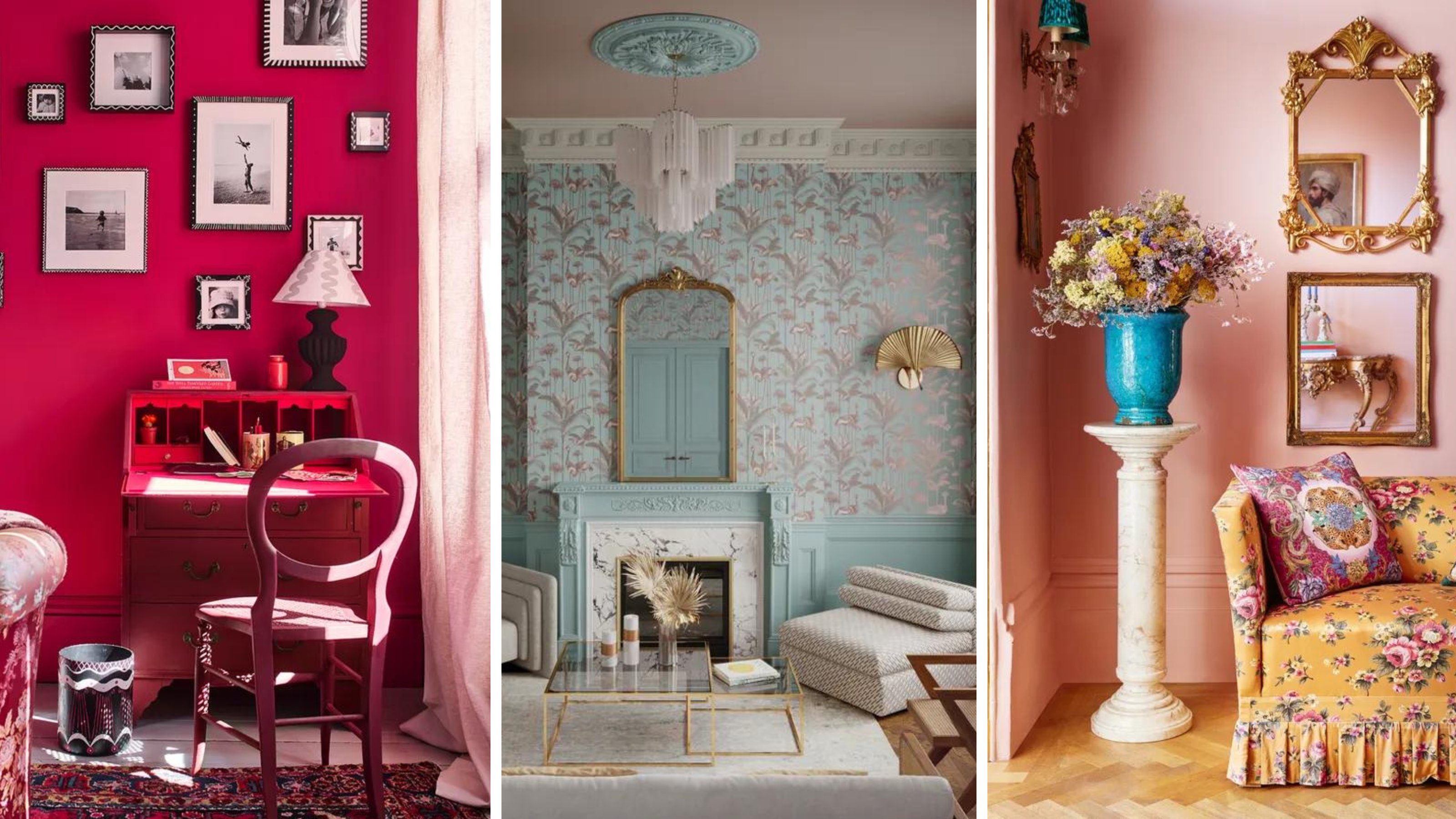
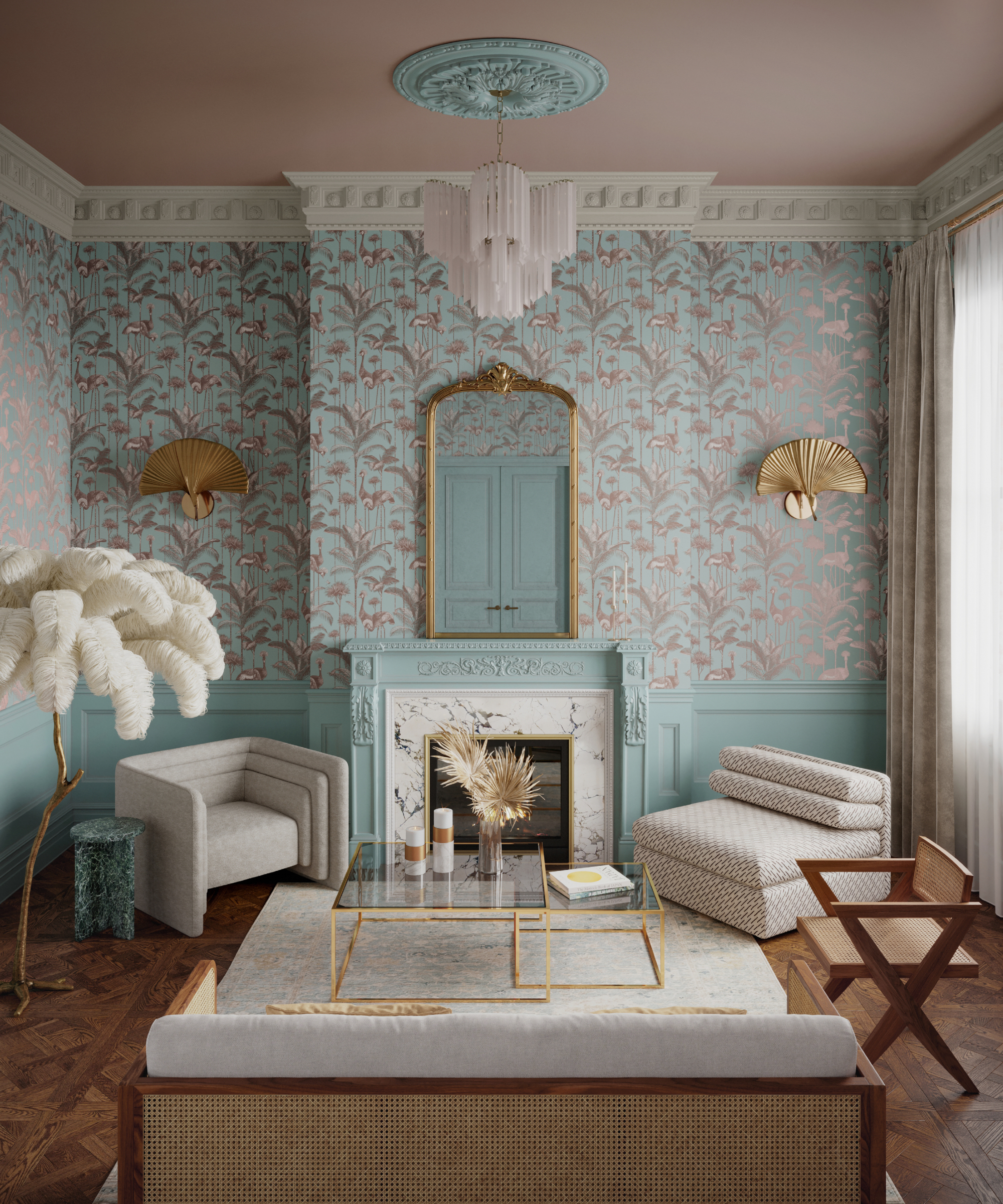
1. Ditch sky blue, embrace aquamarine
Admittedly, sky blue can be a lovely shade to have in a living room, but if you get it wrong, it can feel cold and uninviting and that's where the problem is, especially as there are many shades to choose from.
Jamie Watkins, co-founder of Divine Savages, says, "If you’re hoping to achieve a breezy, serene vibe in your living room, opt for a gentle aquamarine hue, reminiscent of tropical seas, over brighter pastel blues. Aquamarine is both modern and elegant in equal measure."
The reason aquamarine works better is that it's warmer visually and you don't risk the 'coolness' that can come with the wrong shade of sky blue.
For a similar aquamarine to the one pictured, try Benjamin Moore's Iced Green 673.
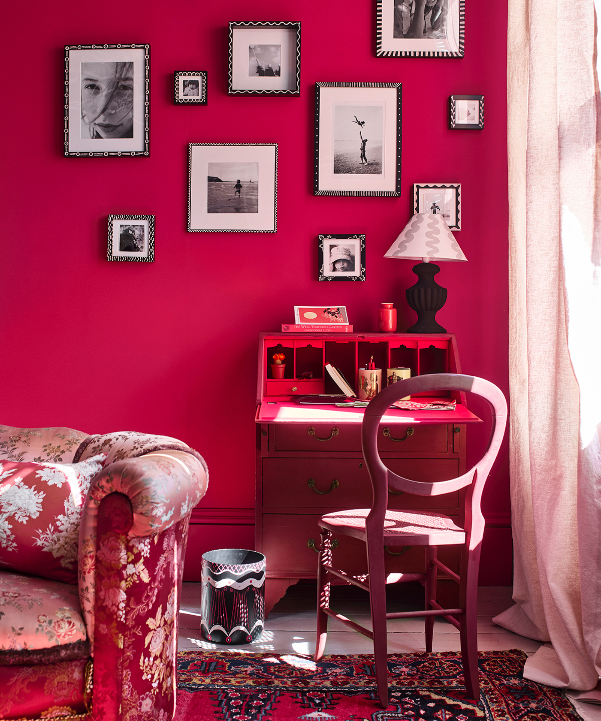
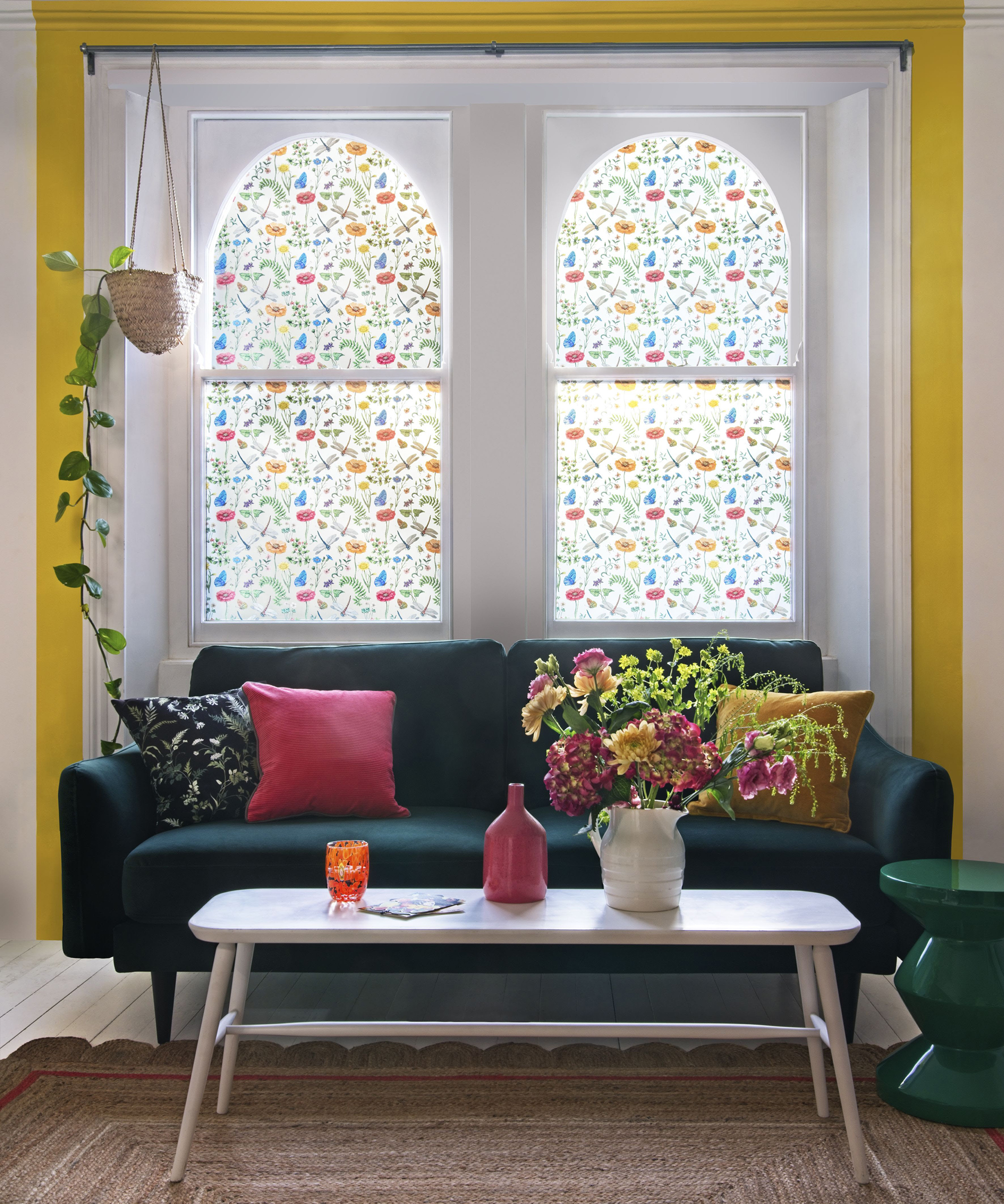
2. Swap beige for plaster pink

If you remember the days of magnolia from floor to ceiling then that's how beige is currently viewed in the interiors industry. Whilst it can be good as a blank canvas, why settle for average when you can have pretty plaster pink instead?
“Be wary of beige, which can sometimes come across as dull and uninspired. Instead, choose an earthy tone of blush or plaster pink," says renowned interior designer, Matthew Williamson. "These pinks have become my go-to neutrals, offering a gentle warmth that is both versatile and inviting, whilst also introducing a more playful element."
We love plaster pink, it's easy on the eye and can warm up the coldest north facing room. Try Lick's Pink 05 or Farrow and Ball's Setting Plaster, and team with yellow to copy Matthew's fabulous style, pictured above.
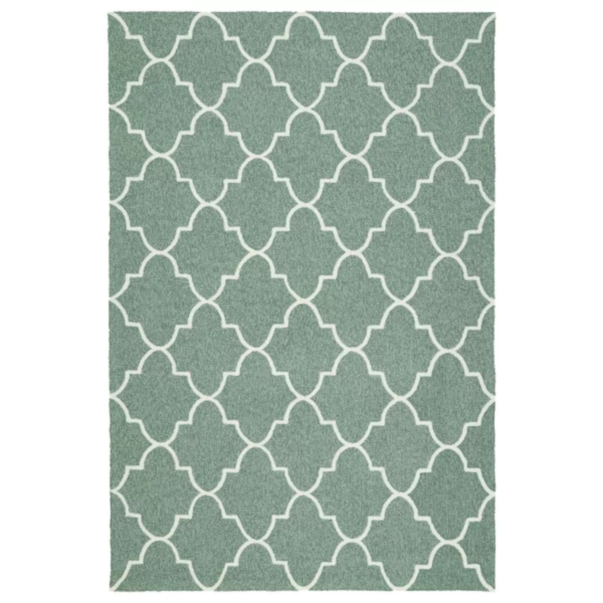
3. Choose mint over forest green

Green living rooms are still popular, but some shades are better to choose than others. Dark greens are out and mid greens are in. So, ditch forest green as it's quite hard to get the tone right, and choose a warming, lighter shade instead.
Patrick O'Donnell, brand ambassador, Farrow & Ball agrees. He says, "Mid greens are always a safe bet — calming and relaxing. Something more nuanced like Farrow and Ball's French Gray , which is not too bright, creates a wonderful, restful environment."
Perfect living room color inspiration for a cozy, snuggly space.
Price: $134.99
Size (in): W60 x L90
A cozy wool rug with a smart geometric design, pair with a modern coffee table.
Price: $21.99
Size (in): H9 x W3.3 x L3.9
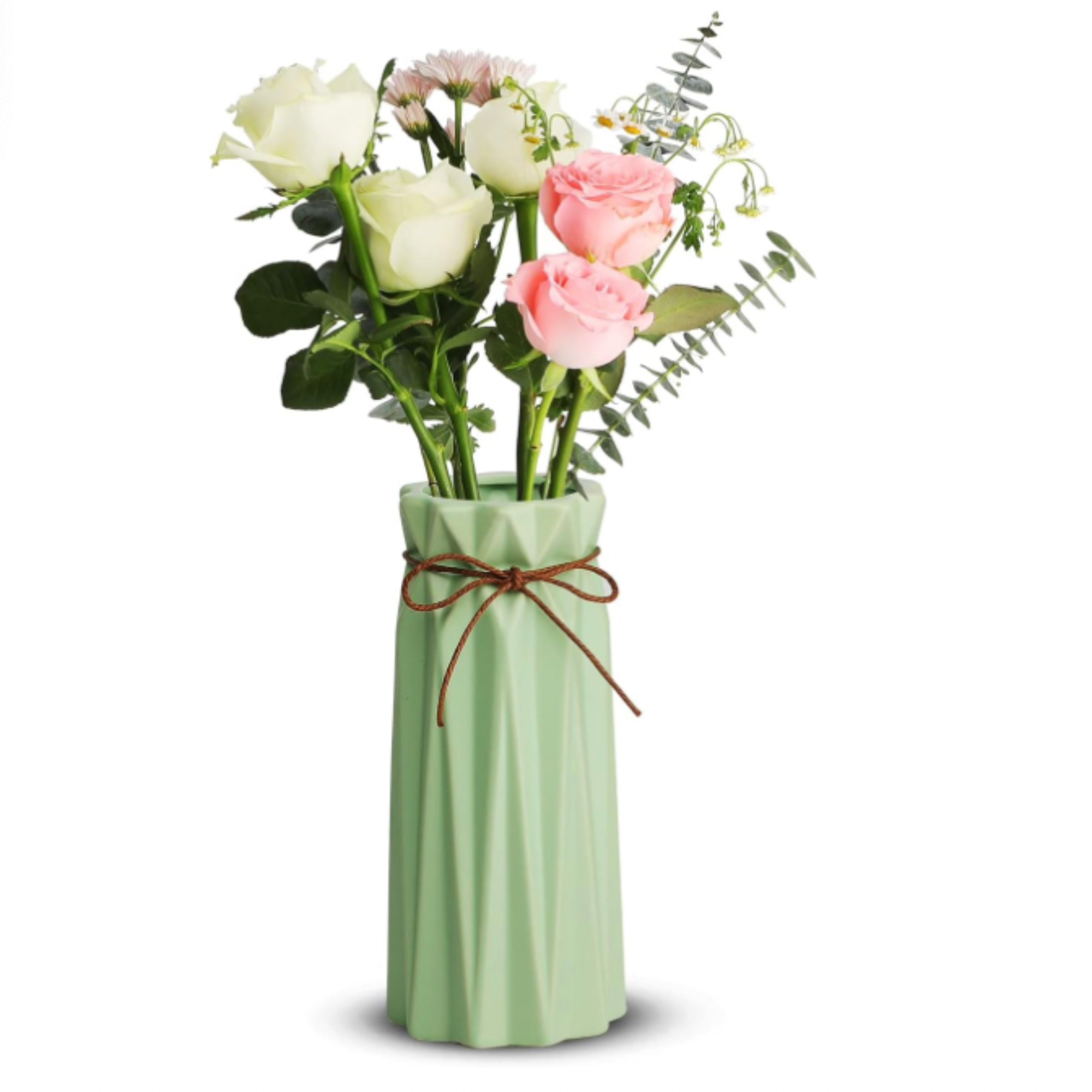
A mint green minimalist style vase with geometric style design, ideal for a mantel.

Price: $2 for a peel and stick sample
A lighter green that will look great with coral or blush accents.
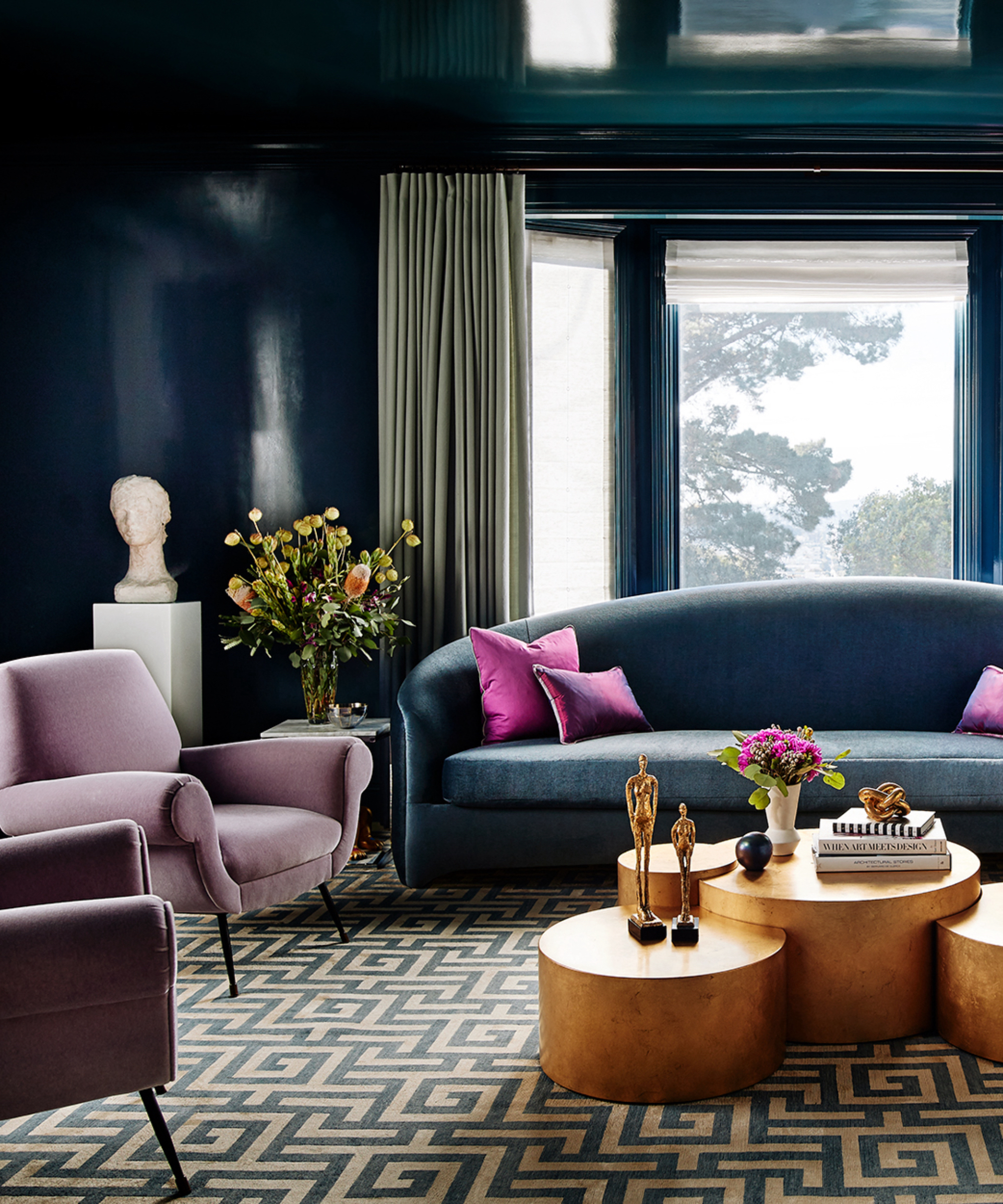
5. Say no to black and opt for hot pink
Many love a dramatic living room and black will certainly bring that. But it can also zap the light from the room. Hot pink will bring drama without leeching the illumination from the space.
Annie Sloan CBE, paint and color expert, says, “I love bright living rooms, they give me energy, inspire me, and make me feel more sociable. This is your leisure space, where you can truly be yourself. Paint a color that makes your heart sing, and then for extra points, layer in a few splashes of a complementary color.
"For example, transpose a deep hue with a hot pink, or offset a sunny yellow with a mellow green, for maximum color payoff. Save calmer shades for bedrooms."
We agree with Annie, and a hot pink although dramatic is uplifting yet cozy at the same time, which gives you the best of both worlds. The shade Annie used in the living room pictured above is Annie Sloan's Capri Pink.
5. Say bye to brilliant white and opt for chalk
There are many benefits to a bright white living room and it certainly gives you a blank canvas to play with. But it can feel too clinical, as well as very cold in a north-facing room. There are many off-white shades to choose from to create a similar look without the unwanted coolness.
Mark Winstanley, chief creative officer at The White Company explains, “When working on a white scheme avoid cold, bluey-white tones and opt for softer whites like alabaster, ivory, and chalk.
"There as so many variations of white on the market now, so invest in some sample pots and try before you buy. White-painted walls will instantly brighten up a gloomy room and make it feel bigger by expanding the space visually.”
For a lovely chalky white with a hint of warmth, consider Benjamin Moore's Gardenia AF-10.
6. Say no to dusky pink, try indigo
Dusty pink is a no? Whilst we are big fans of pink, there are certain shades that are better than others, and more suitable living room color ideas.
"Contrary to popular demand, and I hate to say it because I do love all colors but I would avoid dusty pink in a living room. It is very in Vogue right now but much like mauve in the 80’s when it goes out it is really going to go OUT and look extremely dated," explains Katie McCaffrey, owner and principal of McCaffrey Design Group.
So what does Katie suggest instead? "If you want a splash of color I find dark blues always stand the test of time, they are very liveable no matter what shade."

Price: $147.99
Size (in): H32.75 x W29.75 x L30
A stylish contemporary armchair with sleek lines and a button back.

Price: $2 for a peel and stick sample
A midnight indigo blue shade that will add drama and depth to your living room.
Price: $30
Size (in): W50 x 70
A dark blue knit throw for cozy evenings, fold up over the arm of your couch when not in use.
7. Swap terracotta for sunshine yellow
Terracotta has been a popular choice over the last year and it definitely has its place, but rooms that bring real joy are a holding color theme, says Real Homes editor, Punteha van Terheyden.
"The most important thing about choosing a living room color to update your outdated space, is picking one that makes you happy every time you look at it. Whilst terracotta is easy on the eyes, a sunny yellow will lift your spirit every time. And, if your living room is south-facing, yellow will make it quite literally glow."
Yellow, is full of positivity and joyfulness but if you don't want to use it all over, choose a feature wall or paint your woodwork instead. It really will lift your mood and looks great with other bright shades.
For a yellow that packs a punch, try Benjamin Moore's Amarillo 320, it's not too acid bright but is still a happy shade.
8. Opt for red over coral

Coral has been a popular choice over the last year, but be bold and commit to cozy vibes with a deep red. Vibrant and bold, it's a great choice for a north-facing living room that needs warming up.
It also looks great paired with other bold pops of color — think yellow, bright pink, electric blue and orange. They will add dimension and break up an expanse of red.
If you don't want to paint red, consider a beautiful red wallpaper instead such as the pretty Kenyon Floral Double Roll from Wayfair.
9. Avoid neutrals and choose charcoal
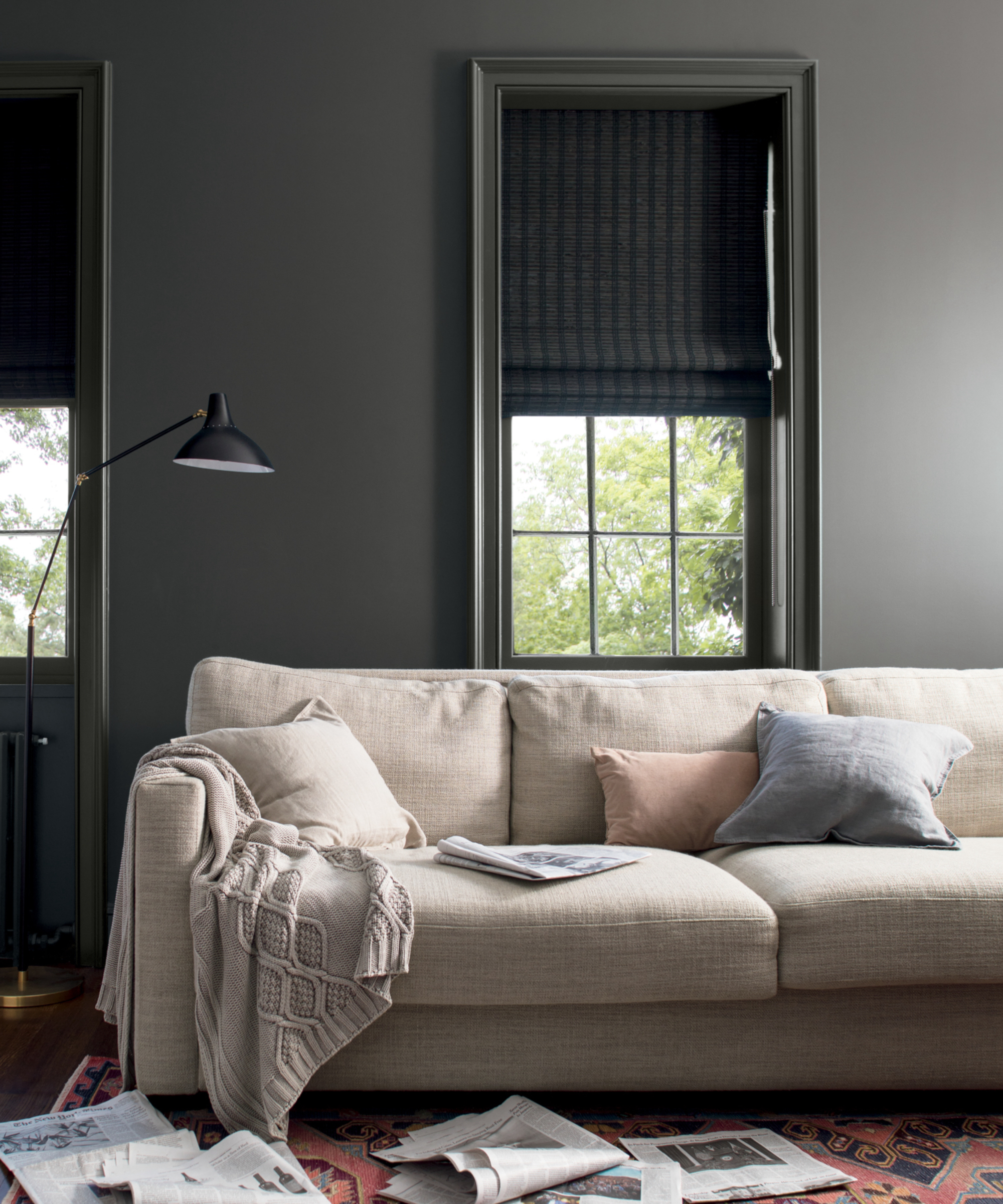
Neutrals have their place, but for a living room that looks stylish and has textural layers that are visually interesting, try a darker base such as charcoal gray.
It can be a warming color if you pick a shade with warming undertones. If the thought of going too dark is a little scary then take Katie McCaffrey's advice and dial it down a little.
"Warm greys and greiges also look great year after year, and can act like a lovely calming shell while you alter the colors of other items in the room — I like to do pops on pillows and rugs as it can be much easier and cost effective to swap out if you want to change the look or feel of your living room over time."
Lick's Grey 07 Matt has warm green undertones and will look fabulous paired with crisp white.
Color is very subjective and important to us all for different reasons, we can be guided by what's hot, but always choose a shade that you love and know if you take the plunge and hate it, you can paint over it and try again.
Next, cast a critical eye over your space and see if any of our tips on how to modernize an outdated small living room might bolster your aesthetic.