Real estate is a competitive industry, and top-notch branding can help realtors stand out. While some companies design their logos in-house, it's not surprising that many will seek out the best logo designer they can find.
It's not uncommon to see companies undergoing rebrands and changing up their logos to better appeal to their target audience. For those estate agents with a broad target market, minimalist logos with popular colours are common, while luxury real estate companies often plump for sleek and classy yet timeless designs.
And then there are modern startups, which will often take note of the top logo design trends when working on branding. Although we will say that real estate logos in general are not known for their cutting-edge design.
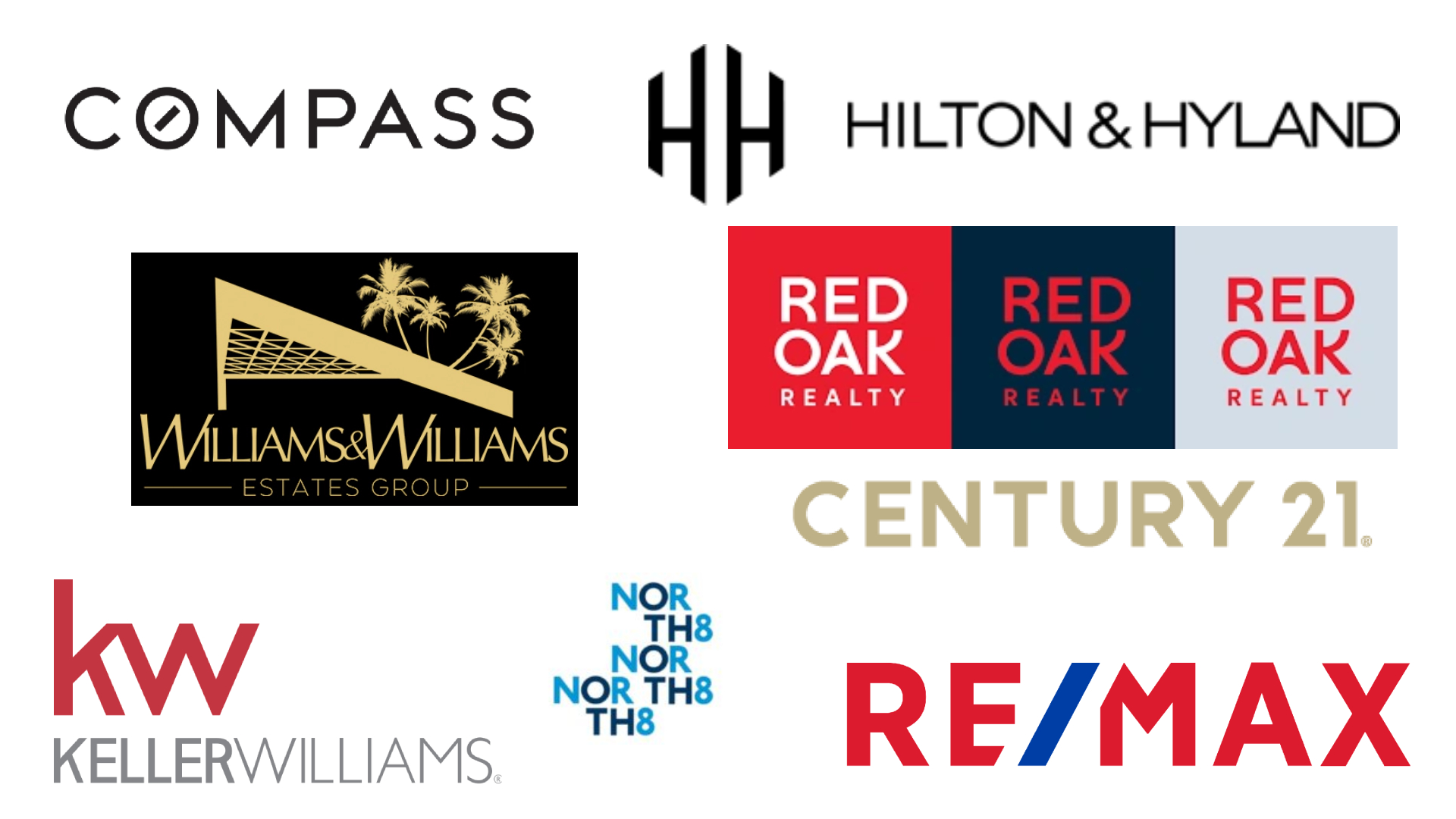
Even if the below don't quite measure up to the best logos, overall, here is our list of the best real estate logos, taking into account everything from colour to typeface to imagery to the brand's target audience.
01. Century 21
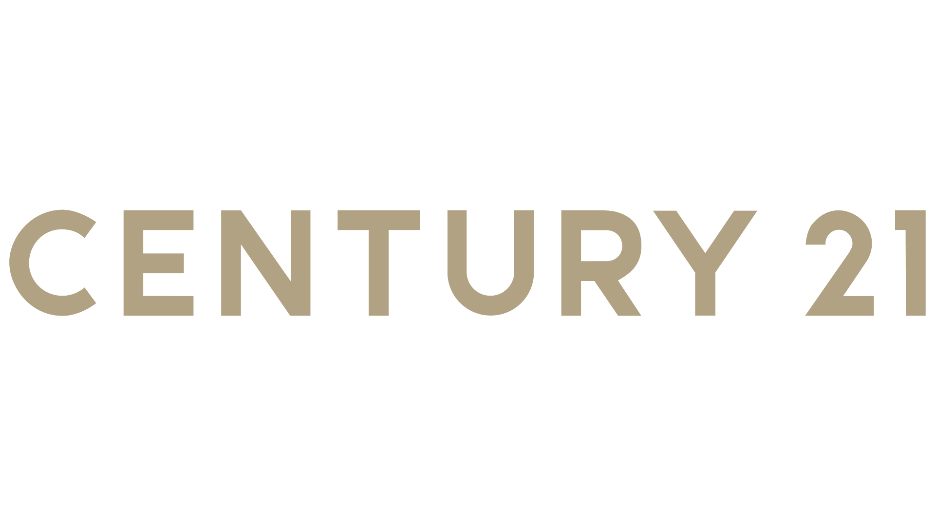
Century 21's logo isn't fancy, and it isn't reinventing the wheel with its design.
However, it's a good fit for its broad and varied audience. Century 21 was founded over 50 years ago, and operates in over 80 countries across the world. It underwent a rebrand in 2018 for a sleeker look that still features the company's gold and black colour scheme.
In colour theory, gold represents wealth, knowledge, success and accomplishment, making it ideal for a real estate company with a large target market.
02. Red Oak Realty
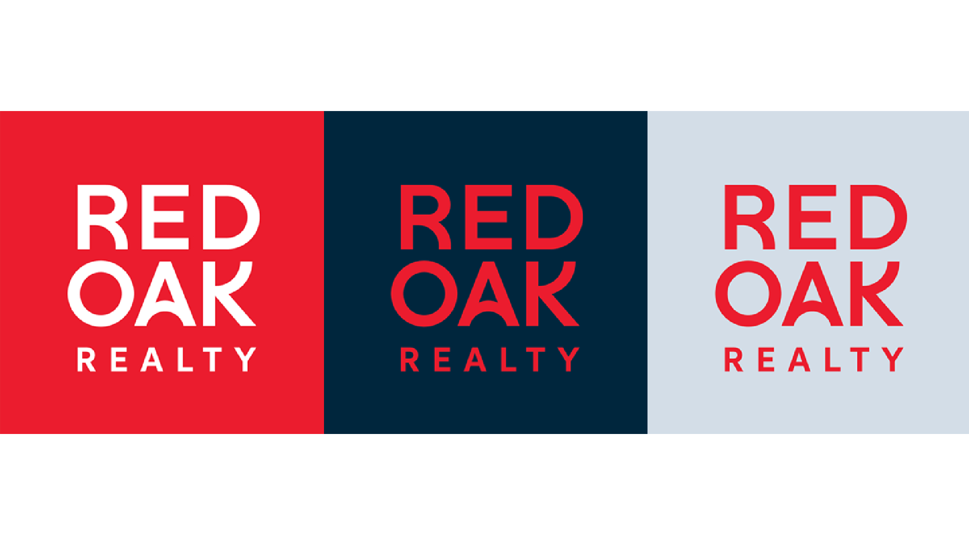
Like Century 21, Red Oak Realty rebranded in 2018. It went for an impressive colour scheme with red the focus, making it eye-catching and memorable.
The bold typeface is both serious and familiar, reiterating the company's reputation as a respected local real estate company, but the rebrand and new logo gives it a more modern feel, too.
And red can symbolise warmth, confidence and passion, making it a good fit for a real estate company.
03. Williams & Williams
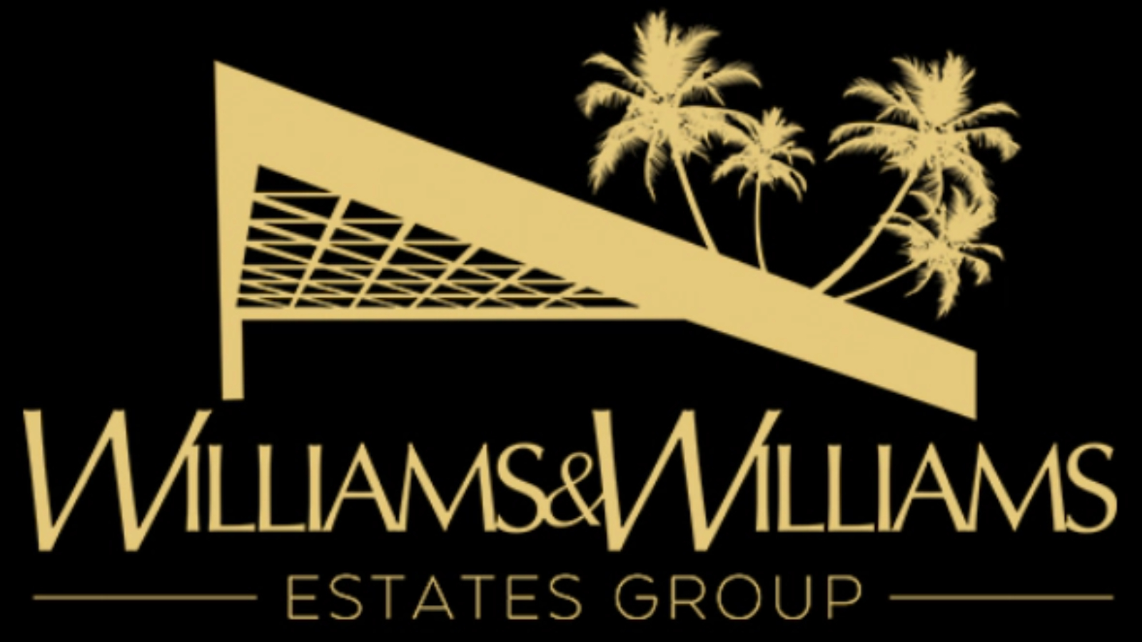
As a luxury real estate company, Williams & Williams has a different target market to many of the other real estate agents here.
And it also has one of the best real estate logos around. The black and gold colour scheme looks classy and luxurious, and the logo has a timeless feel that simultaneously looks fresh but also harks back to 1960s logos and those of the 1970s.
The company used John Lautner's iconic Sheats-Goldstein residence in the logo to convey a sense of luxury, alongside palm trees, which give the feeling of being on holiday.
04. Compass
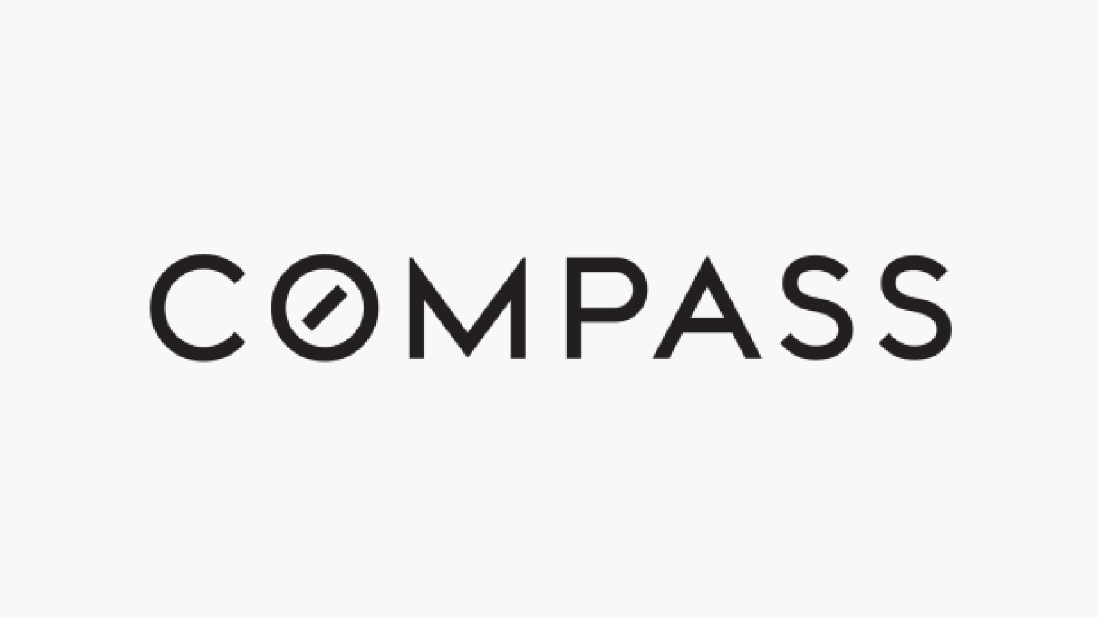
Compass is a relatively new real estate brokerage, getting off the ground in New York City in 2012.
Branding was something that the company gave a lot of thought, and it worked on its logo in-house rather than using a marketing agency. And the result is impressive – a minimalist logo that exudes a cool confidence. It evokes thoughts of a tech startup, perhaps unsurprising when considering that the executive director used to work at X and has founded companies acquired by X and Google.
The letter 'O' symbolises the needle in a compass, which is a clever touch, while the tracking works well with the rounded letters in the typeface – it doesn't feel too claustrophobic and clustered together.
05. North 8
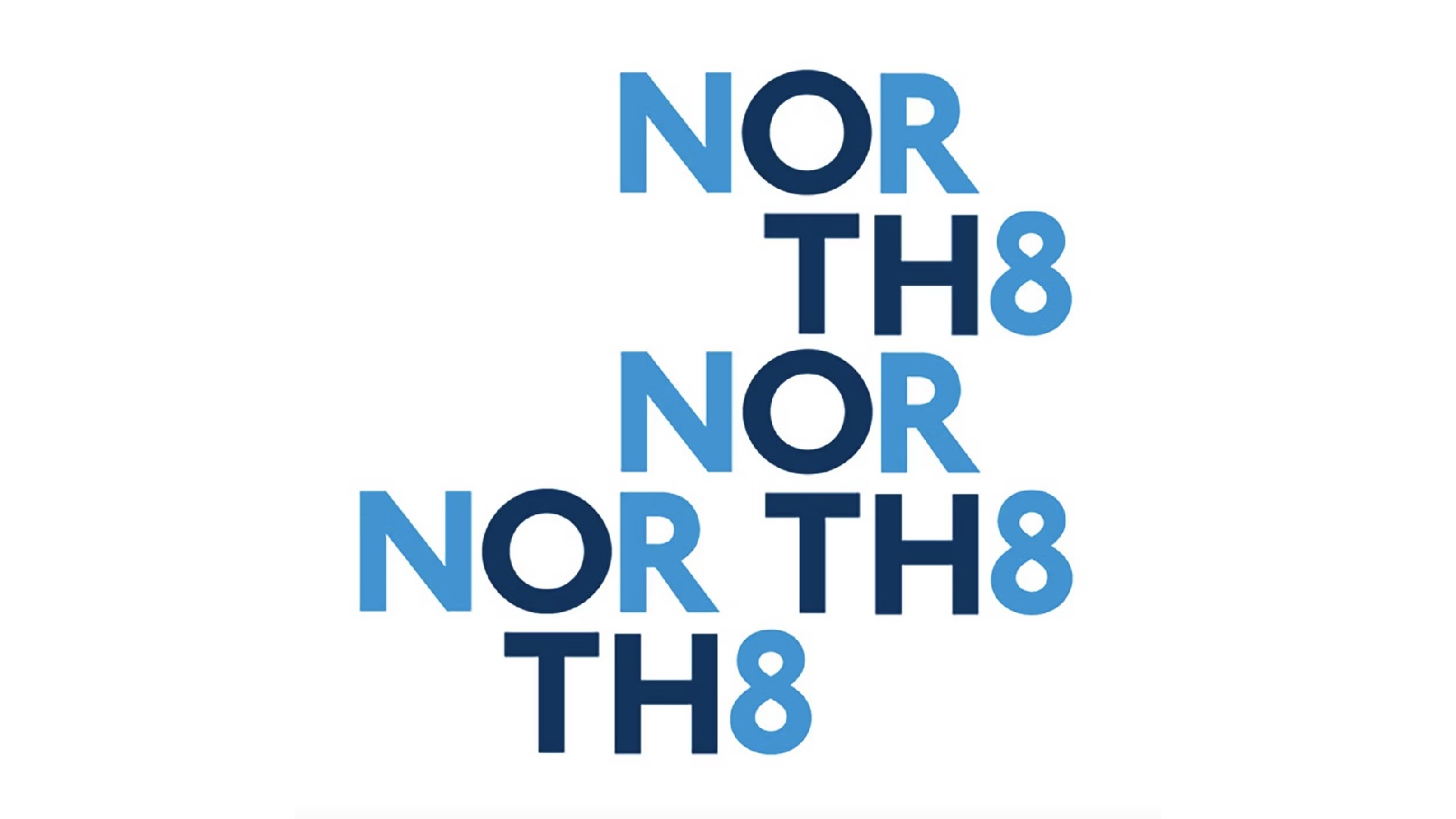
Pentagram worked on North 8's logo, and the Toll Brothers' condo development has one of the best real estate logos we've seen.
The blues and the repetition feel fresh and exciting, and this is logo that you might not assume is for a real estate company at first glance – it could just as easily be a logo for a social enterprise, or a company in the entertainment industry.
And its modern feel is just right for a more recent startup hoping to find its place alongside more established companies. It's a logo you aren't likely to forget.
06. Keller Williams Global Property Specialists

Keller Williams' logo is simple yet bold and emphatic, and easily recognisable too –ideal for such a large company with a varied customer base.
The lowercase initials look classy and refined in a deep red colour, while the name of the company below helps to reiterate the brand's identity, but isn't too overpowering when set under the initials.
The change in font weight is a nice touch too, adding some variety and preventing the logo from becoming too boring.
07. RE/MAX

The RE/MAX logo differs from many of the best real estate logos we've seen. It's louder, bolder, and more exciting.
But this make sense for RE/MAX. It's a huge company, and it's one that people are familiar with. People know what RE/MAX is about, so this logo doesn't need to convey that across. Rather, the logo is there to remind us that RE/MAX are one of the biggest real estate companies out there.
The use of primary colours plays an important role here, reinforcing the idea that RE/MAX is almost the default choice.
08. Hilton & Hyland
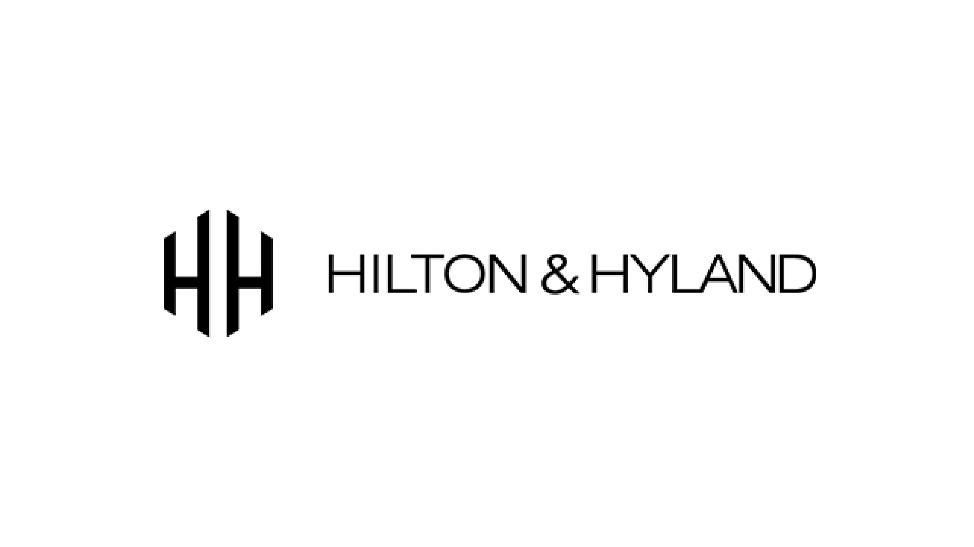
Simply put, Hilton & Hyland's logo oozes luxury and elegance, perfect for its Los Angeles clientele.
The monogram in particular is the crowning jewel of this timeless logo. It's something that doesn't necessarily scream real estate, but could be part of the logo of any luxury brand. It's classy, refined, and smart. (See our pick of the best monogram logos here.)
The design as a whole is ideal for Hilton & Hyland. It's aesthetically pleasing without too much going on, and it looks luxurious. The black and white design exudes power, elegance, and formality.